


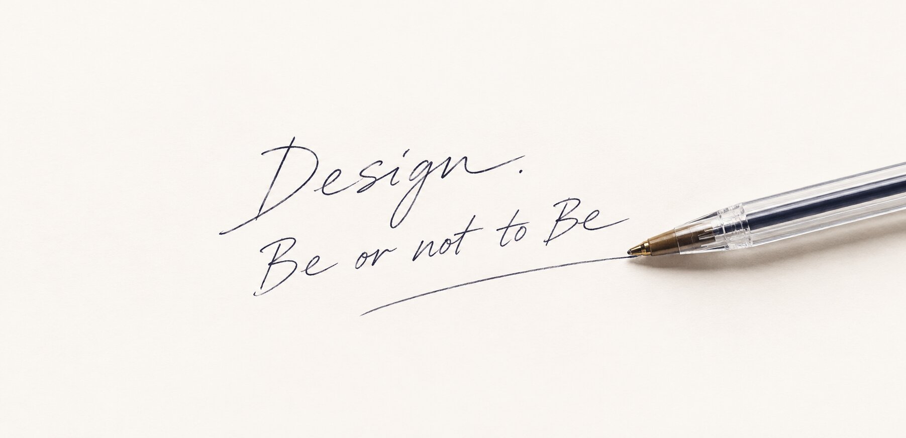
From a Bic Cristal pen to websites, CRM, ERP and AI: why the design that works best is the design you stop noticing.
There are things we only notice when they are done badly.
A door that opens the wrong way. A button you have to hunt for. A website where you can’t tell what to click. A chair you want to get out of after ten minutes. A pen that leaves too much ink and smears your signature.
And there are things we almost never notice.
We just use them.
That may be one of the hardest forms of design there is. Not the design people point at and call beautiful. The design nobody talks about at all.
Because people aren’t busy with design. They’re busy with their lives.
Short answer: invisible design is design that lets people focus on their task instead of the interface. Nobody notices it, because nothing in it gets in the way, whether it is a website, a CRM or an AI assistant. People only notice the result.
THE PEN
Just a Pen
One of the first moments I remember from design lectures was almost funny. They showed us an ordinary ballpoint pen. A Bic Cristal. And asked: “What do you see?”
Most of us said roughly the same thing: “Well… it’s just a pen.”
For some reason, that “just a pen” stayed with me for decades.
Because that was the moment I first understood something strange. We are used to calling design the things we can notice: an unusual shape, a beautiful color, a clever construction, a material, a line, a logo. Something you can photograph and say, “Look how well this was thought through.”
But look closely at a Bic Cristal and there is almost nothing to discuss. A clear barrel. A blue, black or red refill. A cap. A ball. A simple shape.
It doesn’t try to be luxurious. It doesn’t pretend to be a Montblanc. It says nothing about the status of its owner. It doesn’t ask for its own place on the desk. It never says, “Look at me, I’m the work of designers.”
It just works.
There is a good chance a pen like this filled in your birth certificate. The first document of a human life. And nobody looked at the pen.
Yet this “just a pen” has a biography any designer would envy. More than 120 billion have been sold since 1950, making it the best-selling pen in history. It has been in MoMA’s permanent collection in New York since 2001 and in the Centre Pompidou since 2006. And there is a tiny hole in the cap that almost nobody has ever noticed: it is there so a child who swallows the cap can still breathe. Another hole in the barrel keeps a vacuum from forming, so the ink keeps flowing.
Two small holes nobody sees. One of them saves lives.
We are so used to this pen that we stopped seeing it as design. It disappeared. And that word, disappeared, eventually became one of the most important words in my profession.
Good design should be allowed to disappear.
Not physically. From attention.
A person should see the task, not the interface. The result, not the button. The company, not the website. The wish to buy something, not the design of the store. The client, not the CRM. A working business, not the ERP. The answer, not the AI assistant.
At some point I realized that good design is not when people notice how well you did your job. It is when they don’t think about anyone having done anything at all.
THE FEELING
Before We Called It Design
Maybe that’s why I can’t say exactly when my story with design began. It started before I knew the word.
A child doesn’t know the word “ergonomics.” Doesn’t know what product design is, or manufacturing tolerances, tactility, balance, visual weight, composition. But a child knows that one toy is good and another one is somehow wrong.
One you want to hold, the other feels unpleasant. One part moves exactly the way you expect, the other one sticks. One object feels whole, the other looks assembled from random pieces.
We get this feeling long before we get the professional vocabulary we later use to explain it. And design probably begins right here. With a feeling. Not with Figma, not with Photoshop, not with a spec, and not with the question “what color should this button be?” With a very simple human sense: is this right or not?
Then knowledge arrives: design history, typography, architecture, color, composition, materials, manufacturing, psychology, marketing, behavior, analytics, business, technology. But the first feeling stays. The eye keeps seeing things you haven’t found a name for yet.
THE STAGE
When People Think About Your Website
Many years later, the same idea simply moved from objects into the digital world.
Imagine someone who comes to a website to buy a door. They don’t want to study your UX. They don’t want to evaluate your typography. They don’t care how many hours the designer spent in Figma. They want to know what these doors are, whether they fit, what they cost, whether they can order one and what to do next.
If at that moment they start thinking “why is this button so strange?”, “where’s the menu?”, “why is the photo so small?”, “why is everything so slow?”, the design has stopped being invisible. It has walked onto the stage. And it was never supposed to be there.
The same happens with the interface of any product. If someone opens a CRM and thinks about the CRM, we have a problem. They should be thinking about the client. If a sales manager, instead of talking to a client, is trying to figure out which field to fill in, the system is making a person serve the system. That is no longer design. It is bureaucracy drawn on a screen.
This is where design always got interesting for me. It was never limited to visuals. You can’t properly design an interface without understanding what happens behind it. And you can’t understand what happens behind it without understanding the business.
So we never built websites for the sake of websites. We built businesses. Sometimes the website was part of the work, sometimes only the first layer. Then came the CRM, sales, ERP, automation, client portals, mobile apps, integrations, analytics, AI. And every time the question stayed the same: how do we make it easier for a person to do the thing this whole system exists for?
THE REQUEST
“We Need a Website”
There is a sentence I have heard hundreds of times: “We need a website.”
Years ago, like most agencies, I might have answered: “Great, send us a brief.” Over time I understood that this is often the wrong first reply. Because the person isn’t describing their problem. They are describing the solution they came up with themselves.
“We need a website” can mean: we don’t know who we are in the market; we struggle to explain our value; our sales process is broken; we are losing leads; our managers work in spreadsheets; we have no CRM, or we have one nobody uses; clients can’t see the difference between us and competitors; we have outgrown our old business model; we have a great product we can’t present properly; we need a new sales channel, automation or a different positioning.
And sometimes you really do need a website. But that has to be discovered, not assumed. We wrote about this trap in What If You’re Solving the Wrong Problem?
That’s why researching the business has always been part of design for me. In Ukraine, especially in the years when the market was still forming, I often did it almost for free. Not because I thought the work was worthless. Relationships with clients simply worked differently then. We could talk for hours, study competitors, go through the company’s history, argue, drive to meetings, come back, redo things and talk again. I could spend a whole day understanding why a company does things the way it does. Only then did we start drawing.
Today, working with the US market, the Emirates and the Middle East, I see it differently. If I spend professional time researching a business, that is a professional service. That’s why we created the Strategic Session. Not a “preliminary consultation,” not a free call before the sales pitch, and not a conversation after which an agency says, “So, shall we build the website now?” It is a separate part of design. Before you can represent a business visually, you have to understand what exactly you are representing.
Sometimes after a session it becomes clear the company needs a website. Sometimes a CRM. Sometimes an ERP. Sometimes a new digital product or a new positioning. And sometimes none of these. That is a good result too. A designer’s job is not to sell people what they have already decided to buy. It is to understand what actually needs to be designed.
THE MISTAKE
The Most Beautiful Mistake
I remember the story with the Ukrainian Hair Research Society very well. We were working with Prof. Yulia Ovcharenko, and at one stage we produced a very beautiful hero banner. A young woman. Hair. A bright, almost magenta color. Visually it was striking, and if you judged only composition, photography and color, the banner was easy to defend.
But at the meeting, Yulia looked at it and asked, “What is this?” We explained. She looked again and said something like: “Yes, we work with hair. But we are not a salon that colors hair. We do scientific research on hair.”
And that was it. That was where the design ended. Because a visually beautiful solution turned out to be wrong in meaning.
This is one of the most expensive mistakes in design. Not a bad color, not a crooked margin, not the wrong font. It is design telling the wrong story very well. If we had simply improved the photo, adjusted the hair color and added elegant typography, we would have produced an even more beautiful mistake.
That’s why I always told designers: don’t start with the picture. Figure things out first. Who are these people? What do they sell, and to whom? Why do people trust them, and why do they buy from them and not someone else? How do they describe themselves, and how does the market describe them? What do they want to change, and what must not be lost? What does the competitor say better, and what worse? What should a person feel, and what should they do after feeling it?
Because design is not a picture. It is translation. From the language of business into the language of perception.
THE MIRROR
When Design Questions the Business
There was another project, SV Group. We received a prototype made by a very strong sales specialist. Technically, a lot of it was right: SEO, UX, UI, structure, logic. Methodologically, it all looked convincing.
But I had a feeling I couldn’t shake: this isn’t them.
The company sold expensive doors. Not the “I urgently need to replace a door” category, but a product with completely different economics and a different audience. A door could cost two or three thousand euros or more. Now imagine a site perfectly optimized for the query “buy a door.” It starts getting traffic. Sounds great. But who arrives? Someone looking for a fifty-dollar door.
You can perfectly optimize a website for the wrong customer.
You can grow traffic, improve conversion, build beautiful analytics and be proud of the numbers, while slowly destroying your positioning. So the question was not “how do we make the website better?” It was “who are we?” Sometimes a company doesn’t need a new website at all. It needs a new structure.
This may be one of the most interesting moments in a designer’s work. A business comes to you for a website and, during the design process, starts to understand itself better. Design becomes a mirror. Not an ordinary one that simply reflects, but one that can make someone look carefully for the first time and say, “Wait. Is this really who we are?”
The client isn’t always right. People love to repeat that the customer is always right. I never believed it. But the designer isn’t always right either, and that matters much more. An argument between a designer and a business owner is worth nothing on its own. Only the result counts.
If an owner says “our customers do this” and the data shows the opposite, I will argue. If I say “users will do this” and after launch the data shows the opposite, then I was wrong. I don’t see a tragedy in that. If a client can prove me wrong, I’m glad. We are not in court. We don’t need to defeat each other. We need to not damage the business.
It is a simple idea, but it changes the relationship. You stop defending the mockup and start defending the hypothesis. And if the hypothesis doesn’t work, you throw it away.
Years later, Yulia wrote us a review, and one line in it says this better than I can: we really did argue a lot, sometimes very emotionally, but behind every one of those arguments was a shared wish to do things not just well, but actually right. You can read that review and see the project in the Trichology Institute case study.
THE SCHOOL
A School Without a Sign
Maybe that’s why I never hired designers on a beautiful portfolio alone. I was far less interested in how perfectly someone could draw an interface. I cared about something else. Why is this line here? Why this size, this color? Why this hierarchy? Why does this screen exist at all? What changes in the business if we remove this button? Why is there empty space here, and what happens if we cut it in half?
If someone could only answer “because it looks nice,” that wasn’t enough. I wanted to hear “because…”, followed by a reason.
So we effectively had our own school. No sign on the door, no diplomas, no fancy word like EdTech. Every day we sat down with designers and took projects apart, sometimes for an hour, sometimes for an hour and a half. We discussed design history, typefaces, color combinations, line weights, typography, pixel perfection, mobile first, Ukrainian typefaces for Ukrainian brands, composition, interface behavior. But above all, cause and effect. Why. Exactly why.
We went to client meetings, and clients came to us. We talked about more than mockups; sometimes we went for walks and talked about business for hours. From an accounting point of view, those were probably not our most efficient hours. From a team-building point of view, they were some of the most important. Because a person started to see the business behind the interface and gradually stopped being just a UI/UX designer. They became someone who understands product, market, sales, clients, technology and economics. People like that go on to become product designers, founders and entrepreneurs. One day they stop asking “how do I draw this screen?” and start asking “why does this screen exist at all?”
Sometimes schoolkids came to our office. One boy first came very young, in fifth grade. He drew things and looked at everything around him with wide eyes. He had no experience, no portfolio, no professional understanding. But he had curiosity, which may be the most valuable quality a designer can have. We couldn’t always officially hire kids like that, but we could show them, explain, give them a small task, sometimes pay for a small piece of work.
Then years pass, and one day that person shows up in your LinkedIn. An adult now. A product designer. And you realize that once he stood in your office, looking at all of it the way a child looks at a huge workshop. For me, that is design too. Because design is not only what stays on the screen. It is also the people you shape around you.
PIXELS
Pixels and Empty Space
These days you sometimes hear that pixel perfection is an outdated idea. I disagree. Not because every pixel deserves worship, but because the human eye is incredibly sensitive to inconsistency. If one line is slightly thicker than the one next to it, the eye sees it. If a typeface has one visual weight and the line beside it another, you get a feeling: something is off here.
Nobody says, “Your typography’s visual mass is out of proportion with the graphic element.” They say, “I don’t know. It looks kind of cheap.” That is exactly the effect we described in Why Websites Look Cheap Even When They’re Well Designed.
People can rarely explain good design. But they almost always feel bad design.
So pixel perfection was never a cult for me. It is training for the eye. Like a musician: they may not think about every note, but they hear a false one. A designer has to see the false note. And it is made not only of pixels, but of rhythm, spacing, typefaces, contrast, sizes, photography, speed, animation, density and emptiness. Good design looks simple because it contains so many things that don’t get in the way.
I have always loved empty space. Not because emptiness is beautiful in itself, but because space lets a person see what matters. When everything shouts, people stop hearing. Ten buttons, ten accents and twenty messages on one screen don’t give users twenty times more information. They give them noise. The same is true in interiors, architecture, branding and writing. Sometimes the best element of a composition is the one we didn’t add. And it directly shapes how website design affects brand value.
That’s why minimalism is so often misunderstood. Minimalism isn’t “doing little.” It is understanding what is truly necessary and removing the rest. But you can only remove things after you understand the system. Strip everything before you understand the business and you get an empty website. Understand the business, then remove everything unnecessary, and you get clarity. Those are completely different things, and that difference is what our website design is built on.
PRINCIPLE
Kli: A Principle, Not a Copy
One of the projects where I thought hardest about visual simplicity was Kli. At the time I was looking closely at ITQ Amsterdam, an early version of their site. There was very little there: space, product, photography, air, beautiful product cards. And suddenly shoes stopped being just shoes. They became objects of desire.
But I never wanted to make Kli “like ITQ.” That would have been the easiest and, at the same time, the most foolish decision. I wanted to understand why it worked. That is the crucial difference: copying a solution steals a form; understanding a principle gives you a tool. We didn’t take the design, the colors, the cards or the layout. We took one idea: let the product be the hero. It is the same idea behind how we design e-commerce, from objects to experience.
And there is another important point. There is no universally good design. Look at Balenciaga during a certain period and you see a completely different visual philosophy: lines, architecture, graphic structure, an almost engineering aesthetic. It can work beautifully, but that doesn’t mean every website should look like that. A design system is not a religion. Minimalism is not a religion. Neither is maximalism, the grid or animation. Not even simplicity. There is a business, a product, a person and a context. Only then does a visual language appear. It is especially visible in luxury, where the usual conversion rules stop working.
Kli turned out visually strong. But I knew something was missing. Not one big decision, but small things. A photo that wasn’t quite right, a resolution that wasn’t quite there, a product shown a little worse here, speed there, a micro-detail somewhere else. The desire to buy sometimes behaves almost like a physical quantity: a slightly worse photo and desire drops; a slightly better one and it rises. But make the image huge to make it perfect, and the site loads slower, and desire drops again. Size, quality, speed, emotion, technology, business. Everything is connected.
That’s why I have always found it hard to accept the phrase “we’ve finished the design.” No. We have finished one hypothesis.
LAUNCH
Launch Is Not the End
There is a dangerous habit of treating a website as a finished monument. Prototype, UI, development, QA, launch. Done. But what do we really know about users before launch? What we assume. Even with research, a mapped customer journey and interviews, we are still working with a model. Then a real person arrives and behaves completely differently.
So after launch, practice begins. We look at analytics, at Clarity, at behavior maps: where people click, where they stop, where they come back, what they ignore, where they zoom in, where they abandon the process. And sometimes we find things that seem obvious only once we have seen them. The button should be higher. The text is too long. The contrast is too low. The form asks for a phone number too early. The user doesn’t realize this is the next step. So we change it. That is not an admission of failure; it is normal work, and it is exactly what a usability audit is for. Everything you build starts aging the day you finish it.
The customer journey is an especially interesting story. A business owner can often draw it in fifteen minutes: the client saw an ad, visited the site, read, browsed the catalog, left a request, a manager called, the client bought. Logical, neat and often wrong. The business sees the path from the inside; the customer walks it from the outside. They might check Instagram first, then open the website and close it. Three days later find the company on Google, read a review, come back, send the link to their spouse, open it on a phone, call, and return two weeks later. Somewhere in between they may forget the company’s name altogether.
That is reality. And sometimes a designer has to tell the owner: “You think your customer does this. But they do something else.” It is an unpleasant conversation, but a necessary one. My job is not to agree with people. It is to help them not lose their business to a beautiful theory.
EFFECT
Effect and Meaning
There is a lot of talk right now about “new design.” I wouldn’t rush to call it new. Video doesn’t bother me, and neither do new tools. The problem starts when people are handed the same prompt, the same visual preset, the same spectacular intro, a website gets assembled around it, and it is called “the next generation of digital.”
But take away the video, and what is left? A visual effect doesn’t become a new system just because it looks good. Sometimes it is an old marketing trick in a new suit. Video impresses, animation impresses, 3D and AI impress. But after a while people get used to it, and what remains is the essential question: what is happening with the product? How do people interact with it? What does the system understand, and how does it respond?
That is where the genuinely interesting territory begins. I think an interface no longer has to be the same for everyone and drawn in advance down to the last screen. Someone who came for one specific thing shouldn’t have to walk through your whole beautiful website. The interface should adapt to the person, not the person to the interface. We are working on our own product in this direction and will talk about it separately. But the principle is already clear: here, too, design disappears. People don’t think about how the interface is built. They simply get what they need. It continues the idea we started in The Website Is Not Dead.
UNSEEN
What Nobody Photographs
There is another reason the classic idea of “web design” always felt too narrow to me. A business’s most important interfaces are often ones nobody will ever see. CRM, ERP, internal dashboards, procurement systems, logistics, document flow, sales tools. Nobody posts them on Behance, puts them on magazine covers or shows them to clients saying, “Look how beautiful our ERP is.”
But when they are done badly, the whole business suffers. A manager wastes five extra minutes on every client, forgets to enter data, another manager can’t tell what happened, a deal is lost, the warehouse gets wrong information, finance waits. And the owner thinks the problem is the people, when the problem was the system.
And the other way around: a good system gradually disappears. The manager stops thinking about the CRM and simply talks to the client. The company stops thinking about the ERP and simply works. It is the same Bic Cristal, just on another level. The software should fit the business, not the other way around.
The same will happen with AI. Right now many products are desperate to show users: here is AI, here is an AI button, here is a chat, here is a little robot, here is “Ask AI.” But I’m not sure people should see the AI at all. If I want an answer, I want an answer. If the system can understand what I need, why make me open a separate chat?
A good assistant shouldn’t keep reminding you “I am artificial intelligence,” just as a good waiter shouldn’t come to your table every thirty seconds to demonstrate that he can walk. He appears when he is needed. Asks when there is no way around asking. Doesn’t ask when the answer is obvious. Hands over to a person when the situation goes beyond the system. That is how we build AI website assistants, and why AI website assistants are not chatbots. It is the pen again: you don’t think “now I will activate the ballpoint mechanism.” You just write.
BUSINESSES
We Never Built Websites
Sometimes something even more interesting happens. A company comes for a website, and during the design process it turns out the company itself has no structure. No proper catalog, no product logic, no CRM, no shared understanding of who owns a lead, no analytics, no process after an inquiry. And the website becomes the first place where the business is finally forced to answer these questions. What do we sell? To whom? What is it called? What are our categories, prices and terms? What happens after an inquiry, who receives it and who is responsible? How do we know a lead has become a sale?
Suddenly design works far deeper than a visual shell. It forces the business to become a system. That’s why I don’t draw hard lines between “this is design,” “this is strategy,” “this is technology” and “this is consulting.” In a real product, it is all connected.
The longer I work in design, the less I like the idea that design is something we add to a product. As if there is a business, then a designer arrives and adds design. No. Design is already inside. In how someone answers the phone. How a door opens. What a product is called and what its packaging looks like. How the CRM works and how a manager hands a client over. How many seconds a page takes to load, what an error looks like, what happens after a purchase, how a company says “no” and how it solves a problem. You can build a beautiful website for a terrible business. But you can’t sustain a good digital product for long without at least some order inside.
If I had to explain my professional path in one sentence, I would say: we never built websites. We built businesses. The website was a tool, sometimes the main one, sometimes secondary, sometimes the first brick, but never the goal. When we worked on brands, we cared less about how the logo would look than about what it would do to how the company is perceived. In e-commerce we cared less about the catalog than about why someone would want to buy. In CRM we cared less about the client field than about how the manager would sell. When we designed architecture, we cared less about the picture of the building than about the life inside it. Like the Trichology Institute, whose interior our studio DeZZign later designed.
That’s why I have always found it hard to work by the scheme “brief, prototype, UI, development, launch.” It is too linear. Real business isn’t linear, and neither are people. A person arrives with a story. So do the company, the product and the market, and a designer has to hear at least a little of it.
What does a good designer do? Not draw. First they look. Then they listen. Then they ask uncomfortable questions, search, compare, argue, doubt and look again. Only then do they open Figma. Because if you open it too early, it starts dictating reality to you. The first screen appears and looks beautiful, the second has to match it, then the third, then comes the design system, components, animation, a developer. And three weeks later you have a beautiful system that answers a question nobody asked.
That is one of the most expensive mistakes in digital. Not bad design. Well-executed wrong design.
THE END
Design You Don’t Notice
At some point you realize the profession has changed. Tools changed, computers changed. The internet arrived, then mobile, SaaS, the cloud, CRM, ERP, AI, generative interfaces. But people have barely changed. They still want to understand and to trust. They still want to act without unnecessary resistance. They still notice when something is “off,” even if they can’t explain why. And they still love things that are easy to use.
So decades later I keep coming back to that pen. A Bic Cristal. “Well, it’s just a pen.” There is something deep in that answer. Nobody said “what a magnificent piece of industrial design.” Nobody discussed its form or its manufacturing. People just saw a pen. And maybe that was the highest praise of all.
If I put everything these years have taught me on one line, I get a strange sequence. A child who feels the difference between a good toy and a bad one. Then the pen. First projects, websites, brands, e-commerce, CRM, ERP, architecture, products, teams, AI. And everywhere the same question: how easy is it for a person to do what they want to do? Not how beautifully we drew it or how many animations we added. How short the distance has become between a person’s intention and the result.
A person thought, and did. Without extra effort, without fighting the interface, without a twenty-page manual. The way a hand picks up a pen. The way a manager opens a client card. The way a customer places an order. The way someone asks an assistant a question. Between thought and action there is almost nothing. And that “almost nothing” is sometimes the result of enormous work.
I believe less and less in design that demands attention for itself. Not because expressive design is bad. Sometimes a product needs to be demonstrative, a brand needs boldness, an interface needs emotion, architecture needs monumentality. But there is another kind of strength. A quiet one. When everything is exactly where it should be and nothing needs explaining. When a website looks expensive but nobody can say why. When a CRM saves a manager twenty minutes and he thinks he is simply good at his job. When AI helps without demanding constant admiration. When a designer made hundreds of decisions and the user notices only one thing: I feel at ease here.
You can spend months researching the market, talking to owners, redrawing prototypes, arguing over millimeters, studying analytics, reworking and launching. And then someone arrives and says, “Yeah. It all makes sense.” And goes on with their day. At that moment you don’t want to be offended. You want to smile. Because if someone didn’t notice your work, maybe you did it really well.
They didn’t notice you. They noticed themselves.
Their task. Their product. Their purchase. Their client. Their business. Their life.
And maybe that is the hardest thing design can do: step aside. Not vanish completely, but leave a person alone with the thing all of this was created for. The highest level of design arrives when you open an app, a website or an entire system and don’t see design at all. You simply find yourself inside the business, as if inside a natural environment: nothing explains itself, nothing demands attention, nothing argues with you. You just do what you came to do.
Like a pen you pick up when you need to write something. Without thinking about the pen. You just write. And only years later do you realize: that was the design.
A pen like the one that once filled in a birth certificate will one day fill in a death certificate. And again, nobody will look at the pen.
It will stay beside a person their whole life, from the first entry to the last, and never once ask to be noticed.
Where This Philosophy Continues
If this way of thinking resonates with you, here is where it becomes work: a Strategic Session when you need to understand what should really be designed; website design and UI/UX design when the task is clear; product design for digital products; and our case studies, such as SV Group and the Trichology Institute.
Sources on the Bic Cristal: MoMA, Bic Cristal Ballpoint pen, 1950; BIC Group, BIC Cristal 75th anniversary; Fast Company, January 2026.
FAQ
What is invisible design?
Invisible design is design that lets people focus on their task instead of the interface. Nobody notices it because nothing in it gets in the way. People see the result: a purchase, an answer, a problem solved.
Is invisible design the same as minimalism?
No. Minimalism isn’t doing little; it is understanding what is truly necessary and removing the rest. Even a rich interface can be invisible if every element is in its place and nothing competes with the person using it.
Why does design affect business results?
Because people can rarely explain good design but almost always feel bad design. Inconsistencies in rhythm, typefaces or speed read as “cheap,” and that lowers trust, and with it, sales.
Does pixel perfection still matter?
Yes, not as a cult of pixels but as training for the eye. Human vision is extremely sensitive to inconsistency, and a designer has to see a false note the way a musician hears one.
How do you know whether a design works after launch?
By watching real behavior: analytics, click maps, Clarity, where people stop and where they abandon a process. Before launch, design is a hypothesis; after launch, the market tests it.
Should AI be visible in an interface?
Not necessarily. A good AI assistant appears when it is needed, asks only when it must, and hands over to a person when the situation goes beyond the system. People want an answer, not a demonstration of technology.
Want an interface people don’t notice because it simply feels right?
- Share
-

-

-

-

Related Reading
-
27. 08. 2026
How Website Design Affects Perceived Brand Value

-
27. 08. 2026
Why Some Websites Look Cheap Even When They Are Well Designed
-
23. 07. 2026
What Good Web Design Actually Does Once the Structure Is Right
-
24. 09. 2026
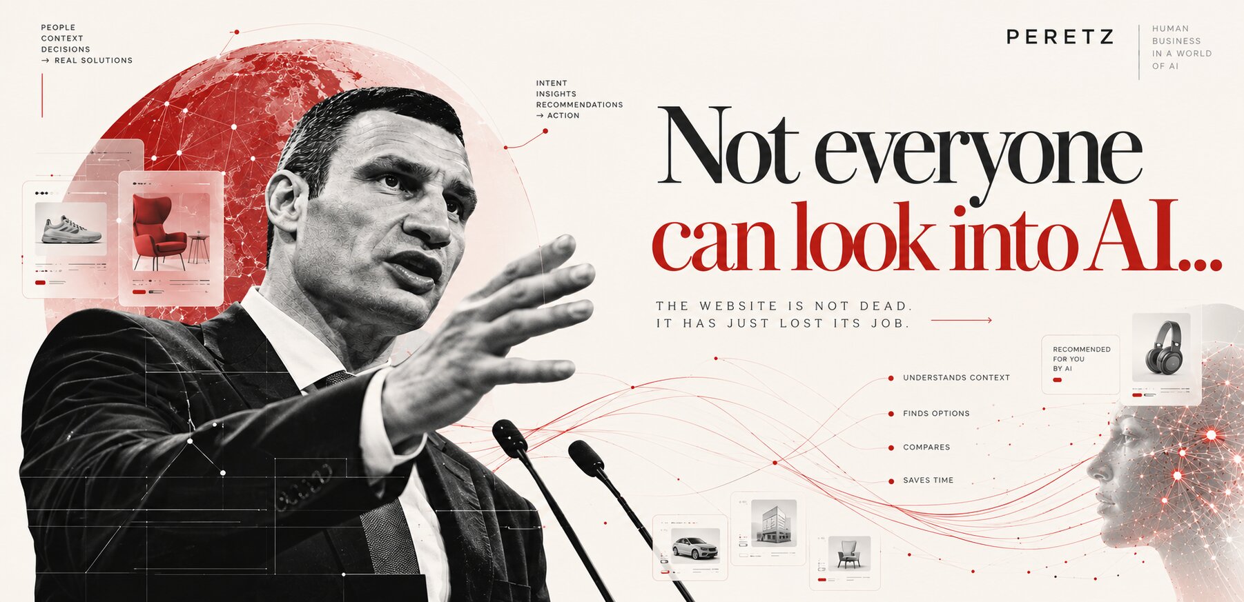
The Website Is Not Dead. It Has Just Lost Its Job.
-
27. 09. 2026
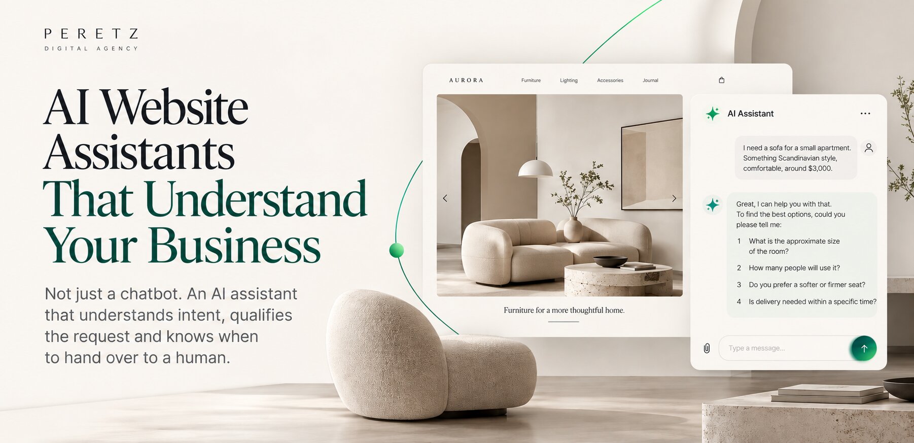
AI Website Assistants Are Not Chatbots. They Are a New Business Interface.
-
24. 07. 2026
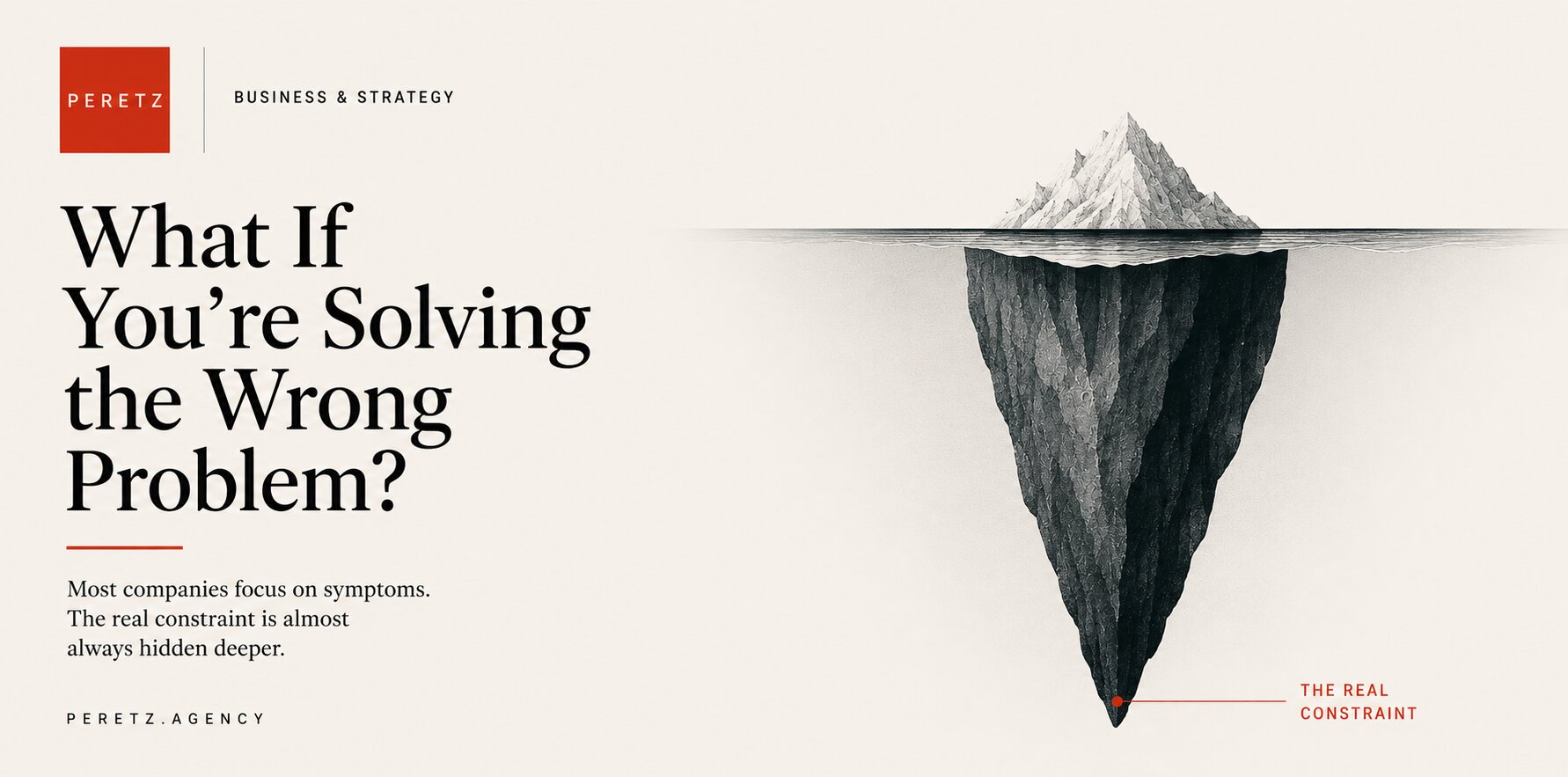
What If You're Solving the Wrong Problem?
-
21. 09. 2026
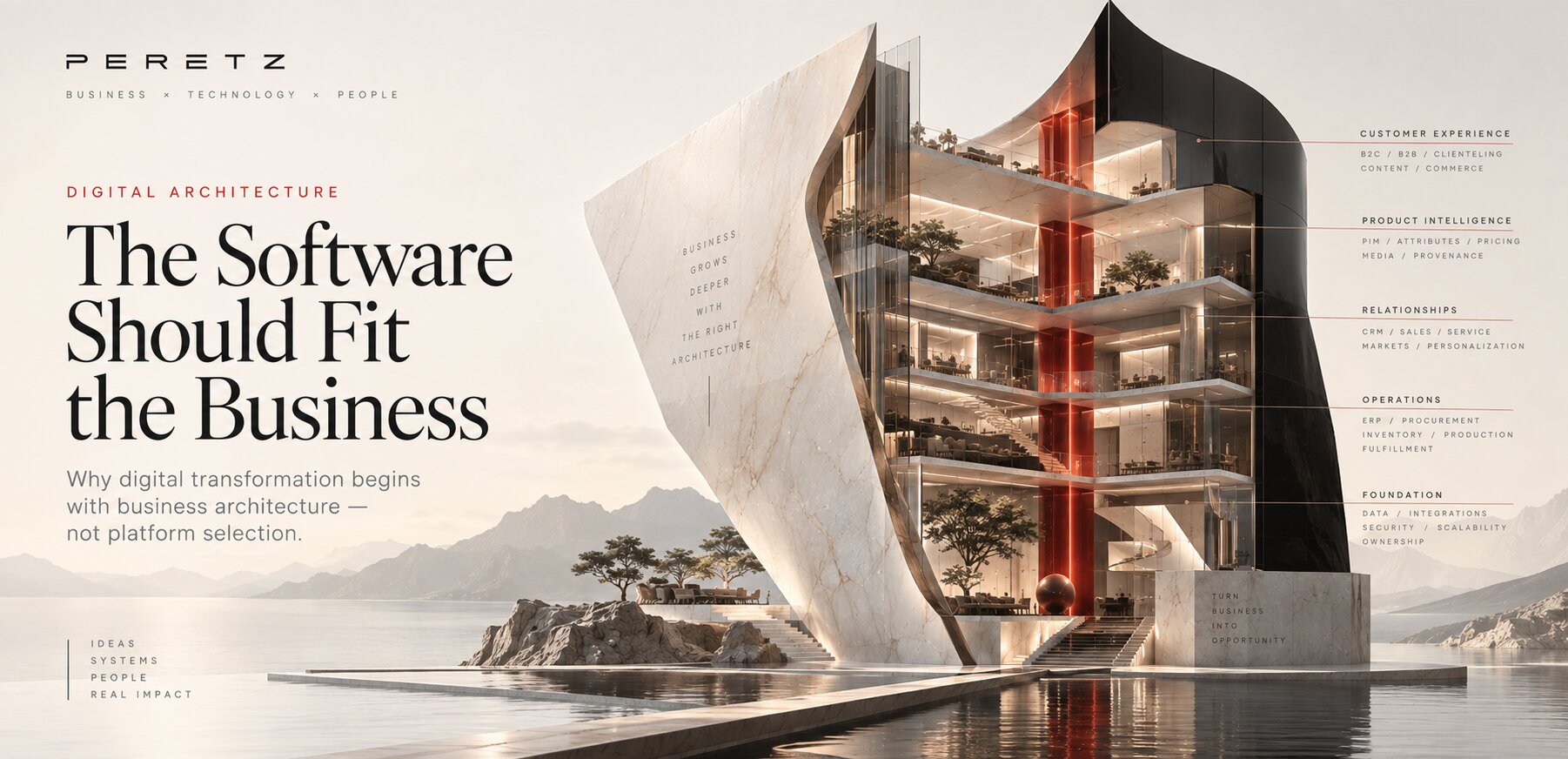
The Software Should Fit the Business