Why All Websites Look the Same, and What It Costs Your Business



Today's average is yesterday's differentiator. We helped make one of those looks, it was right, and then everyone took it. We counted thirty leading home pages to see how far that has gone, and I wrote down what to do about it.
IN SHORT
The short answer
Websites look alike because today's average is yesterday's differentiator. Someone does a clean, simple thing, it is right, it stands out, everyone copies it, and then it stands out no more. Part of that sameness is worth keeping, because shared conventions save people effort. The rest, from the "like Apple" brief to the A/B test, costs you in the places where a customer has to remember you and choose you. So the useful question is which parts of your business should disappear and which must be looked at.
A checkout should be dull. The first screen, the brand, the portfolio and the moment someone weighs you against a rival should not.
TWO SIDES
One brand, told from two sides
On 1 November 2026 SHTAYER, which makes home and hotel textiles, published an article on its blog, in Ukrainian, about how its look changed over twenty years. I stumbled on it by chance. It was pleasant to read: being on one wave with a client is a good feeling, doubly so because I work very closely with SHTAYER and with Tatiana. They wrote it themselves. That blog runs on a site we made, so read it knowing how close we are. Our case on the new identity tells the same story from our side.
Around 2019 we launched their first site. I worked closely with the owner, Yulia, and her assistant, Tatiana: meetings in the office, the positioning of the brand. Before that they had a complicated logo with too many elements, and the minimalist one we made was a breath of fresh air. Our case explains the choice: minimalism spoke to a new generation of buyers inspired by Apple and Dyson, and it left the attention on the product. There was no mistake in it. It was a timely, correct decision, and back then it was itself the differentiator. The project went live, SEO did not continue, and everyone went their own way.
Their article remembers those years in its own way: pastel came pastel interiors, beige and grey textiles and monochrome branding, a wave they say was almost impossible to sidestep. Beside the restrained logo they kept making sets with big roses, chocolate polka dots, coloured soutache and complicated embroidery. Our first case reports minimalist collections from the same period, so both were going on. They now say they were already something else and did not yet dare show it.
In 2025 a first message came from them, about edits to the old site, and we began working together again. When we talked, their vision and horizons had grown. That site, six or seven years old, still looks modern, and many companies order simpler design than it. But under the hood it is OpenCart, and with the new tasks and expansion to other markets they went to a proper product, in our case Laravel, which we began in 2026. And the settled design and the brand now looked too minimal, too simple for their history, for what they had come through and how they were reborn. Their article names the last push, a question of mine: "I can see how you've changed. What are we going to do about the branding?" (our translation). They concluded that the logo had simply fallen behind them.
And this minimalism is everywhere, everyone has already copied it. That is why all sites are the same, and you do not want to go there. Their brand and identity work excellently, but many companies copied all of it, and what we began, among the first to make minimalist sites, is starting to wear itself out. You need something of your own.
Today's average is yesterday's differentiator.
It came from one person. Yulia once said she feels like the curious little monkey from a childhood cartoon, interested in everything, looking at the world slightly differently. We did not want one more neat premium brand with pretty type and a neutral palette, so Chinoiserie came into the system, as a language that could hold her character, the brand's history and its very different lines of work. The monkey is there, and so is magnolia, with a vine that forms the letter S and keeps a link to the minimalist logo.
No rival can borrow that monkey, because the reason for it is a particular person. There is no feedback yet. They have only just shown it in the article, the new site is about to launch, and I am curious what customers will say.
THIRTY PAGES
Thirty home pages, counted
SHTAYER calls it a wave almost impossible to sidestep. I say everyone has copied it. How alike are we all, in fact? We counted.
We took a list nobody on our team chose: the top 30 of the Forbes Cloud 100, private cloud companies, 2025 edition, the latest we could find. On 3 November 2026 a script opened each home page in Chromium at 1440 by 900 pixels, with analytics blocked, and read what the browser had drawn. We checked every first screen by eye and submitted nothing.
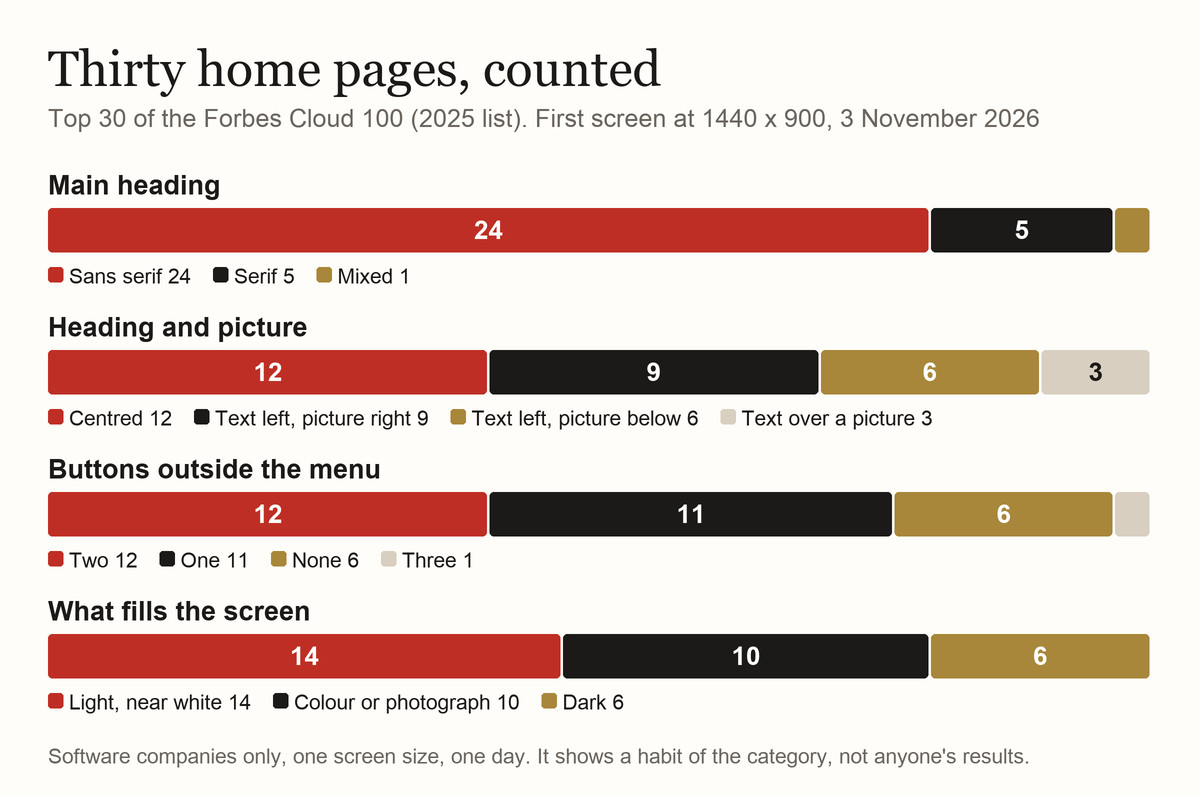
The words converge as well. Eighteen of the 30 first screens offer a demo or a talk with sales, and eight say exactly "Get started". Eleven main headings mention AI or agents. Three contain the words "one platform".
The fonts tell the most. These pages use 27 different typefaces, and seven carry the company's own name, which points to serious money spent on type. Still, 24 of the 30 arrive at a clean sans serif. A designer sees the differences. My guess, which we did not test, is that a customer glancing at the screen mostly does not.
This is thirty software companies, one list, one day, one desktop size, and their buyers expect a demo, so their habits run stronger than in most trades. It shows nothing about money, and many of them are very successful. By the same count our own home page sits in the centred group, so a layout alone proves little.
Every trade has its own average. When we measured nine jewellery and luxury sites in October, four of them paired a serif for names with a sans for the interface. Alex Murrell's The Age of Average finds it in logos, cars and film posters.
IN ITS DEFENCE
Sameness has earned its place
Be fair to it first. Jakob's Law, from the usability researcher Jakob Nielsen, says users spend most of their time on other sites, so they prefer yours to work like the ones they already know. A cart at the top right, a menu where menus live, a form that behaves like every other form: each saves the customer a small lesson.
So when a designer says "that is how it is done", they may be right. I argued this myself in Design You Don't Notice: a Bic pen, a CRM and a checkout work best when nobody thinks about them. I have not changed my mind. A business has more than one kind of part, though.
TWO JOBS
A window and a destination
Every site does two jobs, and each is judged differently. Some parts are a window: people look through them at what they came to do, and you judge a window on function. Others are the destination, the thing they came to see and will remember, and you judge that on what it makes a person feel and what it means.
The second half comes from a video. Design Theory's Why Nothing Looks Cool Anymore, from September 2026, started this article. It argues that design gets judged on looks and function, while what makes it great is how it makes you feel and what it means. Looks and function are means to that. Nobody writes it into a brief.
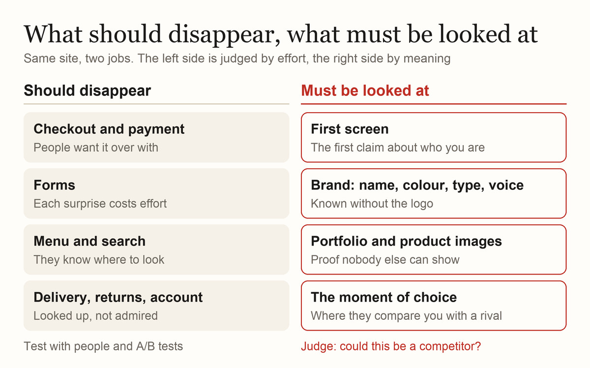
A window should be as conventional as you can stand. Keep it dull, measure it by completion, errors and time, and if you doubt a form, watch five people use it.
A destination has the opposite problem. Built by the book, it disappears as well, and that is the one thing it cannot afford. For a jewellery house the product page is a destination, and tactics that lift conversion elsewhere can backfire: a countdown timer that suits $120 sneakers makes a $100,000 piece look suspicious.
A checkout should be dull. Your first screen should not.
The video's case is a car. An iPhone can afford to be neutral, it argues, because it is a portal that should vanish so your content can appear, while a Ferrari is itself the content. On 25 May 2026 Ferrari showed the Luce, its first fully electric model, styled largely by Jony Ive and Marc Newson's firm LoveFrom. Reuters reported baffled fans, memes about vacuum cleaners and a fall of 8.4% in Ferrari's shares the next day.
For me it is an iron. I know electric cars well and own one myself, I love progress and technical solutions, but I love elegance, and this Ferrari did not become elegant for me. From an aggressive, screaming, bloody, muscular car it has turned into a worn sliver of soap. In Russian and Ukrainian a cheap point-and-shoot camera is called a soap dish, and that is the object I see. You look at it and it stirs nothing in you. At school I went to a drawing club, and we had posters of car sketches from the seventies and eighties: that is how people saw the future, and the Luce belongs on those posters. There is nothing sexy in it, nothing that makes you want it. It is an everyday, ordinary, boring car, not the car you wait for a special day to take out, one you have to prepare yourself to drive. This is not a Ferrari at all. That is my taste, and it is only my taste. In the terms of this article: where people wait for a destination, they were given a window.
Then it reportedly sold. In July Business Chief, citing the Financial Times, reported that the whole 2026 allocation had gone about two months after launch; The Next Web puts that at roughly 500 cars, from €550,000. Ferrari declined to comment on sales figures.
Those sales do not answer the design question in either direction. This car would have sold whether it turns out a failure for Ferrari or a success, because it is the first electric Ferrari, and a first-of-a-kind from a name like that sells on being first and on being collectible, a point the video makes too. In August 2006 a hundred people put down $100,000 each on Tesla's first car, a month after the unveiling. In March 2016 people queued to pay about $1,000 for a Model 3 that would be shown only that evening. Few businesses have that cushion.
HOW IT HAPPENS
How a business arrives at the average
Nobody orders a site hoping it will look like everyone else's. It gets there through a run of sensible decisions.
The brief comes first. Clients ask for "like Apple" constantly, or like a competitor, constantly. But you have to differ, you have to be better, a step ahead. Every thing has its own goals. Apple sells something people already want to see, while most companies still have to explain why they exist. On an ordinary budget you will not match its precision in materials and photography either, so what comes back is the surface without what held it up, and that is often why a competent site reads as cheap.
Competitors do get studied. For Schoeffel, a pearl house since 1921 where the work is still under way, we took 34 brands and their subject matter and studied all of it, down to web archives, and on that basis a business decision is made about why we propose this or that. It is not design that decides, but the tasks.
Then comes the round of comments. Sales wants the form higher, legal needs a line, someone finds the empty space wasteful. Each note is fair, and each tends to remove whatever might bother somebody. I know this from the other side of the table. When the first Peretz site was being built I decided not to take part, because I kept making edits constantly and nothing was mine. It is the same problem as with every client: you cannot see when you are the client yourself. Now I see, I know what I need, and I start from metrics and from the business decisions the site must solve. That is why the order of decisions in a project matters: by the time screens are on the table, what the page should mean ought to be settled.
We go against the current all the time. It happens often with marketers, or a client who says "I want the site like this". You do research and say: this will not work, this will. Here your product card is too complicated and inconvenient, here the UX is overworked. By proving it you make the right product.
Templates pull the same way at scale. Indiana University researchers who compared 10,000 sites found that those built on shared libraries such as Bootstrap look noticeably more alike.
Testing climbs a hill. Don Norman and Roberto Verganti describe iterative design and testing as hill-climbing: it reliably improves what you have and cannot tell you that a higher hill exists somewhere else. The trouble starts when the same method is asked what your company should feel like.
Feeling is no flaw in that decision. University of Iowa researchers studied patients with damage to one area of the prefrontal cortex: their emotional responses were sharply reduced, their intellect and memory were unaffected, and their decisions suffered. One spent 30 minutes choosing between two dates for an appointment. Antonio Damasio's theory that emotional signals help steer choices is still debated, so I take a modest point from it. Metrics and tasks set the goal, and a named person makes the judgement. A metric will not make it for them.
Now add AI. In a 2024 experiment in Science Advances, stories written with ideas from a language model were rated better and were more alike. That is fiction, and we found no peer-reviewed count for websites. But a model learns from what already exists, and its confident default is the middle of that.
THE BILL
What sameness costs
Nobody has put a dollar figure on a generic home page, as far as we can find. The evidence comes from brands and advertising and reaches websites by reasoning.
For a logo, colour or font to stand in for your name, says Jenni Romaniuk of the Ehrenberg-Bass Institute, its fame has to come close to 100%. A sans serif heading on a white screen will never get there.
The study everyone quotes helps less than people think. McKinsey's The Business Value of Design (2018) followed 300 listed companies for five years and found the top quartile with 32 percentage points higher revenue growth and 56 percentage points higher growth in shareholder returns than their industry counterparts. It measures how companies run design and says nothing about whether they look different, and it is a correlation among large companies, from a firm that sells design work. We have written about what it does support.
The rest is reasoning you can check against your own numbers. You pay to bring a person to your site, and that person has two or three tabs open. If your tab leaves no trace, what remains to compare is price and a list of features, and looking interchangeable pushes you toward the cheapest argument. Colour is one of the few things you can come to own, slowly, as I describe in The Same Car in Another Colour Is Another Car.
Being different has a bill as well. Custom work costs more, takes longer and can break things, as our own site shows below. If you cannot keep a distinctive look for years, spend the money elsewhere.
THE TEST
A test you can run tomorrow
None of this needs taste. It needs an hour, some screenshots and one person who knows your market. Do it in this order:
- Sort the page. Mark each block as window or destination, using the map above. Anything unusual in a window goes back to convention, and you can stop discussing it.
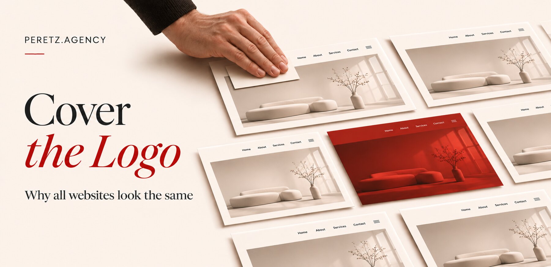
- Cover the logo. Put your first screen beside those of three competitors, hide names and logos, and show them to a salesperson or a long-standing customer. Ask which one is yours and how they know. A shrug is your result.
- Swap the name. Read your main heading aloud with a competitor's name in it. If it stays true, it describes your category, and they can say it too.
- Name the feeling and the meaning. Finish one sentence: after five seconds here a person should feel ___ and understand that we are ___. Then ask whether you can picture the person this belongs to, and ask your designer to point to what on the screen does all that.
- List what could belong to nobody else. Your own photographs, your archive, the way you really work, a material, a number, the founder's voice. Stock images and claims any rival could sign do not count.
- Now test the windows. Put the checkout and forms in front of real people and run A/B tests where you have the traffic. Leave destination decisions to one named person, and say so before the comments start.
We compare logos too, on paper and without covering them. We used to have a big meeting table where we laid out a mass of printouts, competitors, sketches, many drawings by hand. I loved drawing a site's interface for the designer as blocks on horizontal A4 sheets, by hand, explaining every detail, not in Figma, not in Photoshop, not in InVision, which existed at the time.
If nothing here could belong only to you, the problem predates the design.
An empty list at step five means a positioning problem, and that is the place to start. SHTAYER's monkey began as one remark by its founder, which is the kind of thing this list is for. The same work also changes your brief. In place of "like Apple", a designer gets the sentence from step four and the list from step five.
OUR OWN SITE
What this looks like on our site
We hold ourselves to the same split, and you can check it on the live pages. It proves nothing about money: we have no figure showing that any of it earned more.
Our portfolio shows 56 projects as black and white photographs of each client's world, and a tile turns to colour when you point at it. Black and white is eternal. It speaks to the user differently. It is deeper. It makes you pay closer attention. When there was film every frame was worth its weight in gold: frames cost serious money, there was a lot of work, you could not see the result, whether it was sharp, whether the shot came out at all, exposure and aperture all set by hand, and then the film had to be developed, those trays, the reagents, an enormous amount of time. That choice has a price: someone hunting for a screenshot of a site has to open the case.
The first screen of our home page is a 3D scene of objects tied to each client: a pearl for Schoeffel, a ring, a car, a white hotel pillow. It is also our best example of the bill. When it went live in October 2026, mobile PageSpeed fell to 32, with 16 seconds of blocked main thread on devices with no graphics chip. We kept the scene and sent those devices a plain light version of the same text, and by 27 October the score was 78. The whole story is in 3D on a Live Site.
Our 404s have always been interesting. It was our thing: there was always something happening, a construction set to assemble, the fifteen puzzle, mini-games like catching eggs, like the first Nintendo handhelds. So when a plain list version came up I rejected it as boring. Now there are prints you can pick up and move, and digits you can spin. The window part stays dull on purpose: a search box and five ordinary links in the middle, and a real 404 status.
None of this is a recipe, and a payroll tool should not copy it. If something here works, someone will copy it, and then it is the average too. That is what happened with minimalism, and it was right when we did it. So you start again from the business: its logic, its tasks and what it alone has, so that the result belongs to that business in a way a template cannot.
FAQ
Frequently asked questions
Why do all websites look the same?
Because today's average is yesterday's differentiator: a look that stood out gets copied until it stops standing out. Conventions also save visitors effort, and briefs that name a reference, comment rounds, themes, A/B tests and now AI all pull toward the average.
Is it bad if my website looks like my competitors' sites?
Not everywhere. In checkout, forms and menus, looking like everyone else helps. It hurts on the first screen, in the brand and at the moment of choice, because a person who cannot tell you apart compares you on price.
Should I use a template or a custom design?
It depends on how much of your site is a window. If people come to complete a task and leave, a good template may be all you need. If it has to make someone remember you, spend on the destination parts and keep the rest conventional.
Will a distinctive design hurt conversion or speed?
It can. Unusual checkouts cost effort. Heavy visuals can hurt too: a 3D first screen took our own home page to 32 on mobile PageSpeed before we fixed it. Plan the distinctive parts together with their performance.
Does AI make websites look more alike?
Probably, but the direct evidence is thin. AI-assisted stories in one 2024 experiment came out more alike, and we found no count for websites. What could belong only to you has to come from your business.
Sources
- Nielsen Norman Group: Jakob's Law of Internet User Experience, August 18, 2017
- McKinsey: The Business Value of Design, 2018
- Goree, Doosti, Crandall and Su, summary of their study of 10,000 websites, The Conversation via TNW, May 16, 2020
- Doshi and Hauser: Generative AI enhances individual creativity but reduces the collective diversity of novel content, Science Advances, July 12, 2024
- Ehrenberg-Bass Institute: Jenni Romaniuk on distinctive assets and fame
Cover your logo: could it be a competitor? Let's look at what could belong only to you.
- Share
-

-

-

-

One notification a week with the new PERETZ articles. Nothing else.