


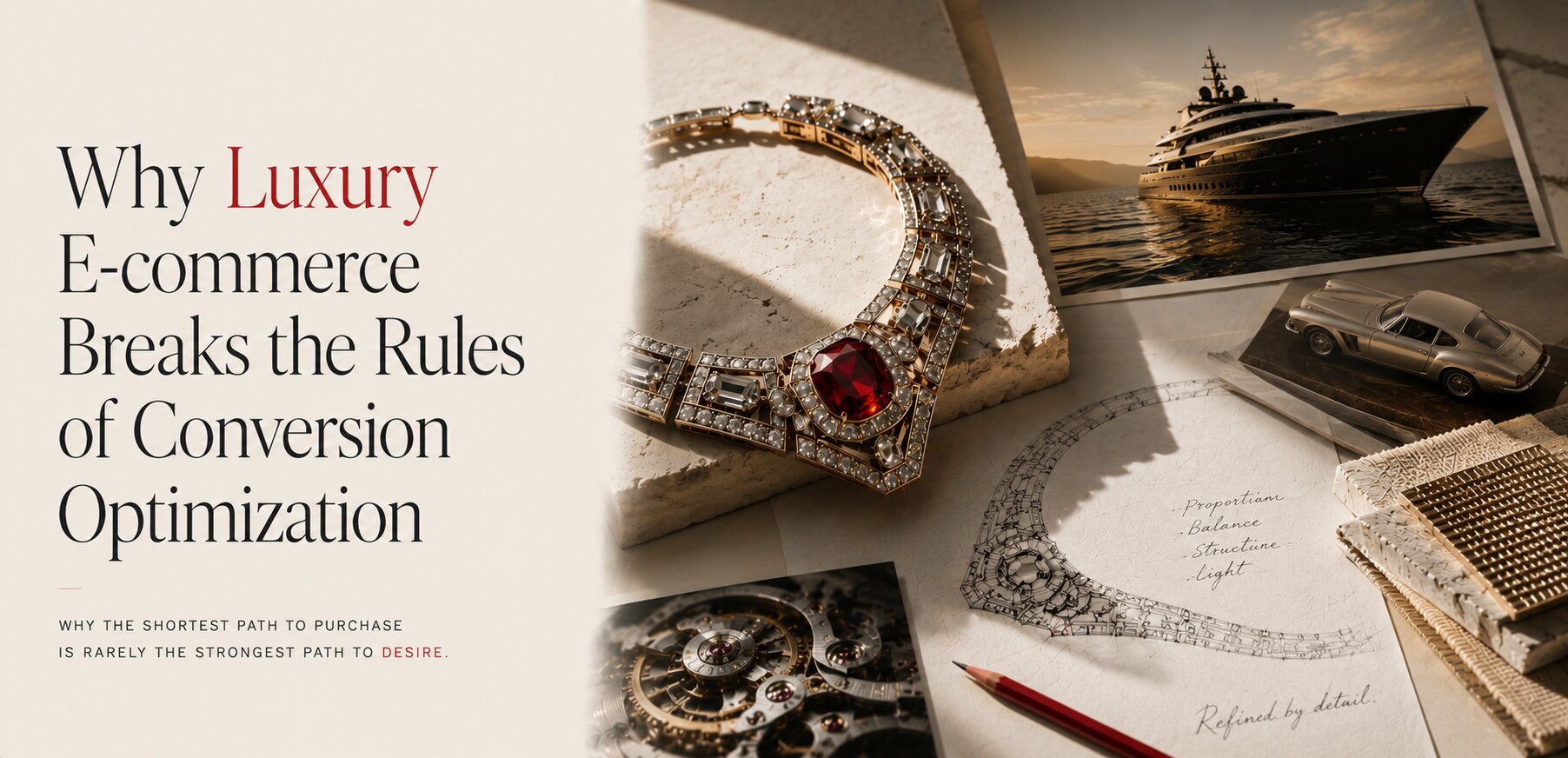
Most e-commerce optimization starts with a seemingly obvious assumption:
The easier you make it to buy, the more people will buy.
Reduce friction.
Shorten the path to checkout.
Make the CTA impossible to miss.
Add urgency.
Show scarcity.
Offer a discount before the customer leaves.
For many categories, this works remarkably well.
If someone is looking for a $150 pair of sneakers, a $200 appliance or a $300 piece of furniture, there is usually little reason to make the buying process longer than necessary. The user knows roughly what they want. The job of e-commerce is to help them find it, evaluate it and buy it.
But what happens when the product costs $20,000?
Or $100,000?
Or $200,000?
At that point, the question changes.
The customer is not simply deciding whether to buy an object. They are deciding whether the object deserves their time, attention, money and, ultimately, a place in their life.
And that changes what conversion means.
SELLING
Luxury Does Not Sell the Product
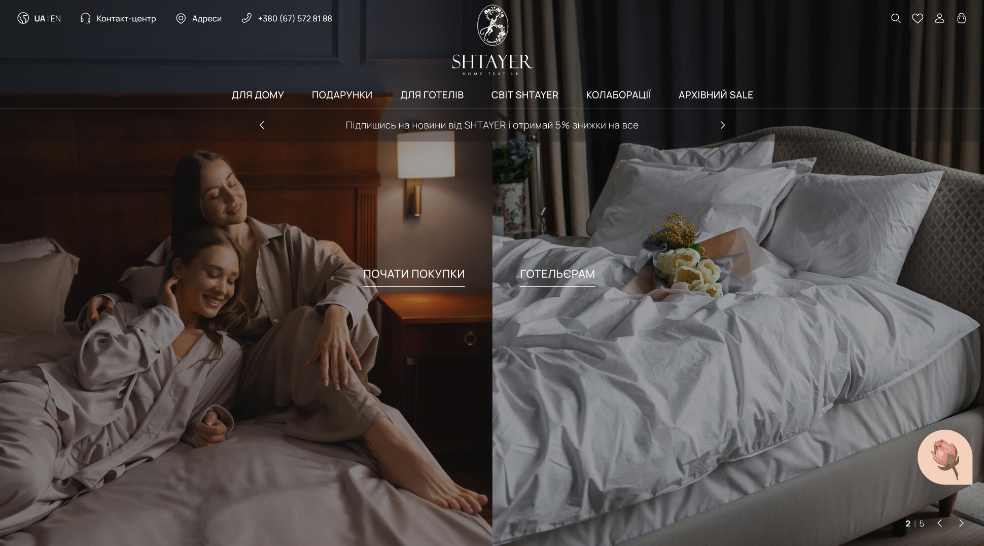
A luxury brand rarely sells only the physical object.
A premium bedding brand, like Shtayer, does not really sell expensive bedding. It sells the quality of your sleep.
A watchmaker does not simply sell a mechanism, a dial and a case. It sells craftsmanship, engineering, heritage and a relationship with a tradition of making.
A luxury eyewear brand does not sell a pair of frames. It sells design, identity and the way the wearer wants to be perceived.
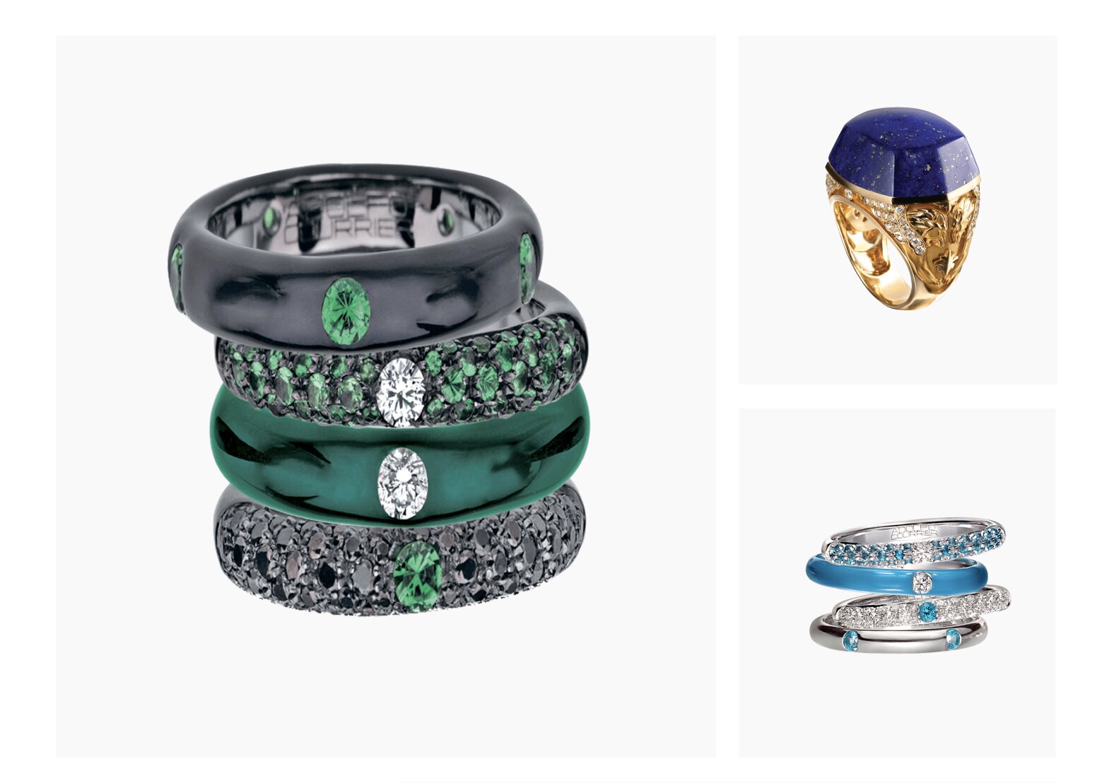
A jewelry house does not simply sell a bracelet, ring or necklace.
It sells access to a certain aesthetic world. A sense of belonging. A relationship with craftsmanship and history. Sometimes, it sells the feeling of entering a social environment in which the customer wants to see themselves.
The object is the vehicle.
The value exists beyond the object.
This is why a luxury product page cannot be evaluated in exactly the same way as a mass-market product page.
If the entire purpose of the experience is to move someone from product discovery to checkout as quickly as possible, we may be optimizing the wrong thing.
The real question becomes:
How do we give someone enough reason to want this object before asking them to buy it?
NOT JUST CHECKOUT
Conversion Is Not Always the Checkout

In conventional e-commerce, conversion is usually straightforward:
Product view → Add to cart → Checkout → Purchase
For high-luxury, the journey can look completely different:
Discover → Explore → Examine → Return → Trust → Experience → Purchase
The customer may visit once and leave.
Then return two days later.
Then come back again.
They may spend several minutes looking at a single product. They may open additional images, watch a video, read about the materials, examine the craftsmanship, look at the designer’s story and then leave without doing anything that a conventional analytics dashboard would call a conversion.
Then they return again.
And eventually they visit the boutique.
That does not mean the website failed to convert.
The website may have been doing exactly what it was supposed to do.
In the luxury projects we have worked on, we have watched these patterns through engagement sessions, returning users, product views, scroll depth and content consumption. The important signal was not simply whether someone clicked “Buy.”
It was whether they were progressing deeper into consideration.
This distinction becomes particularly important when the website is not designed to replace the physical store.
It is designed to prepare the customer for it.
Give the Customer Their Time Back
This is where luxury e-commerce begins to contradict conventional CRO.
A typical conversion optimization mindset asks:
How can we get the customer to the next step faster?
Luxury often asks:
How can we make the customer want to spend more time here?
That sounds like a contradiction.
It isn’t.
If a person is considering an exceptional object, time is not necessarily friction. Time can be evidence of desire.
A customer who spends eight minutes examining a piece of jewelry may be much more valuable than ten customers who spend thirty seconds browsing a product grid.
The important question is not:
“Why did this person spend so long on the website?”
It is:
“What were they doing with that time?”
Were they examining the product?
Reading its story?
Watching how it was made?
Returning to the same piece?
Exploring related objects?
Learning about the house?
Looking for a boutique?
That is a completely different type of digital behavior.
And it requires a different approach to UX.
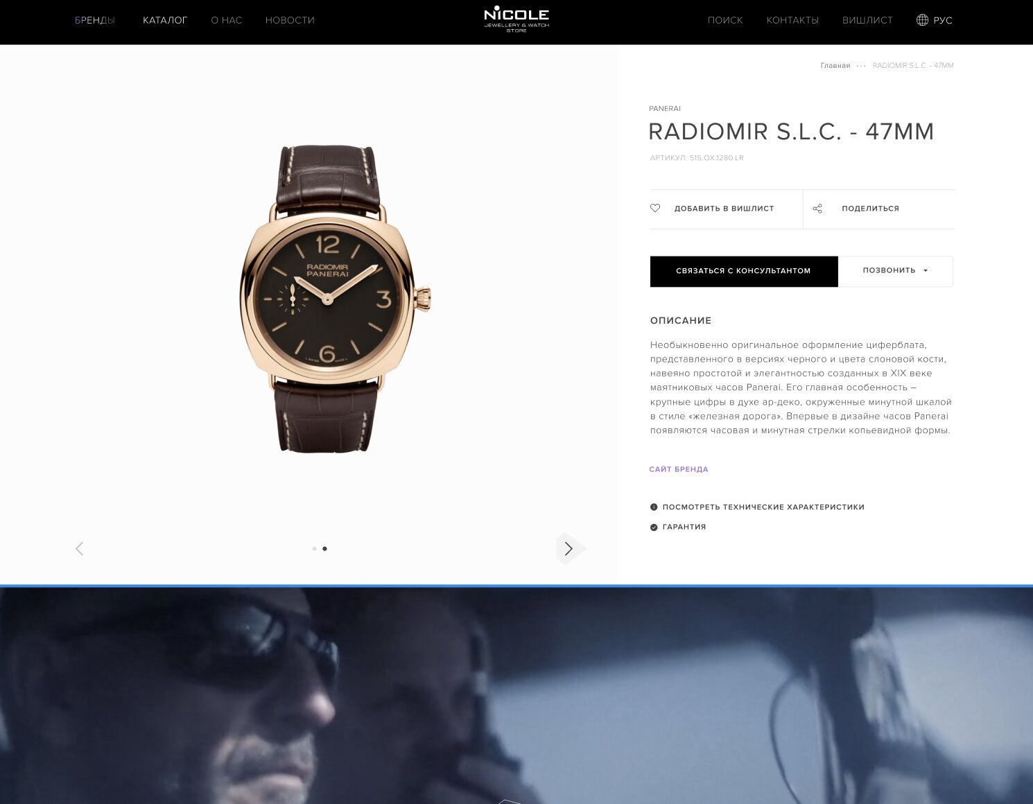
On the Nicole project, a multi-brand jewelry boutique carrying names like Rolex, Hublot and Panerai, we watched exactly this pattern play out. Returning visitors were not behaving like conventional e-commerce users. They repeatedly returned to the same product pages, spent significantly longer examining high-value pieces, and consumed supporting editorial content before eventually moving toward offline contact, typically returning three or four times before making contact, sometimes more. The important signal was not whether someone clicked “Buy.” It was whether they were progressing deeper into consideration.
SURVIVE DIGITAL
The Product Has to Survive Digital
There is another problem.
A luxury object is often experienced physically.
You can hold a watch.
You can see how light moves across a stone.
You can feel the weight of a piece of jewelry.
You can examine the precision of a clasp.
You can see the difference between a beautifully engineered original and an imitation that looked almost identical in a photograph.
A website cannot give you that physical experience.
But it can prepare you for it.
This is why we often want the opposite of what conventional performance thinking might recommend: large images, high-resolution photography, video, zoom, detailed product views, sketches, material information and enough space around the object for the customer to actually examine it.
The website has to put the product into the customer’s hands before the customer can physically hold it.
Not literally, of course.
But cognitively.
The customer should arrive at the boutique already knowing the object, already having imagined it, already understanding why it is different.
Then the physical experience completes what digital started.
There Is No Universal Luxury Product Page
This also means there is no single formula for a luxury product page.
A $100,000 watch may need to explain an extraordinary movement and show the mechanism being assembled.
A piece of jewelry may need to explain the stone, the setting, the designer’s idea and the craftsmanship behind a detail that would be invisible in an ordinary photograph.
A limited-edition car may need to communicate engineering, performance and provenance.
A luxury interior product may need to demonstrate material, texture, installation and the environment it creates.
The mechanics change because the meaning of the product changes.
What remains constant is the principle:
Give the product enough space, enough time and enough context to become desirable.
The First Rule of Luxury Conversion
This leads to the first rule of luxury e-commerce:
Do not optimize the website for the shortest path to purchase. Optimize it for the strongest path to desire.
That does not mean making the website slow, confusing or inconvenient.
Bad friction is still bad friction.
Broken navigation is bad.
Poor mobile UX is bad.
Unclear availability is bad.
A complicated checkout is bad when a checkout is actually appropriate.
But not every additional moment is friction.
Sometimes it is consideration.
Sometimes it is discovery.
Sometimes it is the customer falling in love with the thing they are eventually going to buy.
And sometimes the most important conversion event happens several days later, somewhere completely different:
inside the boutique, with the product finally in their hands.
SIGNAL
CRO Optimizes Behavior. Luxury Has to Protect Perception.
Conversion optimization is fundamentally behavioral.
We look for opportunities to reduce hesitation, create urgency and remove obstacles between intent and purchase.
Luxury has another layer:
perception.
The customer is constantly evaluating not only the product, but the brand behind it.
How does it communicate?
How does it present its work?
How much confidence does it have in what it makes?
Does it need to convince me?
Does it need to discount?
Does it need to tell me that there are only two left?
Does it need to interrupt me before I leave?
Every one of these interactions contributes to the perceived value of the brand.
And this creates a strange situation:
A tactic that increases short-term conversion can sometimes reduce long-term brand value.
That does not mean every luxury brand should avoid every conventional CRO technique.
It means every technique needs to be evaluated against the signal it sends.
URGENCY
Urgency Is Not the Same as Exclusivity
One of the most common tools in e-commerce is artificial urgency:
Only 02:14:37 left.
Or:
Only 2 items remaining.
Or:
Buy now before the offer expires.
The logic is simple. Delay is the enemy of conversion.
But luxury often depends on the opposite idea.
The customer does not want something because the website told them to hurry.
They want it because almost nobody else has it.
There is a fundamental difference between:
“You need to buy this before it disappears.”
and:
“This exists because someone decided it was worth making.”
The first is pressure.
The second is exclusivity.
And exclusivity is much closer to the psychology of high luxury.
This is why scarcity mechanics need to be handled carefully. Real scarcity can be meaningful: a limited edition, a unique stone, a numbered piece, a particular production run.
Artificial scarcity is different.
If a $200,000 necklace suddenly starts behaving like a pair of discounted sneakers, the interface itself can undermine the product.
DISCOUNTS AND CTA
Discounts Are Not Always a Conversion Tool
Luxury brands obviously can discount.
They sometimes do.
A customer may receive a private offer in a boutique. A long-term client may have a relationship with an advisor. A specific commercial situation may justify a different price.
But putting:
SALE, 30% OFF
at the center of the website communicates something very different.
It shifts the conversation from:
Why is this worth owning?
to:
How cheap can I get it?
That is not always the conversation a luxury brand wants to have.
For the most exclusive products, we have often seen the opposite approach: price is not even the primary piece of information.
For a $100,000 piece of jewelry, for example, Price available upon request can make more sense than putting the number beside the Add to Cart button.
But this is not a universal rule either.
A $100,000 car is a different product from a $100,000 pair of earrings.
A luxury brand has to decide whether price transparency helps qualify the audience or whether the relationship requires a more personal next step.
The UX decision follows the business model.
“Buy Now” Is Not Always the Right CTA
The same principle applies to calls to action.
A conventional e-commerce store wants:
BUY NOW
Luxury may want:
Discover
Explore
View the collection
Request availability
Book a private appointment
Speak with an advisor
These are not weaker CTAs.
They simply correspond to a different stage of the relationship.
If the product requires physical inspection, personal consultation or boutique experience, forcing an immediate transaction online can actually remove an important part of the journey.
The website does not have to close every sale.
Sometimes its job is to move the customer to the right next experience.
FRICTION AND SPACE
Friction Is Not the Enemy
“Remove friction” is one of the most repeated principles in UX.
And it is absolutely correct when friction means:
confusing navigation;
broken search;
unclear shipping;
missing product information;
poor mobile interaction;
unnecessary checkout fields;
unreliable payment;
unclear availability.
These things should disappear.
But there is another category of friction that is not necessarily friction at all.
Consider:
examining a product from several angles;
reading about its origin;
watching how it was made;
studying a sketch;
exploring the designer’s thinking;
comparing materials;
watching a movement work;
returning to the same product several times.
These activities take time.
But they may be exactly what the customer needs.
So the real UX question is not:
How do we remove friction?
It is:
Which friction prevents purchase, and which time creates desire?
That distinction is fundamental to luxury e-commerce.
The Product Should Be Allowed to Take Space
This is where visual design becomes a conversion mechanism.
In ordinary e-commerce, product grids are efficient because customers often know what they are looking for.
Luxury products need room to breathe.
Large imagery can be useful.
High-resolution photography can be useful.
Video can be useful.
Zoom can be useful.
3D can be useful.
A sketch can be useful.
A detailed description of a mechanism can be useful.
Not because these elements make the website “more luxurious.”
Because they allow the customer to inspect the value they are being asked to exchange money for.
We have seen this particularly clearly in jewelry and watches.
A watch may be technically extraordinary, but the movement is invisible when the watch is sitting on someone’s wrist.
A video showing the mechanism moving can create a completely different relationship with the product.
The customer is no longer looking at a watch.
They are looking at the people, engineering and decisions that created it.
And sometimes the customer falls in love with the manufacture before they fall in love with the particular product.
That matters.
If the current model is unavailable, they may return for the next one.
Cross-Selling Is Different from Pressure
Luxury does not have to reject every conventional e-commerce mechanism.
Cross-selling can be extremely useful.
A necklace can be presented with matching earrings.
A watch can be shown with a complementary strap.
A piece of furniture can be presented in the interior it belongs to.
This is not necessarily pressure.
It can be curation.
The difference is subtle but important.
An aggressive upsell says:
“You are already buying something. Spend more.”
A curated recommendation says:
“These things were designed to exist together.”
The second approach reinforces the product and the brand.
It does not cheapen either one.
DANGEROUS METRIC
The Most Dangerous CRO Metric
The most dangerous metric in luxury e-commerce is not necessarily a bad metric.
It is a good metric interpreted without context.
Suppose a team says:
“Average session duration is too high. We need to get customers to checkout faster.”
That might be exactly right for one business.
It might be completely wrong for another.
If the customer is spending seven minutes examining a $100,000 piece of jewelry, reading its story, watching its craftsmanship video and returning to it three days later, reducing that time may be the last thing we should optimize.
The number alone tells us almost nothing.
We need to know what the customer was doing during those seven minutes.
This is why luxury e-commerce measurement has to connect behavioral data with the actual business model.
Engagement sessions, returning users, product views, scroll depth, video consumption and content interaction can all provide useful signals.
But none of them should be treated as a universal KPI.
The right measurement model depends on the product, the market, the sales process and the relationship between digital and physical commerce.
The Real Optimization Problem
Luxury e-commerce therefore has a different optimization equation.
It is not:
More pressure → faster purchase → higher conversion.
It is closer to:
Better presentation → deeper understanding → stronger desire → greater trust → qualified action.
And sometimes that action is a purchase.
Sometimes it is a phone call.
Sometimes it is an appointment.
Sometimes it is a visit to a boutique.
Sometimes it is simply returning to the website for the fourth time.
The job of the digital experience is to move the customer forward without destroying the reason they wanted to move forward in the first place.
That is why the most sophisticated luxury e-commerce does not try to shout louder.
It gives the product enough space to speak for itself.
RESEARCH AND DETAIL
Research Does Not Stop When the UX Is Finished
For a serious e-commerce project, research is not a phase that happens before design and then disappears.
It continues throughout the project.
We study the business.
We study customers.
We study competitors.
We monitor changes in the market.
We examine new digital patterns.
And this does not stop when UX is approved.
It can continue through UI design and even into development.
A competitor may launch a new interaction halfway through the project.
A new product may change the way customers need to navigate the catalog.
A brand may introduce a new collection.
A new technology may make an interaction that was previously impractical suddenly possible.
When that happens, the answer is not to copy the competitor.
It is to understand why they did it.
If the underlying idea solves a real problem, we test the hypothesis and determine whether it belongs in the project.
Sometimes we adapt it.
Sometimes we redesign it.
Sometimes we reject it completely.
The objective is not to become a better copy of another luxury website.
The objective is to understand where the market is moving and decide what makes sense for this particular brand.
We Study Luxury Offline, Too
This is especially important for luxury.
You cannot understand a $100,000 object entirely from a browser.
You need to experience the physical product.
You need to understand its scale.
Its weight.
Its material.
Its details.
Its packaging.
The environment in which it is presented.
The way an advisor talks about it.
The way the product is handled.
The experience of entering the boutique itself.
For that reason, luxury research cannot be limited to competitor websites and analytics dashboards.
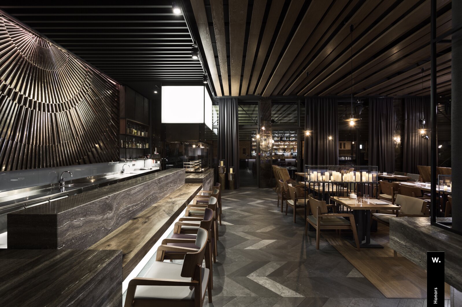
We sometimes go to boutiques and spend time with the actual products.
We look at what customers see.
We touch the materials.
We study how products are presented and how the brand communicates its value in person.
The digital experience is ultimately trying to translate part of that physical experience into a screen.
You cannot do that if you have never experienced the physical side yourself.
Detail Is Not Decoration
This is where product content becomes part of UX.
A luxury product may need:
large-format photography;
extreme close-ups;
high-resolution imagery;
video;
360-degree views;
3D interaction;
technical specifications;
material information;
sketches;
prototypes;
manufacturing details;
designer stories;
provenance;
craftsmanship;
supporting editorial content.
But none of these should be added simply because luxury websites are expected to have them.
The question is always:
What does this information help the customer understand?
A sketch can be more valuable than another polished product photograph.
Especially in a world increasingly filled with AI-generated imagery and highly automated production, seeing an imperfect human sketch can communicate something that a perfect render cannot.
It shows the origin of the idea.
It shows that someone imagined the object before it existed.
It gives the finished product a human beginning.
For a watch, showing the movement working may be more valuable than another photograph of the case.
For jewelry, showing the craftsmanship behind a setting may be more persuasive than another generic lifestyle photograph.
The content has to speak the language of the object.
The Product Should Be Given Time
This is why we often deliberately create more visual space around luxury products.
The product should not fight for attention with twenty other interface elements.
It needs room.
Room to be examined.
Room to be understood.
Room to become desirable.
A customer considering an expensive piece may zoom into a photograph repeatedly.
They may compare details.
They may watch a video several times.
They may read supporting material.
They may return days later.
That behavior is not necessarily a sign that the website is inefficient.
It can be the opposite.
It can mean the website is doing its job.
The mistake is to look at this behavior and conclude:
“We need to make the customer move faster.”
Sometimes the correct conclusion is:
“We should give them even more to discover.”
Content Is Part of the Conversion Architecture
This is why copywriting is not an afterthought in luxury e-commerce.
A product description cannot simply repeat:
Gold. Diamond. 18K. 2.4 carats.
Those are facts.
They may be necessary facts, but they do not necessarily explain value.
The same applies to storytelling.
Luxury does not mean filling every page with poetic language.
Sometimes the right story is historical.
Sometimes it is technical.
Sometimes it is about the designer.
Sometimes it is about the manufacturing process.
Sometimes it is almost entirely factual.
And sometimes a little irrationality, emotion or deliberate exaggeration is exactly what the product needs.
The important thing is authenticity.
A jewelry house should not speak like a watchmaker.
A watchmaker should not speak like a fashion retailer.
A performance car should not describe engineering like a furniture company.
The product has its own language.
The job of UX and content is to discover that language and make it understandable.
MEASURING
Qualifying the Right Customer Is Also Conversion
There is another reason price transparency depends on the business.
Imagine a $100,000 product appearing in search results.
Thousands of people may visit because they are curious.
If the product is actually intended for a very specific audience, filtering that audience out can be useful.
A website that gets fewer visitors but significantly more qualified visitors may be performing better.
This is another place where conventional analytics can mislead.
More traffic is not automatically better.
More sessions are not automatically better.
More checkout starts are not automatically better.
The right question is always:
Are we attracting and developing the right kind of consideration?
There Is No Universal KPI Either
This is where luxury e-commerce becomes particularly difficult to measure.
For a conventional online store, revenue, conversion rate, average order value and cart abandonment may tell a large part of the story.
For a high-luxury brand, the website may influence sales that happen through:
boutiques;
personal advisors;
phone calls;
private appointments;
returning customers;
offline relationships;
sales managers;
long consideration cycles.
That does not make measurement impossible.
It means measurement has to be designed around the actual sales model.
We look at behavioral signals such as engagement sessions, returning users, product views, scroll depth and content interaction alongside commercial outcomes.
But we do not pretend there is one magic luxury KPI.
There isn’t.
The correct measurement framework is specific to the product, customer, market and relationship between digital and physical sales.
MEASURING TECHNICAL
How We Measure a Luxury E-commerce Journey
This is usually the point where a marketing or technical lead asks a fair question: okay, but what do you actually track? Because none of the above means measurement disappears, it means the measurement model has to match a journey that doesn't end at checkout.
In practice this usually means building the event architecture around engagement depth rather than transactions alone: product views, scroll depth, video completion, return visits and content consumption feed into GA4 (or an equivalent), tagged so that returning to the same product a third time is a trackable signal, not an invisible one. Where the sales process crosses into appointments, private consultations or boutique visits, that handoff gets tracked too, an appointment request or inquiry form feeds into a CRM, and from there, wherever the client's process allows it, we try to close the loop back to an eventual offline sale.
That closing step, connecting a digital engagement pattern to a real-world purchase, is usually the hardest part of the whole setup, and it's rarely fully automatic. But even a partial version of that loop tells you more than session duration ever will.
PRINCIPLE
The Principle Behind All of It
After working across luxury jewelry, eyewear, interiors, automobiles and other high-value categories, one principle continues to hold:
The more valuable the object is, the more carefully the digital experience has to explain why it deserves the customer’s attention.
Not by shouting.
Not by creating artificial urgency.
Not by hiding behind generic luxury aesthetics.
By allowing the customer to examine the product, understand its origin, discover the people behind it and decide whether the object deserves a place in their world.
That is not a slower version of conventional e-commerce.
It is a different form of conversion architecture.
NICO JULIANY
The Website Is Not the Boutique
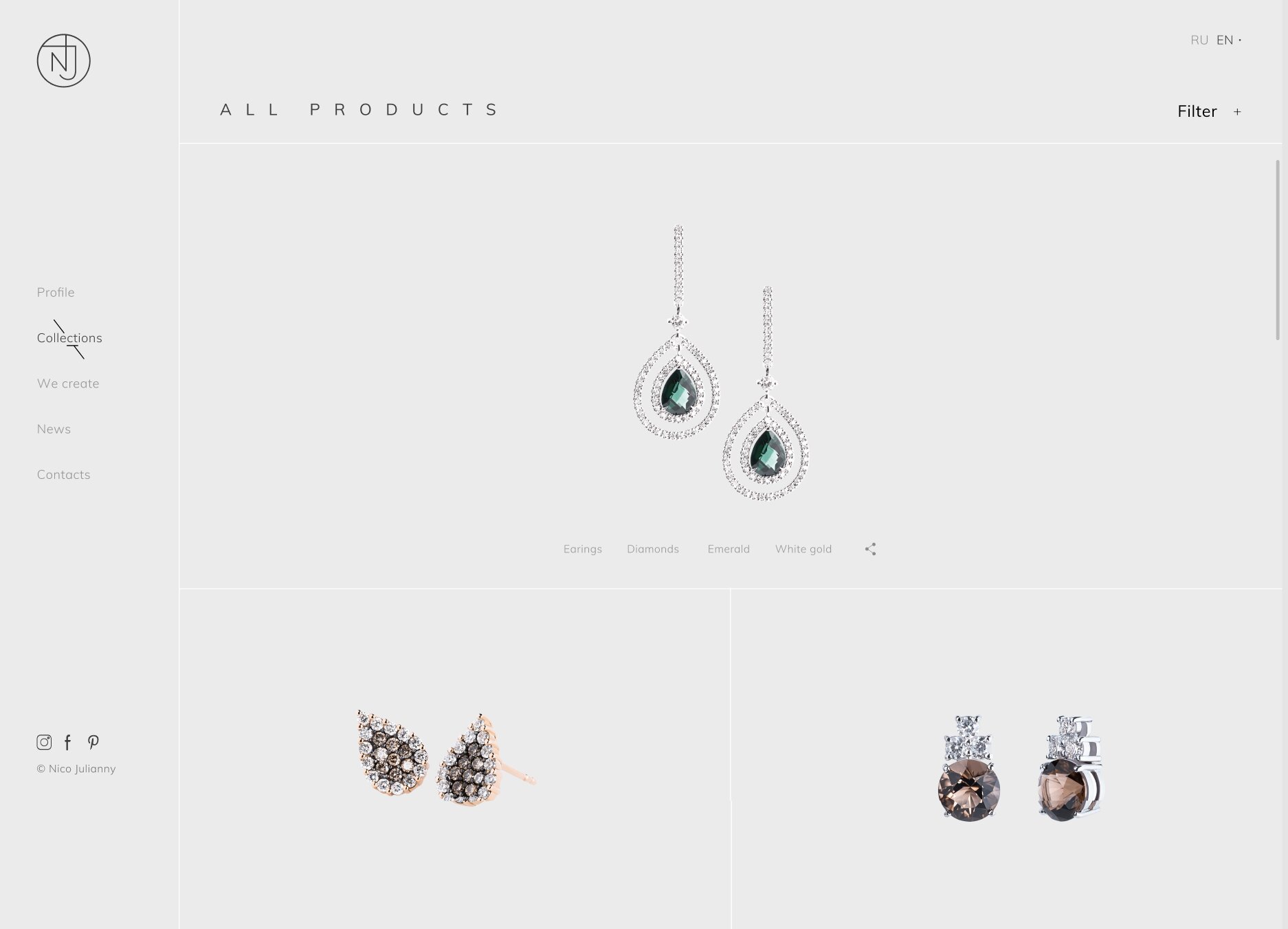
One of the first things we establish when working on a luxury e-commerce project is what the website is actually supposed to do.
If the brand sells exceptional jewelry through boutiques, the website does not necessarily need to become a digital cash register.
Its job may be to create enough desire, confidence and understanding for someone to make the next step:
“I want to see this in person.”
That changes almost everything.
The website becomes the first part of the boutique experience.
The customer may discover a piece online, spend several minutes examining it, return to it later, read about the designer, watch the manufacturing process and then eventually make an appointment.
The purchase may happen somewhere else.
The digital experience still contributed to the conversion.
Nico Juliany: Designing for Desire
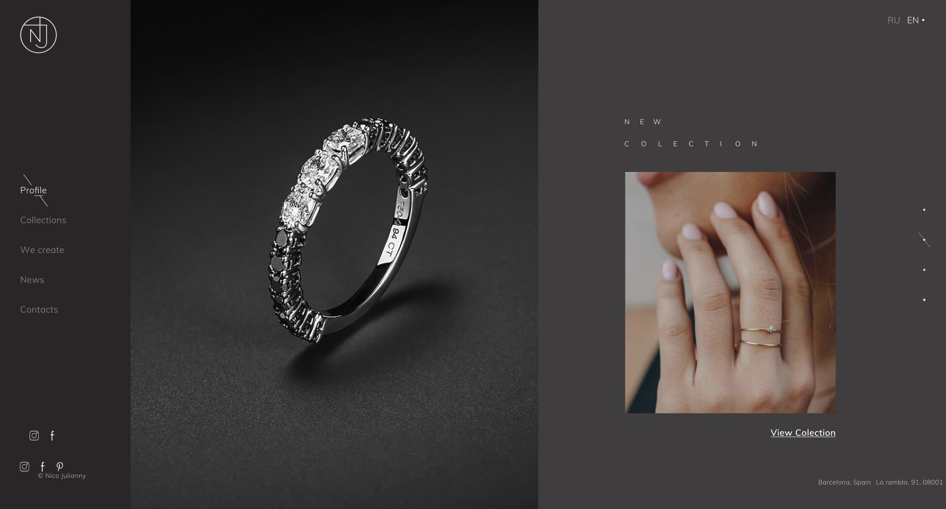
This was one of the principles behind our work with Nico Juliany, a Spanish jewelry house.
The project was never intended to behave like a conventional e-commerce store.
The brand already had recognition, and expensive jewelry was primarily experienced and purchased through boutiques and retail locations.
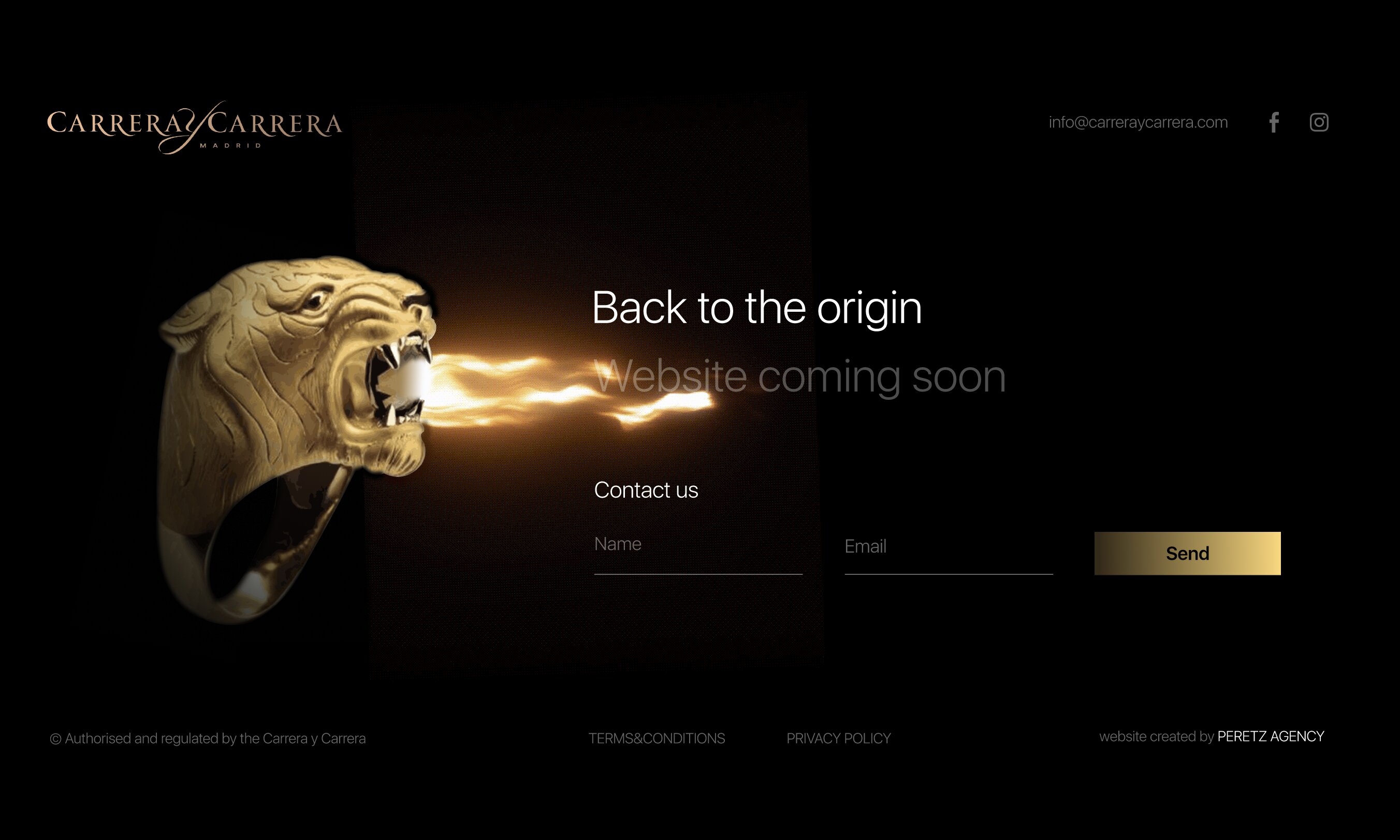
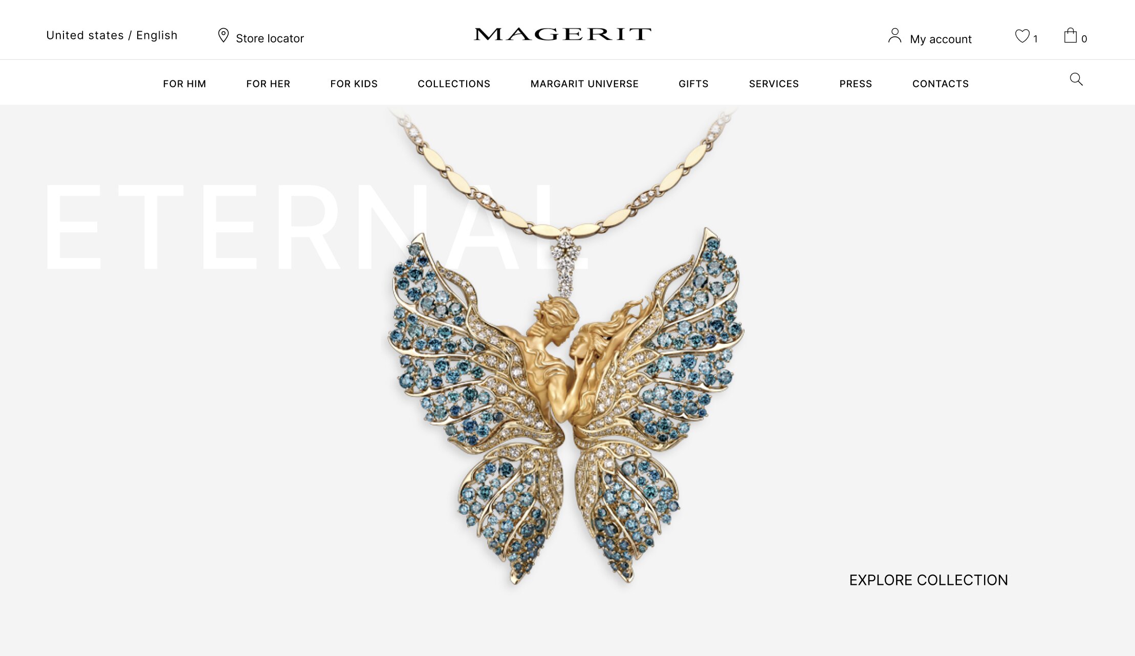
We've seen the same pattern with Magerit, another jewelry house where the website's job was never to close the sale alone, and with Nicole, a multi-brand luxury boutique that carried Rolex, Hublot, and Carrera y Carrera, where the same principle applied to watches as much as jewelry.
So the website did not need to convince someone to buy a necklace in thirty seconds.
It needed to make them want to see it.
The experience began with atmosphere: video, Dubai, private aviation, a woman wearing the jewelry.
This was not an attempt to sell a fantasy lifestyle through generic luxury imagery.
The idea was much more personal:
Stop. Look at this. Can you imagine yourself in it?
That distinction matters.
When someone sees an extraordinary piece of jewelry presented on a person, they do not only evaluate the jewelry.
They begin to imagine themselves wearing it.
The object becomes personal before it becomes transactional.
Give the Object Enough Space
The interface was deliberately minimal, but the product itself was allowed to become large.
Images could be examined in significant detail.
The customer could spend time looking at the construction, proportions and craftsmanship.
That might appear inefficient from the perspective of conventional e-commerce.
Large assets.
High-resolution photography.
Video.
Longer sessions.
More exploration.
But if the customer is considering an object worth tens or hundreds of thousands of dollars, those things are not necessarily performance problems.
They are part of the product experience.
If someone has worked for years to accumulate enough resources to buy something exceptional, why would we assume that they want the website to hurry them?
They may want to look.
They may want to examine every detail.
They may want to understand why it costs what it costs.
They may want to return tomorrow and look again.
The website should respect that time.
HUMAN ORIGIN
The Human Origin of an Exceptional Object
There is a particularly interesting role for sketches and imperfect design artifacts.
We live in an era in which almost anything can be rendered perfectly.
AI can produce an immaculate image in seconds.
Manufacturing can be extraordinarily precise.
Digital interfaces can be flawless.
And precisely because of this, evidence of human imperfection can become incredibly valuable.
A sketch does not need to be beautiful.
It needs to show that someone thought about the object before it existed.
A line that is slightly uneven can communicate something that a perfect render cannot:
there was a human idea here first.
That origin matters.
When someone falls in love with a watch, they may eventually fall in love with the manufacture that created it.
When someone discovers a jewelry house through one particular necklace, they may begin following the brand even when that necklace is no longer available.
The immediate product may disappear.
The relationship with the maker does not have to.
That is one of the reasons luxury e-commerce should build brands, not just transactions.
From Product to Brand
This is particularly important for limited editions.
Imagine a customer discovers a watch they love.
It is sold out.
A conventional e-commerce system might consider the journey finished.
A luxury experience can treat it completely differently.
Show the story.
Show the movement.
Show the manufacture.
Show the designer.
Show related pieces.
Show the next collection.
Let the customer understand why this brand creates things worth following.
The objective is no longer:
“Sell this particular product.”
It becomes:
“Make this person want to remain in the world this brand has created.”
That person may eventually find another product that is right for them.
SPEX
SPEX: Luxury Eyewear Is Not Just a Product Grid
We applied a related principle when developing the UX/UI concept for SPEX, a Ukrainian retailer of luxury eyewear and premium international frames.
Eyewear sits in an interesting space between product and fashion object.
A conventional optical store can be organized around categories, filters and specifications.
That structure is useful.
But luxury eyewear also has character.
The frame is part of someone’s appearance, identity and personal style.
So the experience we designed was intentionally more visual and editorial than a conventional optical catalog.
The goal was not simply:
Find a frame → compare specifications → buy.
It was:
Discover a frame → understand its character → imagine yourself wearing it → explore the brand → decide whether it belongs to you.
The project remained a UX/UI concept in Figma and was never developed, but the principle behind it remains relevant:
luxury products need to be experienced before they are evaluated as transactions.
BOUTIQUE FUNNEL
The Boutique Is Part of the Conversion Funnel
This is why we often think about luxury e-commerce as a bridge rather than a destination.
The website creates the first relationship.
The customer explores.
The product becomes familiar.
The brand becomes credible.
Desire develops.
Then the website can guide the customer toward the physical experience:
Find the boutique.
Request an appointment.
Speak with an advisor.
See the piece in person.
And this is not a failure of digital commerce.
It is the completion of digital commerce.
For the most exclusive products, the moment when the customer finally touches the object may be one of the most important conversion events in the entire journey.
The website has spent days or weeks preparing for that moment.
COPY VS ORIGINAL
The Difference Between a Copy and an Original
There is another reason physical experience matters.
A sophisticated copy can reproduce an enormous amount of visual information.
It can imitate proportions.
It can reproduce colors.
It can photograph well.
It can even feel convincing online.
But when you hold the original, you begin to understand something that a copy cannot reproduce so easily:
why it was made this way.
The original carries decisions.
Why this material?
Why this mechanism?
Why this proportion?
Why this particular detail?
Why did the designer spend so much time solving this apparently insignificant problem?
A copy can reproduce the result without necessarily understanding the reasoning that produced it.
That is part of what people are paying for in exceptional products.
And it is something a good digital experience should begin to reveal.
The Website Should Lead to the Moment of Recognition
Ultimately, the goal of luxury e-commerce is not to make the customer think:
“This website made it very easy to buy.”
It is to make them arrive at the physical product and think:
“Now I understand.”
They see it.
They touch it.
They examine the detail.
They understand the craftsmanship.
They recognize the decisions behind it.
And suddenly the price is no longer just a number attached to an object.
It becomes part of a much larger story.
That is the moment digital cannot create by itself.
But it can create the conditions for it.
The best luxury e-commerce does not replace the boutique. It makes the customer want to go there.
SCHOEFFEL
From One Hundred Years to the Next One Hundred
This is where the role of e-commerce becomes much bigger than presenting products.
A good luxury website reveals enough of the thinking behind the object for the customer to understand why it exists.
Sometimes that means technical information.
Sometimes it means history.
Sometimes it means sketches.
Sometimes it means showing the manufacturing process.
Sometimes it means explaining the designer’s obsession with a tiny detail.
Sometimes it means simply allowing the object to occupy the screen without competing with anything else.
There is no universal formula.
But there is a universal question:
What can we show that helps the customer understand the value that cannot be seen at first glance?
That question should influence UX, UI, content, photography, video, product architecture and even the decision of whether a price should appear on the page.
From One Hundred Years to the Next One Hundred
This becomes particularly important when working with a heritage brand.
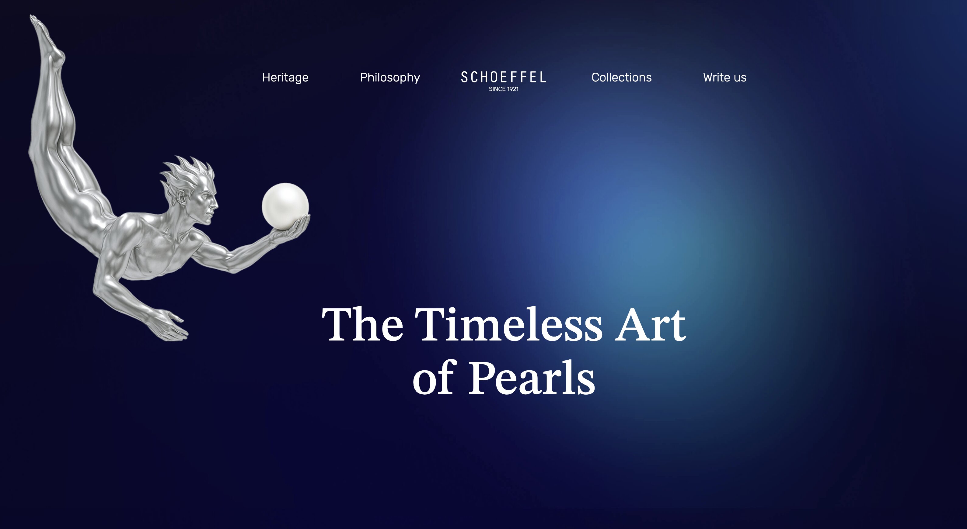
Schoeffel, a jewelry house with more than a century of history, is a good example of the scale of this challenge. We wrote more about starting that engagement in Building the Next Century.
When you work with a brand carrying a history of more than a century, the task is not to make the company look “modern” simply for the sake of being modern.
The challenge is much harder:
How do you carry what made the brand valuable into the next generation?
Digital becomes part of that continuity.
The objective is not to replace heritage with technology.
It is to give heritage a new medium through which it can continue to exist.
A century ago, there was no digital experience.
There were craftsmen, designers, materials, boutiques, printed catalogs and personal relationships.
Today there are screens, video, 3D, high-resolution imagery, analytics, interactive experiences and global distribution.
The tools have changed.
The fundamental exchange has not.
Someone creates something they believe is worth making.
Someone else recognizes its value.
And that recognition gives the creator the ability to keep creating.
Our job is to make that exchange possible in a digital environment.
The Work Never Really Stops
This is also why serious luxury e-commerce cannot be treated as a project that ends when the Figma file is approved.
The market continues moving.
Competitors release new experiences.
Brands launch new collections.
Customers change.
Technology changes.
A new interaction appears.
A new way of presenting a product becomes possible.
Sometimes we discover something during development that changes a decision we made months earlier.
So we research again.
We test the hypothesis.
We ask why it works.
We determine whether it belongs to this particular brand.
Then we either adapt it, improve it or reject it.
This is not copying.
It is continuous design research.
And it is one of the reasons luxury e-commerce should be treated as an evolving business system rather than a static website.
WHAT WE OPTIMIZE
What We Actually Optimize
After working across luxury jewelry, eyewear, interiors, automobiles and other high-value categories, our approach can be reduced to a few principles.
01, Optimize for desire before transaction
The customer needs a reason to want the object before the interface asks them to buy it.
02, Remove bad friction, preserve valuable consideration
Make navigation, search, checkout and communication effortless.
Do not remove the time someone needs to understand an exceptional product.
03, Give the product space
Photography, video, 3D, sketches, technical details and storytelling are not decoration when they help communicate value.
04, Design around the actual sales model
If the sale happens in a boutique, the website should not pretend otherwise.
Digital and physical commerce should reinforce each other.
05, Measure the journey, not just the transaction
Returning users, product engagement, content consumption, appointments, inquiries and offline sales can all be part of the commercial picture.
The exact measurement model depends on the business.
There is no universal luxury KPI.
06, Never copy a competitor without understanding why
A new interaction is only valuable when its underlying logic makes sense for the brand, product and customer.
07, Sell what the product makes possible
The object is important.
But the meaning behind the object is what creates its value.
REAL MEANING
The Real Meaning of Luxury Conversion
This brings us back to the original question.
Does luxury e-commerce really break the rules of conversion optimization?
Not exactly.
It exposes the limitations of applying the same rules to every product.
A $200 product may need to get the customer to checkout quickly.
A $5,000 product may need a more sophisticated e-commerce experience.
A $20,000 piece may require substantially more consideration.
A $100,000 piece may lead to a private appointment rather than a checkout.
A $200,000 piece may never be purchased through the website at all.
And yet the website can still be one of the most important parts of the sale.
Because the website can create the moment before the decision.
It can make the customer stop.
Look.
Examine.
Return.
Learn.
Imagine.
Desire.
And eventually walk into the boutique already understanding what they are about to hold.
That is conversion too.
Perhaps a more meaningful kind of conversion.
The Website Should Earn the Right to Sell
The best luxury e-commerce does not constantly ask the customer to buy.
It earns the right to ask.
By respecting their time.
By respecting their intelligence.
By showing the product honestly.
By explaining the work behind it.
By revealing the people who created it.
By giving the object enough space to become desirable.
And by understanding that the customer is not simply looking for another product.
They are deciding whether this particular creation deserves their money, their attention and, ultimately, their respect.
That is why we do not approach luxury e-commerce as a collection of conversion tricks.
We approach it as a system for transferring value.
From the maker to the customer.
From the physical object to the digital experience.
From the website to the boutique.
And, ultimately, from one generation of the brand to the next.
Because the most valuable transaction in luxury is not simply the moment when money changes hands.
It is the moment when someone looks at something another person created and says:
My respect. This was worth making.
And then chooses to become part of its story.
IRRATIONALITY
Sometimes Irrationality Is the Best Rational Strategy
There is one more thing we have learned from working with luxury brands.
Not everything that works needs to be rational.
Sometimes the opposite is true.
A small irrational detail can become the most rational decision a luxury brand makes.
It can be a strange sentence in a product description.
An unexpected visual.
A sketch that has no practical reason to be there.
A moment in an animation.
A slightly excessive piece of photography.
A detail in the interface that makes someone stop for half a second longer than they expected.
It may not improve a conventional conversion metric.
It may not make the checkout faster.
It may not even be immediately explainable in an A/B test.
But it can create something much harder to measure:
recognition.
That small spark can become a bridge between the person and the product.
And this is particularly important in luxury because luxury is not entirely rational in the first place.
Nobody needs a $200,000 necklace.
Nobody needs a mechanical watch that takes hundreds of hours to manufacture.
Nobody needs bedding that costs many times more than a technically functional alternative.
People buy these things because something beyond utility matters to them.
The digital experience should not be afraid to acknowledge that.
In fact, sometimes the most rational thing a luxury brand can do is leave a little room for the irrational.
Because the customer may not remember the perfectly optimized CTA.
They may not remember the conversion funnel.
They may not even remember the product specification.
But they may remember that one strange, beautiful, unnecessary detail that made them stop and feel something.
And sometimes that is the bridge that takes them from looking at a product to wanting to become part of its story.
We looked at what a genuinely different e-commerce architecture can look like in What Happens to E-Commerce When a Website Stops Being a Website?
We go deeper into our actual design process, from objects to experience, in How We Design E-Commerce: From Objects to Experience.
Author: Yevhen Borovoi, Founder at Peretz Agency.
For a closer look at how this plays out for family-owned jewelry businesses specifically, see Why Family-Owned Jewelry Stores Outgrow Their E-commerce Platform.
We explored this idea further, through the Schoeffel and Carrera y Carrera partnerships, in When a Brand Disappears, Is It Really Dead?.
We looked at the research behind why visual design shapes trust and perceived value more broadly in How Website Design Affects Perceived Brand Value.
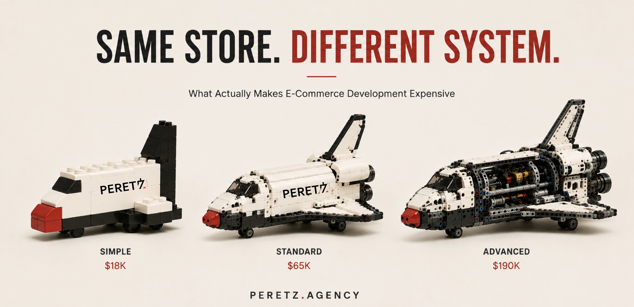
We broke down what that architecture actually costs to build in What Actually Makes E-Commerce Development Expensive.
Building or rethinking a digital experience for a high-value product? A Strategic Session is where we start mapping what your customer actually needs to understand before they're ready to buy.
See the fuller architecture thesis, with real cases, in the software should fit the business.
- Share
-

-

-

-

Related Reading
-
08. 08. 2026
Building the Next Century: PERETZ Begins the Digital Transformation of Schoeffel

-
13. 08. 2026
What Happens to E-Commerce When a Website Stops Being a Website?
-
14. 08. 2026
How We Design E-Commerce: From Objects to Experience
-
16. 08. 2026
Why Family-Owned Jewelry Stores Outgrow Their E-commerce Platform
-
20. 08. 2026
When a Brand Disappears, Is It Really Dead?
-
27. 08. 2026
How Website Design Affects Perceived Brand Value
-
28. 08. 2026
What Actually Makes E-Commerce Development Expensive
-
21. 09. 2026
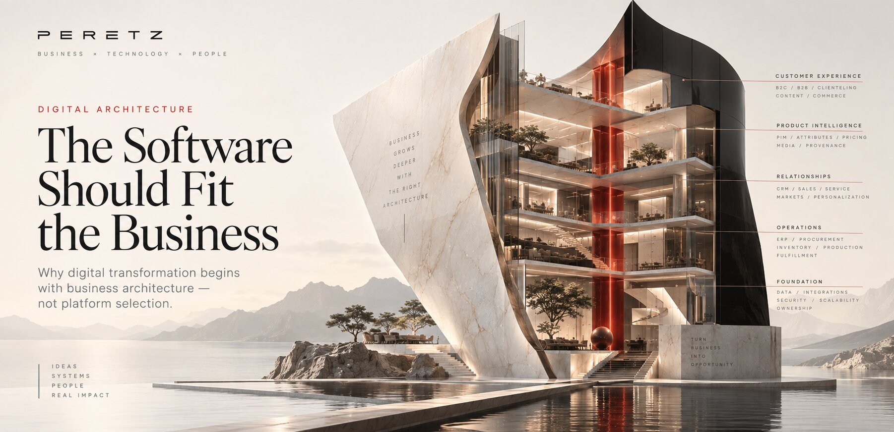
The Software Should Fit the Business
-
27. 09. 2026
Design You Don't Notice: Why the Best Design Disappears