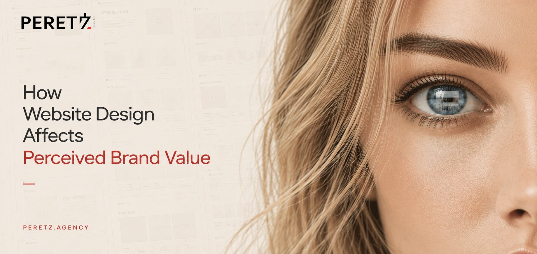
A visitor forms an opinion about a website before they have read a single word on it.
Not a vague impression built over several seconds of browsing. An actual judgment can begin forming in less time than it takes to blink.
In 2006, researchers at Carleton University tested exactly how quickly this happens. Their findings helped put numbers behind something designers had long observed: visual design does not simply make a website more attractive. It influences whether the brand behind it feels credible, competent and worth paying attention to.
The important distinction is that this judgment happens before the visitor has enough information to make a rational assessment.
That changes what a website's design is actually responsible for.
It is not decoration applied after the strategy, positioning and content have been figured out. It is the first signal through which all of those things are encountered.
The Judgment Forms in Milliseconds
The Judgment Forms in Milliseconds
In 2006, a team led by Gitte Lindgaard at Carleton University showed participants website homepages for 500 milliseconds and asked them to rate their visual appeal.
The researchers then repeated the experiment, flashing the same pages for just 50 milliseconds, one twentieth of a second.
The ratings from the 50-millisecond exposure correlated closely with those from the longer exposure.
The implication was striking. People did not need time to consciously inspect a page before forming a visual opinion of it. The first impression was already taking shape almost immediately.
By the time a visitor has consciously registered the headline, the visual system has already started answering a more basic question:
Does this look like a company I should take seriously?
That question matters because everything that follows depends on the answer.
A visitor who finds a website visually credible is more likely to continue, read, explore and give the information on the page a chance to work.
A visitor who has already classified it as amateur, outdated or unreliable may never discover how good the underlying business actually is.
Credibility Is Judged Visually
Credibility Is Judged Visually
Stanford's Persuasive Technology Lab spent years studying what makes people trust websites. In research involving more than 4,500 participants, 46.1% of respondents said that the visual appeal of a site, including its layout, typography, fonts and color, influenced their assessment of credibility.
That finding is important because people were not necessarily judging the actual quality of the business at that moment.
They were judging the signal around it.
This is closely related to the psychological phenomenon known as the halo effect: one positive impression can influence how we interpret everything else about an object or person.
A polished website can therefore create an initial presumption of competence. A poorly considered one can do the opposite.
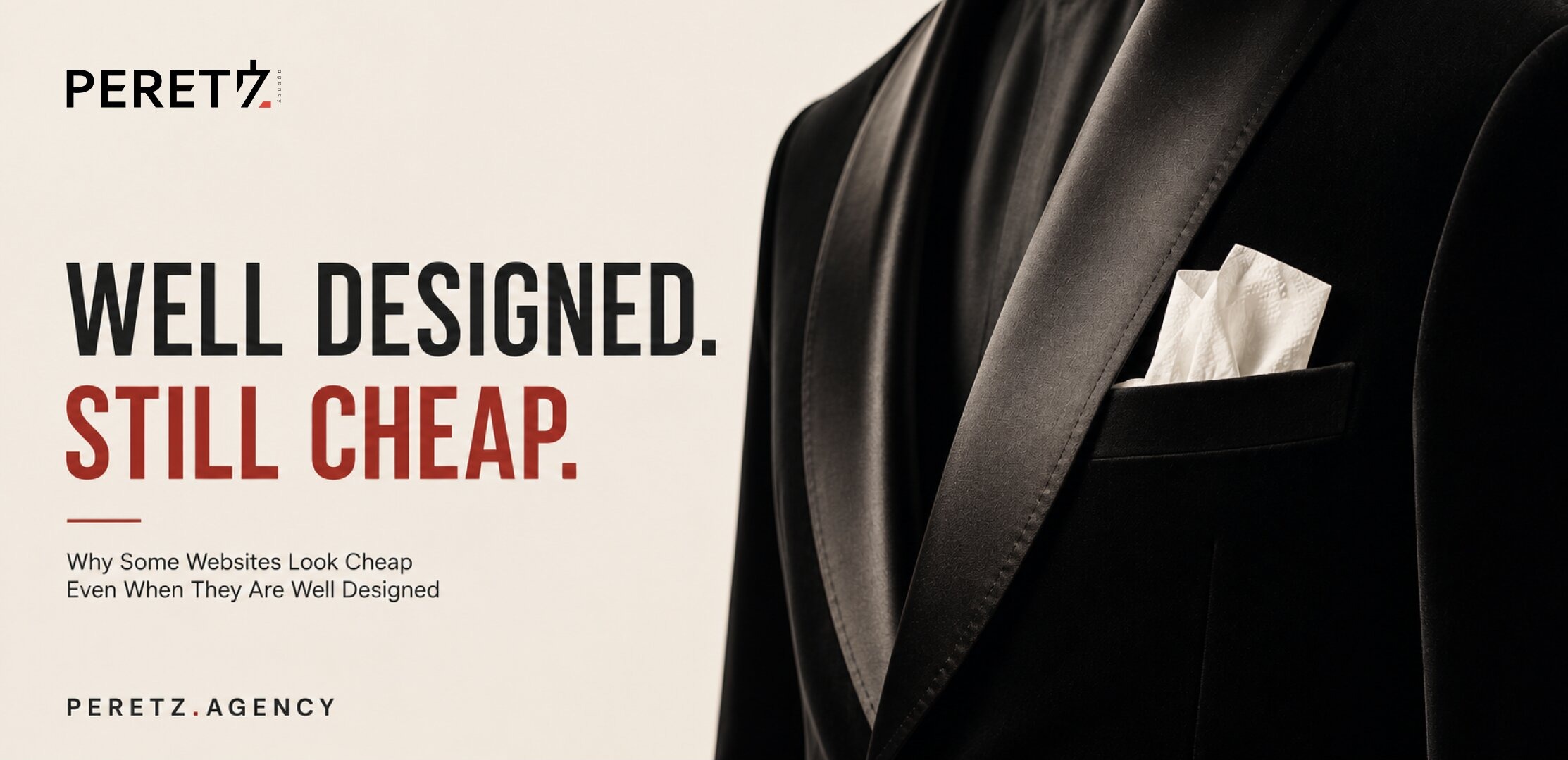
Design is not competing with content for credibility.
Design often determines whether the content gets the opportunity to establish credibility in the first place.
This is one reason we do not see a website as a visual layer placed on top of a business after the strategy is finished. The interface is part of the mechanism through which that strategy is perceived.
Attractive Can Feel More Usable
Attractive Can Feel More Usable
There is another interesting effect.
In a 1995 study at Hitachi's Design Center, Masaaki Kurosu and Kaori Kashimura created 26 versions of an ATM interface and asked participants to rate both their attractiveness and their perceived ease of use.
The two perceptions were closely related.
More attractive interfaces were often perceived as easier to use, even when their actual usability did not necessarily justify that judgment.
This became known as the aesthetic-usability effect.
The effect is commercially relevant because perception does not stop at appearance.
When something looks considered, people tend to give it more patience. Minor friction can be forgiven. An unusual interaction may be explored rather than immediately rejected.
The opposite is also true. A dated or visually careless interface can lose the benefit of the doubt before its actual functionality has had a chance to prove itself.
Beauty does not simply decorate an experience.
It changes how people interpret the experience.
Design Correlates With Revenue
Design Correlates With Revenue
All of this would be interesting but limited if it remained inside psychology laboratories.
It does not.
McKinsey studied the design practices of 300 publicly listed companies across medical technology, consumer goods and retail banking over a five-year period. The research incorporated more than two million pieces of financial data and more than 100,000 individual design actions.
The strongest-performing companies shared several practices: they measured design with the same seriousness as other business functions, connected physical, digital and service design, made user-centric thinking broader than a single department, and continuously tested with real users.
Companies in the top quartile of McKinsey's Design Index achieved substantially stronger revenue growth and total shareholder returns than their industry peers over the period studied.
The important point is not that a new typeface produces revenue.
It is that design maturity appears alongside stronger business performance when design is treated as part of the business rather than as decoration around it.
That distinction is easy to miss.
The value is not in making something beautiful for its own sake. It is in designing the entire experience with the same level of intent applied to the business itself. The broader business case for UX, from ROI estimates to the real cost of avoidable rework, is laid out in UX/UI Design in 2026: Why It Still Pays Off for Your Business.
Why B2B Feels It More
Why B2B Feels It More
It is tempting to assume that visual perception matters mostly to consumer brands.
B2B buyers, after all, are supposed to be rational. They compare specifications, capabilities, pricing, case studies and credentials.
But the buying process is changing.
Gartner's 2026 research found that 67% of surveyed B2B buyers preferred a sales-representative-free buying experience, while 70% preferred a completely digital, self-service path through the purchase process.
That removes one of the things that historically helped compensate for a mediocre website: the salesperson.
A person in the room can explain context, answer objections and create confidence. A website cannot do that conversationally.
When buyers conduct their own research, the website becomes part of the sales conversation before the sales team ever enters it.
For a capable B2B company with a dated or inconsistent digital presence, the problem may therefore be larger than looking less professional. Architecture studios are a clear example: what the website decides for them is covered in Website Design for Architecture Firms.
The company may never make the shortlist.
No Universal Pattern
No Universal Pattern
There is a temptation, once we understand how people visually scan a page, to turn that knowledge into a formula.
This is where things become more interesting.
You may have heard of the F-pattern or Z-pattern, common ways of describing how people scan certain types of web layouts. They are useful observations, particularly when thinking about hierarchy and information density.
But they are not laws of human behavior.
People do not arrive at every website with the same goal, motivation or level of attention. Someone looking for a bank's mortgage rate is behaving differently from someone exploring an architecture studio. Someone comparing software vendors is in a different cognitive mode from someone discovering a luxury jewelry brand.
The content itself changes the way the page is read.
The industry changes the expectations.
The user's motivation changes the pattern.
And the design changes what deserves attention in the first place.
So F and Z are useful tools for thinking about hierarchy. They are not instructions to make every website look like a letter.
The pattern is not the strategy.
The strategy begins with understanding why the person is there.
Luxury Breaks the Rules
Luxury Breaks the Rules
Luxury makes this distinction especially clear.
Many conventional UX principles are designed around reducing friction, accelerating comprehension and making the next action obvious.
Luxury often has different priorities.
It may deliberately slow the visitor down. It may leave more unexplained. It may use large amounts of empty space, unconventional navigation, restrained information and imagery that communicates before the copy does.
The visitor is not always being asked to find something as efficiently as possible.
Sometimes they are being asked to feel something first.
That makes luxury design both a science and an art.
We can study attention, perception, hierarchy and behavior. We can test interfaces and observe where people look and what they do.
But there is no universal formula that tells us exactly how desire, status, exclusivity, cultural meaning and aspiration should be translated into a digital experience.
In luxury, breaking an established UX convention can sometimes be the more correct decision.
This is where design stops being a collection of rules and becomes judgment.
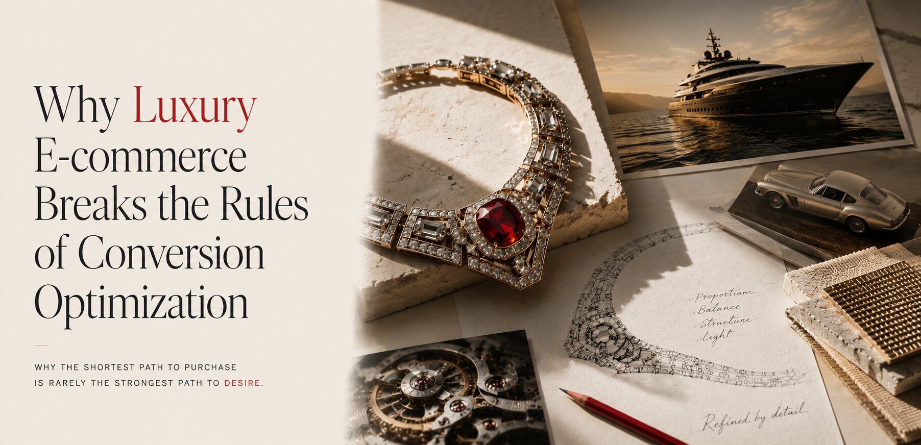
We wrote more about how luxury e-commerce breaks conventional UX assumptions in Why Luxury E-commerce Breaks Every Rule of Conversion Optimization.
Sometimes: Do Not Redesign
Sometimes: Do Not Redesign
There is another trap in learning all these principles: assuming that every successful website eventually needs to be redesigned.
We have a project that argues otherwise.
SV Group has been running on the website we originally built for them for almost seven years. We wrote about that project in full in The Story Behind SV Group, and you can see the site itself in our portfolio.
By today's standards, we could certainly find reasons to change it. Technology has moved forward. Visual trends have changed. Design systems have evolved.
But redesigning a website simply because it is old is not a strategy.
The more important question is whether the existing experience is still doing its job.
In this case, the answer has been yes.
The site has become part of the way the company presents itself. It communicates the business to the people it needs to reach, and it continues to perform that role without requiring a redesign for the sake of keeping up with fashion.
That is an important counterpoint to everything discussed above.
Good design does not mean following every current convention.
Sometimes good design means knowing what not to change.
Where Perceived Value Lives
Where Perceived Value Lives
Put these findings together and a more useful picture emerges.
A visitor forms an almost immediate visual judgment. That judgment influences credibility. Credibility affects whether the visitor gives the business enough attention to understand its offer. The quality and consistency of subsequent interactions either reinforce that first judgment or contradict it.
But there is no single visual trick responsible for the result.
Typography matters. Hierarchy matters. Spacing matters. Photography matters. Performance matters. Interaction matters.
More importantly, the relationship between them matters.
A premium typeface cannot rescue a confusing proposition. Perfect spacing cannot compensate for weak positioning. A beautiful homepage cannot make an incoherent business suddenly coherent.
The perceived value of a brand is created by the consistency of the signals it sends.
And those signals extend far beyond the homepage.
This is why we approach digital projects as business problems rather than isolated design exercises. The website is one visible part of a larger structure: positioning, content, technology, identity, interaction and the expectations created before a customer ever speaks to the company.
Design Is Not One-Time
Design Is Not One-Time
A final implication follows from all of this.
Perceived value is not established once at launch and then stored permanently.
Every new visitor evaluates the company against the visual standards available to them today.
That does not mean every company needs a redesign every few years. SV Group is a useful reminder of that.
It means the standard itself needs to be intentional.
Sometimes the right answer is a complete redesign. Sometimes it is a refinement of the existing system. Sometimes it is leaving a successful experience alone.
The job is not to follow the newest pattern.
It is to understand what the business needs the design to communicate, and then make sure every visible part of the experience supports that message.
Your website is already making a judgment about your business.
The question is whether it is making the judgment you intended.
If you are not sure, a Strategic Session is a useful place to start. We can look at the website not simply as a design, but as a signal of the business behind it.
Explore our Website Design services.
The philosophy behind all of this, why the best design is the design you stop noticing, is in Design You Don't Notice.
- Share
-

-

-

-