

There is a specific kind of frustrating feedback a designer gets after presenting work that is, by almost every technical measure, good.
The layout is balanced. The grid is consistent. The typography is competent. The colors work together. Nothing is broken.
And the client says:
"It looks a little cheap."
Usually, they cannot explain why.
Sometimes the designer cannot either, because there is nothing obviously wrong with the design.
The gap between well designed and expensive-looking is real.
And it is not simply a matter of taste.
People form expectations about quality and price from visual cues before they have enough information to judge the actual business. When quality is difficult to evaluate, which is particularly common online, aesthetics become one of the signals people use to fill that gap.
That creates an interesting problem.
A visitor can arrive at a website, form an expectation about the business within seconds, and then interpret everything that follows through that expectation.
The service may be excellent.
The price may be justified.
The case studies may be impressive.
But if the website has already suggested a lower price bracket, the business now has to spend part of the sales process overcoming an impression it created unintentionally.
So what actually makes a website look expensive?
The answer is less about decoration than most people expect.
Cheap Rarely Means Ugly
Cheap Rarely Means Ugly
The most common reason a competent design looks inexpensive is surprisingly simple: too many decisions were never actually made.
A system font was left because it was "good enough."
Framework spacing became the spacing system.
Standard button radii remained because nobody had a reason to change them.
A color palette came from a generator.
None of these choices is necessarily wrong.
That is precisely why the problem is difficult to see.
Each individual decision is defensible. Together, they communicate something else: nobody appears to have decided what this brand should look like.
Visitors do not consciously identify a framework's spacing scale or recognize a default border radius.
They register the cumulative absence of intent.
Defaults accumulate for understandable reasons. A framework provides sensible values. A deadline arrives. A component works. Changing it feels like unnecessary fussing.
But eventually a page can become something nobody actually authored.
This is why we often find that the difference between an ordinary-looking website and an expensive-looking one is not the number of design decisions.
It is the quality, relevance and consistency of those decisions.
Cheap rarely means ugly. It usually means undecided.
Typography Carries Weight
Typography Carries Weight
Typography does more signaling work than most people realize.
Weight. Scale. Spacing. Line length. Hierarchy. The relationship between the type and everything around it.
Premium positioning often relies on restraint and deliberate typographic choices. But the typeface itself is rarely the entire answer.
Text that feels compressed can feel rushed.
Text with room to breathe can feel considered.
The same typeface can communicate very different things depending on how it is used.
There is another common failure: choosing a typeface that is good in isolation but wrong for the category.
A font optimized for interface legibility may be excellent for software and completely wrong for a heritage jewelry brand.
Neither font is bad.
The signal is mismatched.
This is why changing a font is so often an ineffective solution to a perception problem.
The typeface was not necessarily the problem.
The decisions around it were.
Photography Is the Tell
Photography Is the Tell
Photography is where the difference between well designed and expensive-looking often becomes most obvious.
A beautifully structured website filled with generic stock photography can feel cheaper than a much simpler website filled with specific, real images.
The visitor is not necessarily evaluating production quality.
They are asking something much simpler:
Does this image belong to this business?
Or could it appear on a competitor's website tomorrow?
Generic imagery can make the visual layer feel assembled rather than authored. Specific imagery gives the visitor evidence that there is something real behind the interface.
We have seen this on a manufacturing website.
The initial design was strong. The structure worked. The visual system gave the company a significantly better digital presence.
But something was missing.
The content was not ready.
Some sections still relied on placeholders or material that did not communicate the depth of the actual business.
Once those placeholders were replaced with properly prepared content, real photography and specific information, the perception of the same design changed substantially.
Nothing fundamental had changed in the interface. The evidence had changed.
This is why we are careful with the idea that a website can simply be made "more premium" through visual treatment.
Sometimes the design is already doing its job.
The business simply has not given it enough substance to communicate. Architecture firms feel this more sharply than most, see Website Design for Architecture Firms: What Actually Works.
Not One Picture
Not One Picture
This is another distinction that gets lost surprisingly often.
People look at a website as a picture.
A homepage appears on a screen, and we judge the composition as a whole: is it clean, modern, balanced, attractive?
But a website is not a poster.
A large hero image and a small amount of copy can work beautifully when the visitor primarily needs an emotional signal.
The same approach can fail completely when the visitor needs technical evidence, specifications, comparisons, credentials or context before making a decision.
A manufacturing company, a jewelry house, a SaaS platform and an architecture studio can all have exceptional websites.
They should not necessarily look or behave the same way.
This is where the idea of minimalism is frequently misunderstood.
Minimalism is not the absence of information. It is the absence of unnecessary information.
The question is never simply:
Can we make this section smaller?
It is:
What is this section supposed to solve?
If the answer is "nothing important," remove it.
If it helps someone make a decision, reducing it simply because a screenshot looks cleaner may be a mistake.
Whitespace Is a Decision
Whitespace Is a Decision
Whitespace is often treated as a visual style.
We think that misses the point.
Space exists because something was deliberately left out.
A page that tries to communicate everything can suggest that the business cannot afford to leave anything unsaid.
A page with room around its strongest ideas can suggest confidence in what deserves attention.
But whitespace is not automatically premium.
A sparse website with no substance does not look luxurious.
It looks empty.
The space works when the business has something strong enough to deserve it.
This is why the most convincing minimalism usually comes from positioning rather than from design software.
Someone first decides what matters.
Then the designer creates enough space for it to matter.
Restraint is valuable when it is the result of selection, not when it is applied as a style.
Copy Can Undermine Design
Copy Can Undermine Design
A well-designed page filled with generic copy still feels generic.
"Innovative solutions."
"Cutting-edge technology."
"Customer-focused approach."
These phrases may be technically true.
They are also almost impossible to own.
Specificity works differently.
A company that can explain exactly what it does, who it does it for and why its approach is different gives the visitor something concrete to evaluate.
Generic claims ask the visitor to believe.
Specific claims give them something to believe in.
There is a simple test we like.
Remove the logo from the homepage.
Could a competitor publish the same copy without changing a word?
If yes, the copy may be describing the category rather than the business.
And once again, this is not primarily a design problem.
It is a positioning problem that happens to become visible through design.
The same pattern shows up with words that have been repeated until they stopped meaning anything, which we wrote about in Why "Authenticity" Became 2026's Most Overused Word.
When Taste Overrides Evidence
When Taste Overrides Evidence
There is another way a well-designed website can become less effective: the design process turns into a negotiation of personal taste.
"This block should be bigger."
"That one should be smaller."
"Can we make the logo more prominent?"
"I don't like this much empty space."
"Let's move this higher."
None of these requests is inherently wrong.
The problem begins when they become decisions without a reason beyond preference.
A website does not exist on one particular monitor at one particular resolution.
A composition that looks perfect on a large desktop can behave very differently on a laptop, tablet or phone.
And mobile is not a secondary version of the desktop experience.
If analytics show that 65% of visitors are on mobile, designing primarily for desktop and treating mobile as something to "fix later" is not a neutral decision. It means optimizing the experience around the minority of the audience.
The same applies to hierarchy.
Making a block larger does not automatically make it more important.
Making the logo larger does not automatically make the brand stronger.
Increasing the headline size does not necessarily make the message clearer.
Scale is a communication tool, not a reward for whatever feels important in the moment.
This is where analytics becomes useful.
Not because data should design the website for us.
It cannot tell us what a page should look like.
But it can tell us whether our assumptions survive contact with real users.
Where do people click?
What do they ignore?
Where do they stop?
How far do they scroll?
Which devices do they use?
Where do they leave?
Are they trying to interact with something that does not behave as expected?
Tools such as Clarity can make some of these behaviors visible.
The point is not to replace design judgment with a heatmap.
It is to make sure that design judgment is informed by something more useful than whoever has the strongest opinion in the room.
We don't believe every design decision needs a number behind it. We do believe every significant change should have a reason.
Consistency Makes It Believable
Consistency Makes It Believable
A page can be individually beautiful and still contribute to a cheap overall impression if it does not match everything around it.
The homepage looks one way.
The product pages use another spacing system.
The emails use a different typeface.
Social media looks like it belongs to another company.
Each piece may be perfectly competent.
Together, they create uncertainty.
Perceived value is built across repeated exposure, not from one screenshot.
Research frequently associates brand consistency with stronger commercial performance, although some of the widely cited figures come from self-reported marketer expectations rather than controlled measurements. The exact numbers should therefore be treated cautiously.
The underlying principle is more useful:
A premium impression has to survive repetition.
Otherwise, it looks less like a brand and more like a business that hired someone good once.
Performance Is Design
Performance Is Design
Speed is usually discussed as a technical or SEO concern.
It is also a perception problem.
A page that hesitates, shifts as it loads or reveals its images in stages communicates something about the business regardless of how beautiful the finished layout is.
The visitor does not separate the loading experience from the design.
They experience one continuous thing.
PwC research has associated effortless customer experiences with willingness to pay more and found that a poor experience can cause a meaningful share of customers to walk away. The precise commercial effect varies by category, but the broader point matters: how an experience arrives is part of the experience.
A beautiful interface that makes people wait is still a compromised interface.
Premium Is Contextual
Premium Is Contextual
This may be the most important qualification.
There is no universal definition of "premium."
A restrained interface may feel sophisticated for a jewelry house and underbuilt for enterprise software.
Dense information architecture may feel excessive for luxury and reassuringly thorough for financial services.
The same design decision can produce opposite impressions depending on what visitors already expect from the category.
This is why blindly following "best practices" can quietly work against a business.
A convention exists because an audience has learned to recognize it.
Breaking that convention deliberately can create distinction.
Breaking it without understanding it usually creates confusion.
The same applies to copying another brand.
A visual language can look expensive in its original category because it fits the expectations of that audience. Transplant it somewhere else and it may suddenly feel borrowed.
Premium is contextual.
There is no universal luxury layout.
What Actually Changes the Impression?
This is where we would challenge the usual redesign conversation.
When a website looks cheap, the instinct is often to redesign it.
Sometimes that is exactly right.
But sometimes the design is only revealing a problem that exists somewhere else.
The more fundamental questions come first:
- What exactly does this company do that others do not?
- Who is it specifically for?
- What does it want to be compared against?
- What does it know well enough to leave out?
- What evidence does the visitor need before making a decision?
- Which assumptions about the current design have actually been tested?
Those are positioning, content, UX and business questions before they are visual questions. We made a related argument in What Good Web Design Actually Does Once the Structure Is Right.
When those decisions are clear, design has something meaningful to express.
Typography becomes purposeful.
Photography becomes specific.
Whitespace becomes intentional.
Content becomes sharper.
Components become consistent.
When those decisions are unclear, the opposite happens.
More decoration.
More sections.
More messages.
More revisions.
More requests to make one thing bigger and another smaller.
The website becomes busier while the business behind it remains unresolved.
This is why we are cautious when a redesign becomes an endless sequence of subjective corrections.
The client is allowed to have taste.
The designer is allowed to have taste.
But neither should confuse taste with evidence.
Sometimes the logo really is too small.
Sometimes making it larger destroys the hierarchy.
And sometimes both sides are solving the wrong problem, a question we explored directly in What If You're Solving the Wrong Problem?.
The better question is:
What are we trying to improve, and how will we know that we improved it?
That question changes the design conversation.
The Fix Is Not More Design
A website looks expensive when the business behind it has made deliberate decisions, and the design makes those decisions visible.
Sometimes the answer is better typography.
Sometimes it is better photography.
Sometimes it is better content.
Sometimes it is less content.
Sometimes the problem is positioning.
Sometimes it is inconsistency.
Sometimes the design itself is already right, but nobody has looked at the evidence closely enough to understand what actually needs to change.
Good design is not about making every element bigger, cleaner or more beautiful.
It is about making every decision earn its place.
That is why the difference between a website that looks competent and one that feels valuable is rarely a single visual trick.
It is the cumulative effect of hundreds of decisions, and the discipline to know which ones matter.
The fix is not more design. It is more decisions.
And when those decisions are right, design does something more important than making a website look expensive.
It makes the value that already exists in the business legible.
A related problem appears when pages are technically fine but addressed to the wrong market, covered in Multilingual SEO: Why Translated Pages Do Not Rank in Their Own Markets.
If the website looks competent but still does not communicate the level of the business behind it, the problem may not be visual execution. It may be positioning, messaging, content, category expectations or the consistency of the entire experience. That is exactly the kind of question we address in a Strategic Session.
Explore our Website Design services.
The philosophy behind all of this, why the best design is the design you stop noticing, is in Design You Don't Notice.
- Share
-

-

-

-

Related Reading
-
22. 07. 2026
Why "Authenticity" Became 2026's Most Overused Word — And What Actually Works Instead

-
23. 07. 2026
What Good Web Design Actually Does Once the Structure Is Right
-
24. 07. 2026
What If You're Solving the Wrong Problem?
-
27. 08. 2026

How Website Design Affects Perceived Brand Value
-
05. 07. 2026

SHTAYER: Building a Brand for a New Generation
-
06. 09. 2026
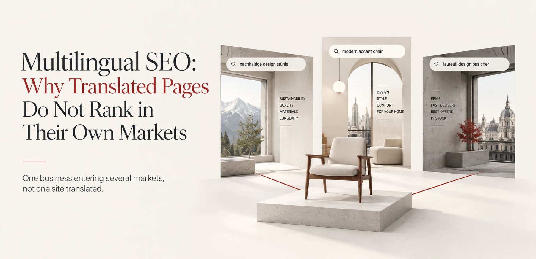
Multilingual SEO: Why Translated Pages Do Not Rank in Their Own Markets
-
27. 09. 2026

Design You Don't Notice: Why the Best Design Disappears
-
04. 10. 2026
When Not to Rebrand: What to Change and What to Leave Alone
-
05. 10. 2026
How Much Does a Brand Identity Cost in 2026?