


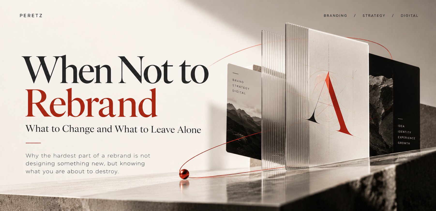
Why the hardest part of a rebrand is not designing something new, but knowing what you are about to destroy
THE QUESTION
Do You Need a Rebrand?
There is a strange moment in the life of almost every successful company.
The business grows. The website starts looking old. A competitor launches a new identity. Someone opens a presentation with a sentence like:
"I think we need a rebrand."
And suddenly everyone is looking at the logo.
Maybe the logo is old. Maybe it is not. And that is precisely the problem.
A brand does not become a business problem simply because its visual identity has been around for five or ten years. Sometimes the right decision is to change everything. Sometimes it is to change almost nothing. Sometimes you need a new identity because the business has become something different. And sometimes the most expensive mistake you can make is destroying something that was already working.
The difficult part is not designing a new brand. The difficult part is knowing whether you need one.
In short
- Most corporate rebrands are a consequence of a deeper change, such as a merger, a spin-off or a new strategy, not a cure for an old-looking logo.
- A brand is not wrong because it is old. It is wrong when it keeps describing a business that no longer exists.
- The risk runs both ways. Changing a brand can destroy recognition customers relied on; refusing to change one the business has outgrown can hold it back.
- In 2026, a rebrand also has a digital cost: years of mentions, reviews, links, search demand and AI-readable descriptions are attached to the old name.
- The real job of a rebrand is an inventory. We use four decisions: Keep, Evolve, Replace and Test.
THE RESEARCH
A Consequence, Not a Cause
Laurent Muzellec and Mary Lambkin studied 166 companies that changed their corporate names. The largest drivers were mergers and acquisitions (33.1%) and spin-offs (19.9%). Brand image accounted for 17.5%. The rest came from divestment, internationalisation, diversification and legal reasons.
In other words, companies rarely rebrand simply because someone got tired of looking at the same logo. Something underneath has usually changed already. The ownership. The business. The market. The country. The audience. The strategy. The old brand becomes the visible symptom of a deeper transformation.
There is a second data point, and it cuts both ways.
Brand Finance analysed 3,000 public acquisitions above $500 million over five years. Only 21% of the acquired companies were rebranded; 79% kept their existing names. That sounds like an argument for leaving brands alone, and often it is: a brand can carry years of recognition, trust, relationships and search demand that are expensive to rebuild.
But the same study found something less comfortable, and it is easy to misread. The acquisitions that kept their old brands had far more scattered results: some did very well, and they were 56% more likely to suffer serious damage to the business. The rebranded ones landed in a narrower range, yet a year after the deal they had, on average, performed slightly worse. In other words, rebranding reduced the chance of an extreme outcome without guaranteeing a better one.
This does not prove that acquired companies should be rebranded. The deals that were rebranded and the ones that were not were different deals, made for different reasons. What the numbers do show is that the decision has real financial consequences in both directions. The risk lies not in rebranding or in leaving a brand alone, but in deciding without understanding what you have.
So before asking "How can we make this brand look better?" we should ask "What exactly is wrong with the brand we already have?"
PERETZ
Sometimes, Change Nothing
We know this because we have been on both sides of that decision. We build brands, redesign them, launch new identities. But one of the brands we have worked with for years is our own.
At different points, people told us we should change the name PERETZ. Make it more international. More obvious. More technological. Easier to understand. And there was a perfectly reasonable alternative sitting right in front of us: THE STRUCTURE, the name of our own company. International, immediately suggestive of what we do, naturally connected to our philosophy of systems, architecture and building businesses.
It would have made sense. We did not do it.
Because THE STRUCTURE does not have something PERETZ has: a history. PERETZ did not come from a naming exercise. It came from the beginning of the company itself, from a client, five meetings, a series of failures and a name that appeared almost by accident. That story is told here. Later we discovered another layer: peretz is also a Hebrew word associated with a breakthrough. For part of the Israeli audience the name creates immediate familiarity, and we started receiving inquiries where the name itself seemed to open the door.
Would THE STRUCTURE explain the company more clearly? Probably. Would changing PERETZ make the business stronger? We had no evidence of that. So we left it alone.
A better explanation is not necessarily a better brand.
Sometimes the thing that looks strange from the outside is exactly what makes a brand memorable.
NICO JULIANY
When a Brand Becomes Wrong
Leaving a brand alone should not become a religion either. "We have always had this logo, so it must be valuable" is just as irrational as changing it for no reason.
Nico Juliany is a good example. Five years ago the brand spoke to a different audience: progressive, young, technical. Its visual language had almost a drafting quality, clean geometry, controlled lines, a sense of engineering. And it worked, because that was the business.
Then the company changed. The customer changed. The brand moved toward luxury, and its audience became older, more established and more at home with what we might call heavy luxury. The old visual language was now telling an outdated story.
The answer was not to make the old logo more beautiful. It was to tell a different story with two characters. NJR, the mark of the jewelry house: composed, precise, almost architectural, at home on a case, a certificate or a boutique sign. And Nico Juliany as a pen stroke: a signature, a living, controlled movement of a maker's hand, something that could exist on a cheque. One provides structure, the other life. One speaks of the house, the other of the person behind it. The full case is here.
The new identity no longer says "look how technologically advanced we are". It says "we have already arrived".
The old identity was not a mistake. It was the right answer for the previous stage of the company.
A brand does not become wrong because it becomes old.
It becomes wrong when it keeps describing a business that no longer exists.
SHTAYER
One Brand, Two Generations
SHTAYER shows that a brand can evolve more than once without ever being thrown away.
When we first met, SHTAYER had more than twenty years behind it as a trusted supplier of bedding to many of Ukraine's leading hotels, and almost no consumer knew the name. The company was preparing to enter the consumer market. A brand built for a hotel supplier does not become a consumer brand just because a beautiful online store is put behind it, so the foundation came first: a minimalist identity that spoke the language of a new generation of buyers while respecting decades of trust. We told that part of the story here.
Years later SHTAYER came back. Not because the first identity had failed, quite the opposite. The business had grown, and universal minimalism had become too small for it. The second-generation identity, built in 2026, gave the brand a personal voice: a language inspired by chinoiserie, rooted in its founder's character, and the magnolia, a flower that became part of the company's new life after the war forced it to relocate to western Ukraine. And one detail we care about a lot: in the new emblem, a magnolia vine forms the letter S, keeping a visible connection to the original minimalist logo. The brand moved from "not disturbing sleep" to "creating sleep itself" without breaking continuity with the identity its clients already trusted. The 2026 brand book is here.
Strong brands are not redesigned because the previous design failed. They are refined because successful businesses keep growing.
A rebrand does not always mean destroy, replace, start again. Sometimes it means understand, preserve, evolve.
THE INSTITUTE
More Clarity, Not Less Meaning
Another project brought a completely different problem. The Institute of Trichology's previous identity had a complicated symbol somewhere between hair, DNA and other references to the field. The problem was not that it had no meaning. It had too much, while the name itself was not doing enough work.
So the primary identity became simple and direct: Institute of Trichology. But we did not throw away the complex symbol. We kept it as a deeper layer, because the founder is not simply running a beauty business. She is a scientist and a professor, and for her hair represents several things at once: science, DNA, profession, aesthetics, human identity, and love for the work. The story behind it is here.
That complexity mattered. It just did not need to be shouted at the viewer every time they saw the logo. Good design doesn't remove meaning. It organizes it.
This is also one of the few cases where we have real numbers. In the first month after the new identity and website launched, conversion increased by 5%. Over the following year it was up 34%, while advertising budgets and posting activity stayed broadly comparable.
We cannot honestly attribute all of that growth to the logo. The website, the user experience, the content, accumulated trust and other factors were all part of the equation. But the result showed that making a brand easier to understand can have measurable commercial consequences.
DIGITAL COST
The Cost Nobody Budgets
Most rebrand budgets include design, signage, packaging, printing and a launch. Almost none include the part that has quietly become one of the most valuable: everything the internet has learned about the old name.
Over the years a brand accumulates a digital footprint. People search for it by name. Other websites mention it and link to it. Reviews and business profiles carry it. Directories list it. Its website describes it to search engines in structured data. And more and more, AI assistants describe it to people who ask about companies like yours.
A rebrand does not update any of that automatically.
We recently looked at the website of a group of clinics that unified its practices under a new brand back in 2022. Four years later, the site still described the company to search engines under its old name, in the structured data that Google and AI assistants read, and even in the label of its logo. Nothing looked wrong to a visitor. But to machines, part of the story was still the previous company.
In our own case, it was an old website. We found a forgotten subdomain from 2020 where our early pages used to live; it was showing a placeholder. Any link that still pointed there was leading nowhere. We redirected every old page to its current equivalent, so the trust those links had earned would flow back to the brand instead of disappearing.
This is the part of a rebrand that is easy to miss, because it is invisible:
- Search demand for the old name. People will keep searching for it for years.
- Mentions, links and reviews that carry the old name and point to old addresses.
- Business profiles and directories that need to be updated, not duplicated.
- Structured data and AI-readable descriptions that tell machines who you are.
- Old URLs that need permanent redirects to their new equivalents.
In our essay on why SEO, AEO and GEO are amplifiers, not engines, we describe a business in three layers: Reality, what it does; Reputation, what people say about it; and Representation, how it is described to machines. A rebrand changes the Representation in a day. Reputation follows slowly, and only if you help it.
THE MODEL
Keep, Evolve, Replace, Test
So what should change, and what should stay? That is the real job of a rebrand. Not replacing everything. Not protecting everything. Making an inventory.
We sort every element of a brand into four decisions. Each of our own cases illustrates one of them.
Keep. What has accumulated value the market already recognizes: often the name, sometimes a symbol, a color, the search demand and reputation attached to it. PERETZ is our own example. Tropicana's orange with a straw belonged here too, as we will see.
Evolve. What still carries meaning but no longer fits the stage of the business. SHTAYER evolved twice, from a hotel supplier's identity to minimalism and then to a personal, botanical language, while keeping its S. The Institute of Trichology kept its complex symbol but moved it one layer deeper, so the name could do the work on the surface.
Replace. What actively describes a business that no longer exists. Nico Juliany's technical, drafting-board language had to give way for a house that has moved into heavy luxury.
Test. What you cannot know until the market answers: a new positioning, a higher price category, a different audience. Here a rebrand is an experiment, and should be designed, measured and named as one.
The questions that help sort elements:
- Do customers recognize it, search for it or ask for it by name?
- Does it still describe what the business does and who it serves?
- Would losing it break something the market has learned to trust?
- Is it holding the business back, or do we simply dislike it?
Sometimes the result is: keep the name, change the identity. Sometimes: keep the symbol, change the typography. Sometimes: keep the history, change the positioning. Sometimes almost everything stays. And sometimes the only honest answer is: start again.
EXPERIMENTS
And Then, Experiments
This is where branding becomes uncomfortable. Sometimes a company genuinely does not know what will happen. There is a hypothesis: if we reposition, we may reach a different audience; if we look more premium, we may enter a higher price category.
You can research it. Interview customers. Analyse competitors. Test messaging. But some hypotheses can only be tested in the market, and sometimes that experiment is expensive. That does not make it irrational. It just means you should call it what it is: an experiment, not a guaranteed result.
We are doing exactly that right now. SHTAYER and Nico Juliany are both projects where we have worked on substantial brand evolution together with new digital experiences. The identities are ready. People like them. But that is not the same as proving commercial success. The campaigns have not completed a full cycle yet, and we do not have enough post-launch data to claim that a new identity increased revenue by some impressive percentage.
We are not going to invent that story. A beautiful brand is not the same thing as a successful brand. The market gets the final vote.
This is surprisingly rare in agency case studies. A new logo launches, the client loves it, the agency publishes a case study, and somehow the logo increased sales by 147%. Maybe. But often there is no evidence. We would rather wait, measure, compare, and then talk about the result. When these brands have gone through a full cycle in the market, we will publish what actually happened, good or not.
FAILURES
We Have Seen the Opposite
Some of the most famous rebranding failures are useful precisely because they show what happens when existing brand equity is treated as disposable.
In 2009 Tropicana redesigned the packaging of its Pure Premium juice and removed familiar cues, including the orange with a straw. Sales of the line fell by about 20% in the following weeks, roughly $33 million, and the company brought back the old packaging less than two months later. The lesson isn't "never redesign packaging". You may not know which parts of your identity your customers are actually buying. The orange. The straw. The colour. The familiarity. What looks like an old-fashioned asset to a designer can be a recognition mechanism to a customer.
Gap went through something similar in 2010. It introduced a new logo and, after an intense reaction from customers, returned to its classic blue box within days, acknowledging the strength of the existing association. Again, the lesson isn't that old logos are always better.
You should know what you are destroying before you destroy it.
WHEN
When to Actually Rebrand
There is no universal checklist, but there are questions worth asking.
Has the business changed? If the company now does something fundamentally different from what the brand communicates, that is a strong reason.
Has the audience changed? Nico Juliany's customer evolved, and the brand needed to evolve with them.
Has the market changed? SHTAYER moved from hotels to people's homes, a completely different relationship with the customer.
Has the ownership changed? After a merger or an acquisition, keeping or changing the brand is a decision that deserves analysis, not habit.
Is the brand actively limiting growth? Not because you personally dislike it, but because customers misunderstand it, cannot distinguish it, or put it in the wrong category.
Is there a hypothesis worth testing? Then a rebrand can be a legitimate experiment, as long as you understand the risk before running it.
Or are you simply bored? This is the weakest reason of all. You have looked at the same logo for ten years. Competitors changed theirs. A designer showed you something beautiful. A new marketing director wants to "modernise the brand". None of these, on its own, is a business reason.
AGING
Aging Is Not a Problem
A website can look old and still convert. A logo can be twenty years old and still be recognised. A brand can have an unusual name and still create powerful associations. And a beautiful new identity can fail commercially.
So the question should not be "Does our brand look modern?" It should be "Does our brand still represent the business we are trying to build?" Those are completely different questions.
WHAT TO KEEP
Knowing What Not to Change
We don't believe every old website needs a new website. We don't believe every old brand needs a new identity. We don't believe every uncomfortable business problem can be solved with a new logo. And we don't believe rebranding is inherently dangerous. Sometimes it is exactly what a business needs. Sometimes it is a calculated experiment. And sometimes the smartest branding decision is to leave the brand alone.
The difficult part isn't knowing how to change a brand. Most agencies can do that.
The difficult part is knowing what not to change. Because a brand is not just what you want it to become. It is everything the market has already learned to believe about it, and before you throw that away, you should find out what it is worth.
FAQ
Frequently Asked Questions
Should I rebrand my company?
Only if something underneath the brand has changed: the business, the audience, the market, the ownership, or the brand is actively limiting growth. Being tired of an old logo is not a business reason on its own.
What are the most common reasons companies rebrand?
In Muzellec and Lambkin's study of 166 corporate name changes, the most common drivers were mergers and acquisitions (33.1%) and spin-offs (19.9%). Brand image accounted for 17.5%.
What are the risks of rebranding?
Losing recognition customers relied on, as Tropicana and Gap discovered, and losing the digital footprint attached to the old name: search demand, mentions, links, reviews and the way search engines and AI assistants describe the company. Not rebranding has risks too: a brand that describes a business that no longer exists can hold it back.
Should a company rebrand after an acquisition?
It depends, and it should be a deliberate decision. Brand Finance found that only 21% of large acquisitions were rebranded; those that kept their old brands had more scattered results and were 56% more likely to suffer serious damage, while rebranded ones were more stable but not more successful on average.
How do I know which parts of my brand to keep?
Make an inventory and sort every element into four decisions: Keep what customers recognize and trust, Evolve what still carries meaning but no longer fits, Replace only what describes a business that no longer exists, and Test what you cannot know until the market answers.
What should I do with my website and search presence after a rebrand?
Redirect every old URL to its new equivalent, update business profiles and directories instead of creating duplicates, update structured data and the descriptions search engines and AI assistants read, and expect people to keep searching for the old name for years.
Sources
- Corporate rebranding: destroying, transferring or creating brand equity?, Laurent Muzellec and Mary Lambkin, European Journal of Marketing, 2006
- To rebrand or not to rebrand: rebrands reduce risk in acquisitions by more than 50%, Brand Finance
- Tropicana fiasco from Arnell is gift that keeps giving, Bloomberg
- Gap listens to customers and will keep classic blue box logo, Gap Inc.
Not sure whether your brand needs a change, or which parts of it are worth keeping?
- Share
-

-

-

-

Related Reading
-
07. 07. 2026
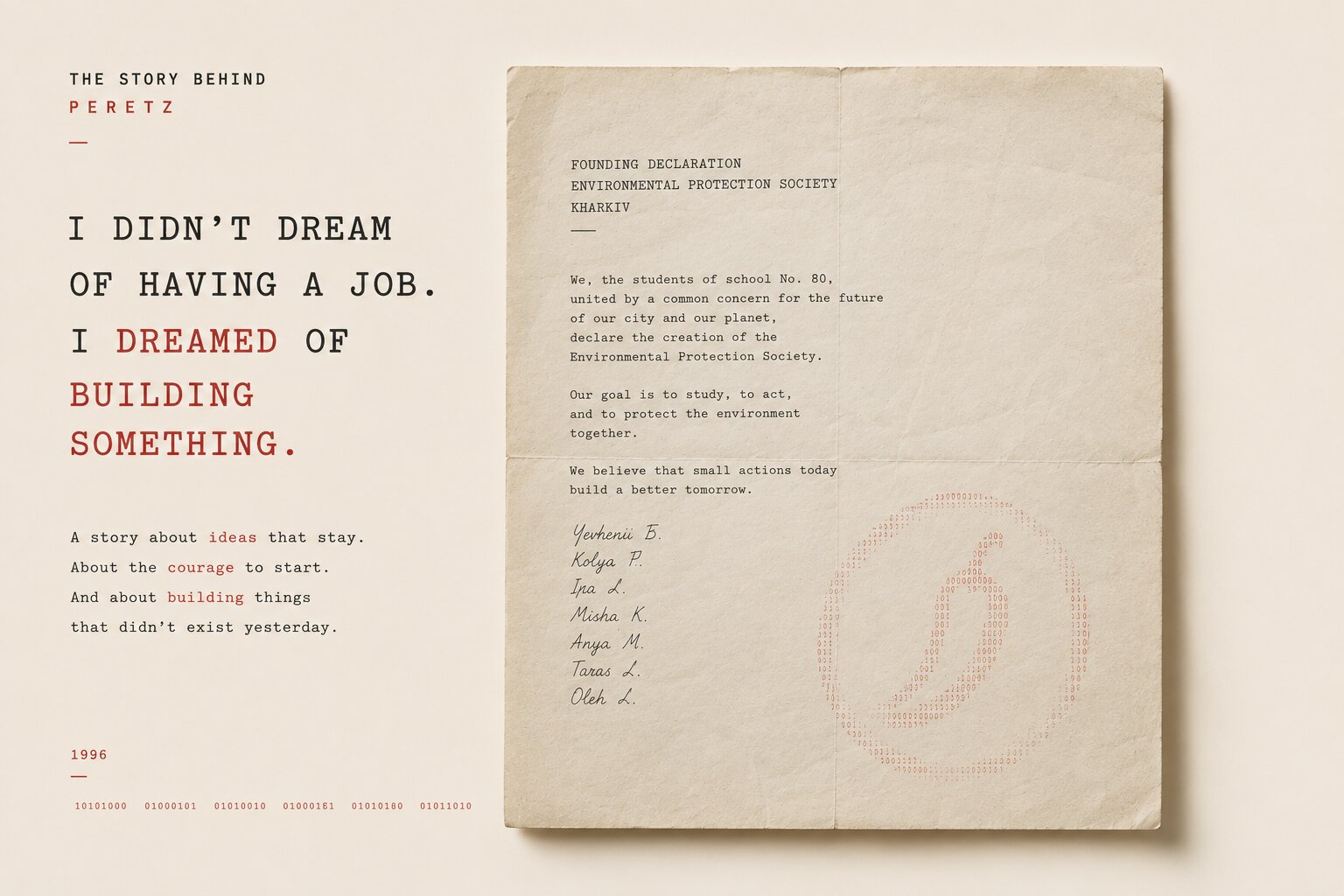
I Didn’t Dream of Having a Job. I Dreamed of Building Something.

-
05. 07. 2026
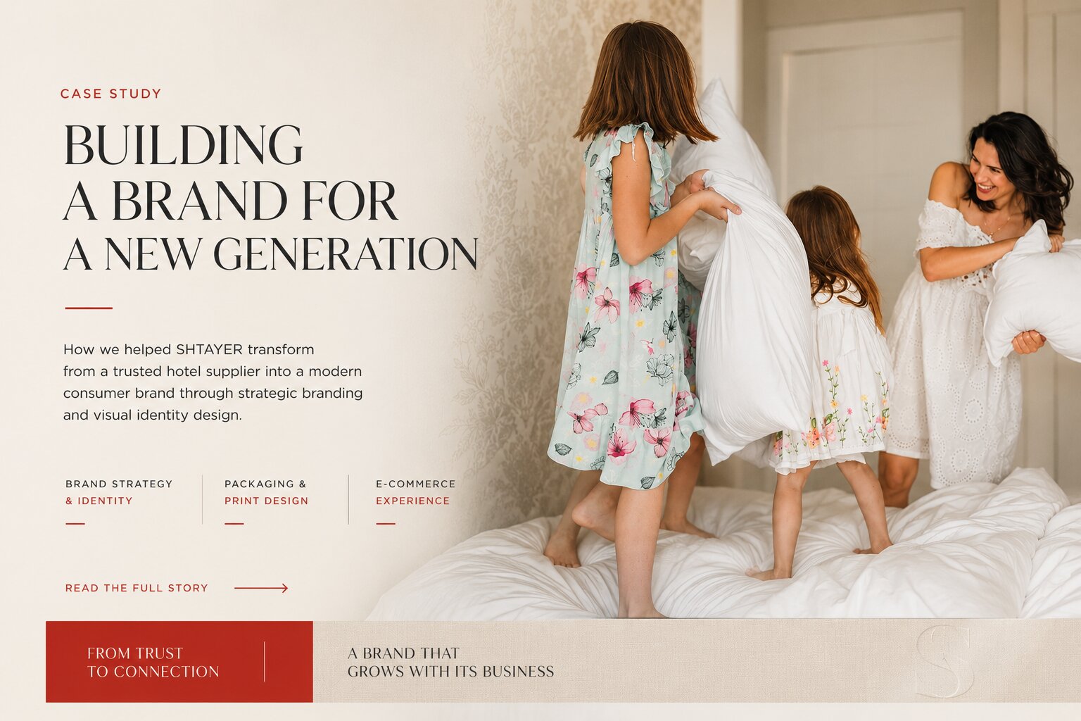
SHTAYER: Building a Brand for a New Generation
-
11. 07. 2026
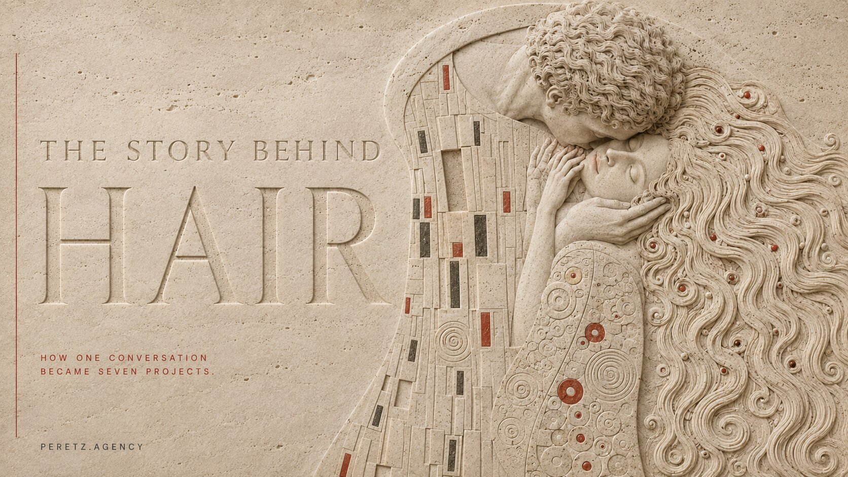
The Story Behind Hair
-
22. 08. 2026
What We Leave Behind: Heritage, Technology and the Things Worth Passing On
-
02. 10. 2026

SEO, AEO and GEO Are Amplifiers, Not Engines
-
27. 08. 2026
Why Some Websites Look Cheap Even When They Are Well Designed