


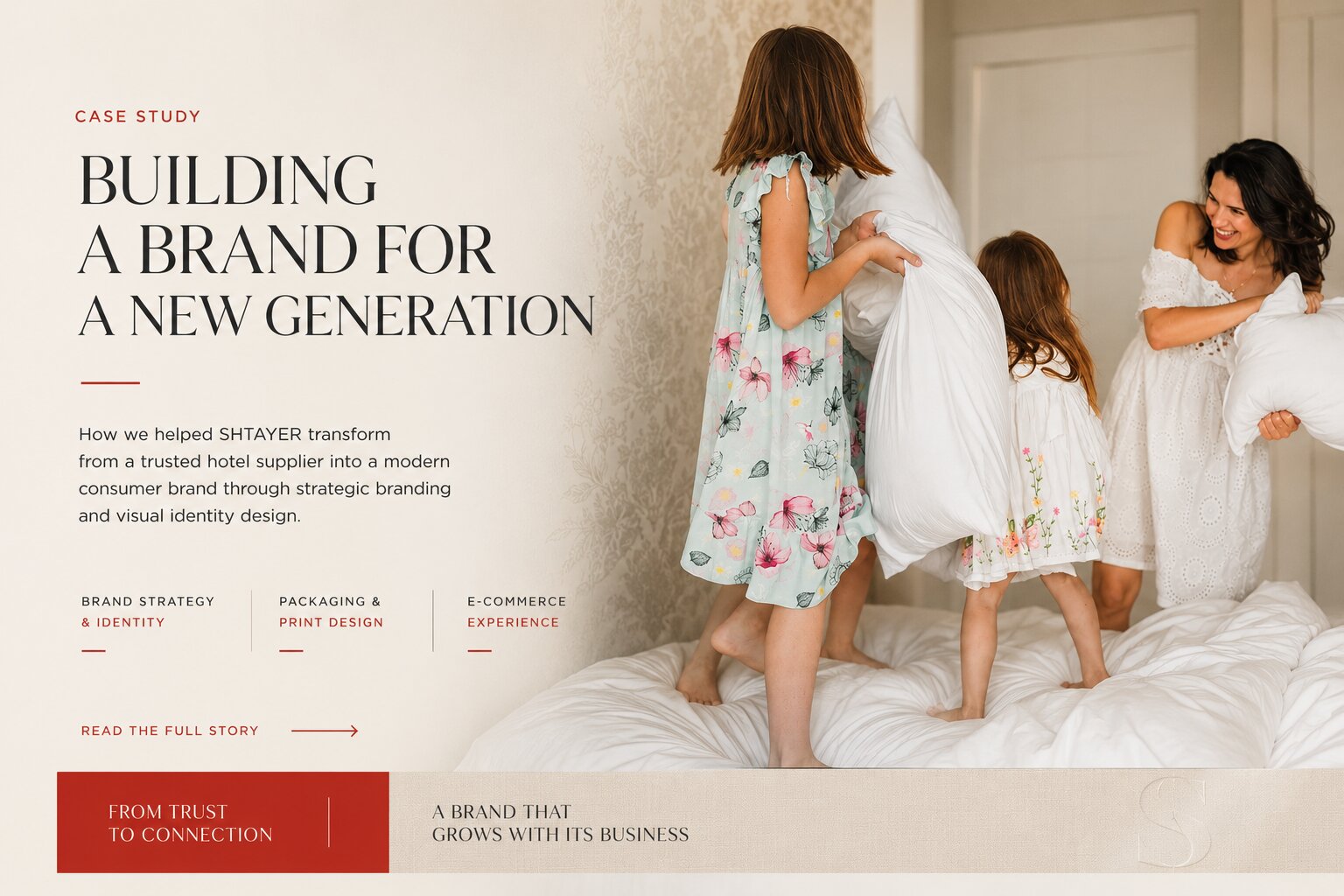
Some projects begin with a brief.
Others begin with trust.
Our collaboration with SHTAYER started through a recommendation. Years earlier, we had designed a concept website for Superior Golf Club in Kharkiv, working closely with the club's PR Director. After seeing how we approached strategy, design, and communication, she introduced us to one of her clients — SHTAYER.
At the time, SHTAYER had already spent more than twenty years in business and had earned a trusted reputation among Ukraine's leading hotels and hospitality businesses. Many of the country's leading hotels trusted the company to manufacture their bedding, yet very few consumers knew the brand existed.
The company wasn't looking to reinvent itself. It was preparing to enter an entirely new market.
A STRONG BUSINESS WITHOUT A CONSUMER BRAND
A Strong Business Without a Consumer Brand
For decades, SHTAYER had grown through long-term relationships with hotels, resorts, and hospitality partners rather than consumer marketing. Its visual identity reflected that history.
The existing logo, typography, presentations, and packaging had served the company well, but they belonged to a different era. They weren't created for e-commerce, social media, or a generation of customers discovering brands through digital experiences.
Launching a new website before redefining the brand simply didn't make sense. The foundation had to come first. Only then could the website, digital marketing, and future growth be built on top of it.
THE CHALLENGE: DESIGNING A BRAND IDENTITY FOR TWO DIFFERENT AUDIENCES
The Challenge: Designing a Brand Identity for Two Different Audiences
Our task wasn't to redesign a logo. It was to build a visual identity capable of connecting two very different audiences.
On one side were hospitality professionals who already trusted SHTAYER because of its product quality and long-standing reputation. On the other were younger consumers entering the premium home textile market — people who expected brands to feel contemporary, refined, and digitally native from their very first interaction.
The new identity needed to respect the company's heritage while speaking the language of a completely new generation.
WHY WE CHOSE A MINIMALIST BRAND IDENTITY
Why We Chose a Minimalist Brand Identity
This project was developed during a period when minimalist design was reshaping premium branding around the world. Companies such as Apple and Dyson had influenced how a new generation perceived premium products — not through decoration, but through clarity and restraint.
That wasn't simply a design trend. It was the visual language of the audience SHTAYER wanted to reach.
Minimalism also allowed something equally important to happen. Instead of competing with the products, the identity gave them room to speak for themselves. Luxury bedding doesn't need to shout. It needs to communicate craftsmanship, comfort, and quality with quiet confidence.
BUILDING A COMPLETE BRAND IDENTITY SYSTEM
Building a Complete Brand Identity System
The visual identity quickly expanded into a complete branding system. Typography, packaging, product labels, stationery, printed materials, and digital assets were redesigned to create a consistent experience across every customer touchpoint.
From strategy to production-ready assets, the entire identity system was completed in just three weeks. That speed wasn't the result of rushing. It came from something much more valuable — mutual trust.
The client challenged ideas, asked thoughtful questions, and cared deeply about every detail. Rather than slowing the project down, those conversations helped us reach better decisions faster because both teams shared the same objective from the very beginning.
WHEN BRAND DESIGN STARTS TO SHAPE THE PRODUCT
When Brand Design Starts to Shape the Product
One of the most rewarding outcomes appeared after the project had already launched. The new branding didn't simply change how SHTAYER looked — it began influencing what the company created.
As the minimalist identity became established, new bedding collections emerged that reflected the same philosophy of simplicity, balance, and understated elegance. The products evolved alongside the brand.
Looking back, that may have been the project's greatest success. The new identity didn't simply change how the company looked — it influenced how the business thought about its products.
A BRAND THAT CONTINUED TO GROW
A Brand That Continued to Grow
Several years later, SHTAYER returned to us. Not because the original identity had become outdated — quite the opposite. The business had grown. Its audience had expanded. Its ambitions had evolved.
The next chapter wasn't about becoming more modern. It was about giving the brand a stronger emotional voice.
Together, we developed a second-generation identity inspired by chinoiserie, introducing richer storytelling and a distinctive illustrated symbol while preserving the clarity and recognition established by the original system.
THE RESULTS
The Results
The first identity gave SHTAYER the confidence to enter the consumer market without losing the trust it had built over decades within the hospitality industry. It established a consistent visual language across digital and physical touchpoints while influencing product development and supporting the company's continued growth.
Years later, while rebuilding SHTAYER's e-commerce platform, our work shifted toward information architecture, content strategy, product structure, and user experience rather than a dedicated SEO campaign. Even so, the impact has already been measurable.
EARLY ORGANIC GROWTH
Early Organic Growth
- Average Google Search position: 40.8 → ~12
- Organic CTR: 0.58% → 2%+, with recent weeks exceeding 3%
- A significantly stronger foundation for long-term SEO and content growth
These improvements were achieved primarily through better information architecture, cleaner content organization, and a significantly improved user experience — not through aggressive search engine optimization.
LOOKING BACK
Looking Back
This project reinforced something we've believed for years.
Strong brands aren't redesigned because the previous design failed. They're refined because successful businesses continue to grow.
The first identity gave SHTAYER a modern voice.
The second gave it a distinct personality.
Neither replaced the other.
Each reflected a different stage in the company's evolution.
That's what we believe great branding should do.
Related Projects: SHTAYER E-commerce Website • SHTAYER 2026 Brandbook
Related Services: Brand Identity • E-commerce Development
See the identity carried through to a full brand refresh in SHTAYER's 2026 brandbook.
See the fuller architecture thesis, with real cases, in the software should fit the business.
Where this architectural thinking is heading next, and what it means for a business between 2030 and 2035, is covered in the website is not dead, it has just lost its job.
How SHTAYER's two generations fit into a wider way of deciding what to keep and what to change is described in When Not to Rebrand.
- Share
-

-

-

-

Related Reading
-
13. 11. 2020
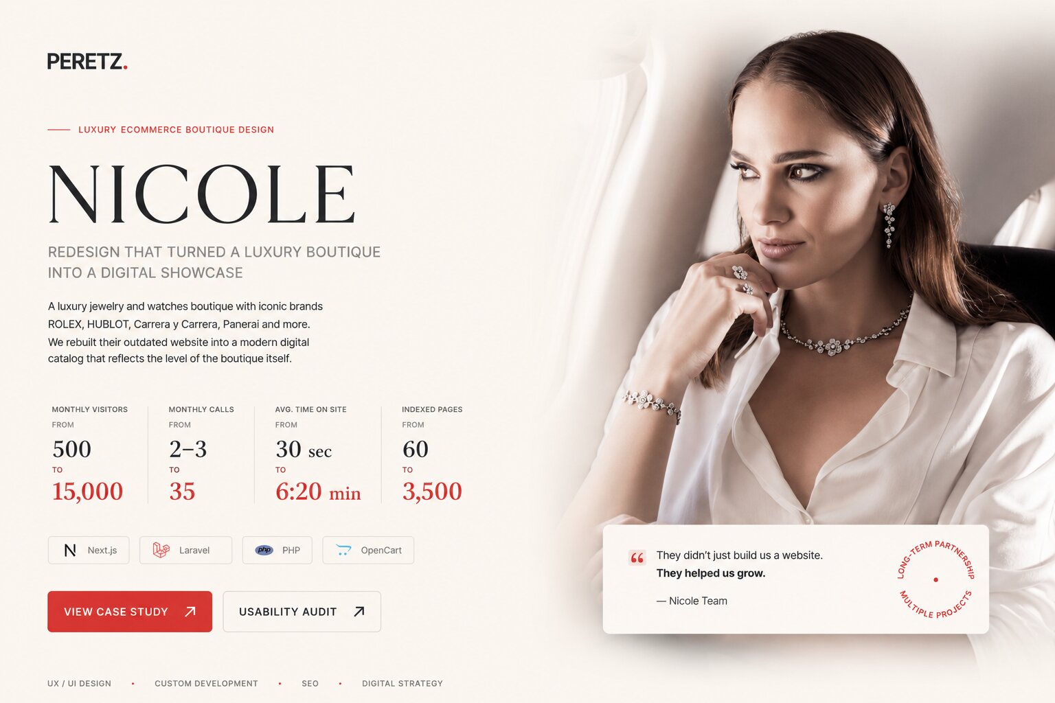
Why Launching a New Site Is Good for SEO: The Nicole Case

-
01. 07. 2026
THE STORY BEHIND SV GROUP
-
26. 06. 2026
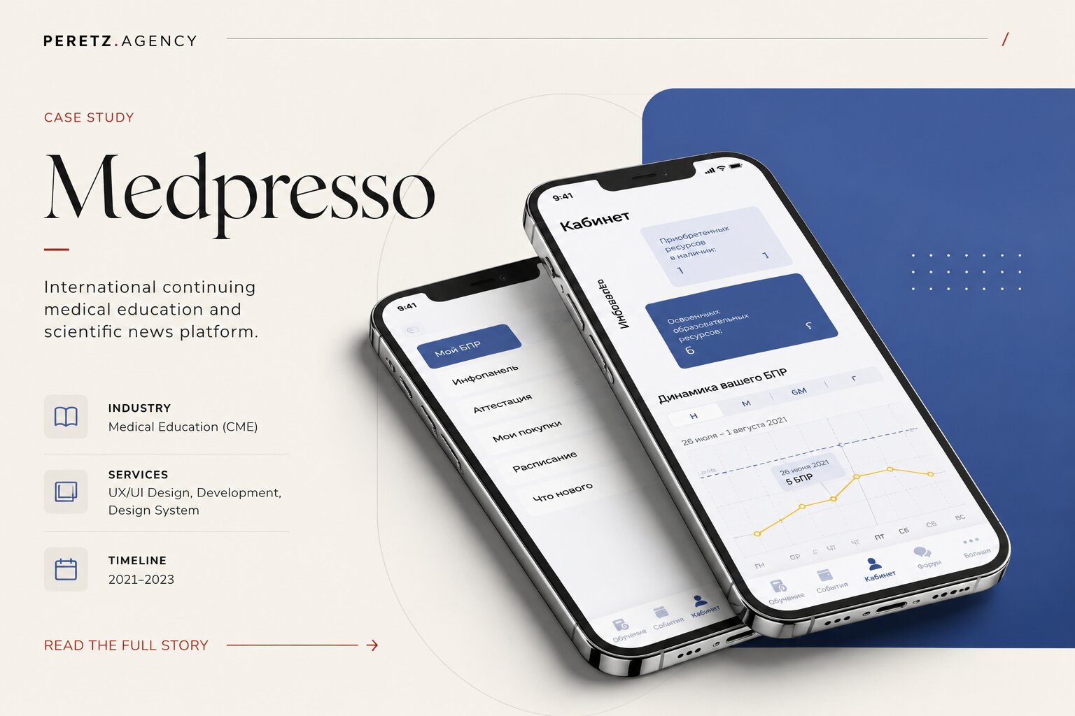
The Story We Never Planned to Tell - Case MEDPRESSO
-
30. 11. 2020

The case of Laduchi
-
02. 12. 2020

Redesign of Sports Online Store Sport Discount
-
06. 07. 2026

Some Clients Change Your Business. MDC LUX Changed Ours.
-
08. 07. 2026
Everyone Wants the Prestige. We Study the Turn.
-
07. 07. 2026
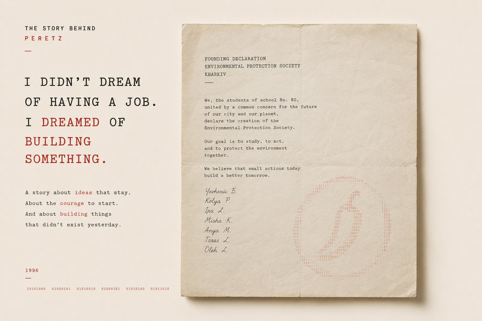
I Didn’t Dream of Having a Job. I Dreamed of Building Something.
-
22. 08. 2026
What We Leave Behind: Heritage, Technology and the Things Worth Passing On
-
27. 08. 2026
Why Some Websites Look Cheap Even When They Are Well Designed
-
14. 08. 2026
How We Design E-Commerce: From Objects to Experience
-
11. 07. 2026
The Story Behind Hair
-
19. 08. 2026
Collaboration Strategy: Why One-Off Partnerships Don't Build Lasting Growth
-
21. 09. 2026
The Software Should Fit the Business
-
24. 09. 2026
The Website Is Not Dead. It Has Just Lost Its Job.
-
04. 10. 2026
When Not to Rebrand: What to Change and What to Leave Alone
-
05. 10. 2026
How Much Does a Brand Identity Cost in 2026?