


Sport Discount is a large online store of sporting goods from world brands. We presented the first store design to the client in 2017. Since then, the business has grown significantly, and the website's functionality had to be scaled for new sales volumes and development strategy.
For optimization, the client and I chose an ESR approach to redesigning an online store and presented a modern and working resource.

For four years of operation, the website has been developing very dynamically in functionality and assortment. Still, most often, the corresponding changes in the interface were implemented in a hurry upon request and were not always balanced. Over time, all these changes began to transform the visual concept significantly: different indents, new fonts, and their sizes appeared.
IN ADDITION TO THIS, OTHER FACTORS ALSO INFLUENCED ON THE WEBSITE'S REDESIGN:
-
Business scaling
Since its launch, the online store has extended its assortment, concluded agreements with major brands, and set a goal to develop the platform as a marketplace.
-
Demand for mobile version
By 2020, the number of mobile users has increased significantly compared to 2017. Nowadays, almost 76% of website users make orders via mobile devices, so effective optimization of the resource is necessary.
-
Appearing of new user behavior patterns
If earlier the most informative interfaces were quite popular, now they are replaced by minimalism. Users don't want to read a ton of information; they shop more intuitively. They don't like it when they are distracted by some portal blocks and want to make their purchases as quickly as possible.
-
Analysis of existing interaction with the website
To competently optimize the website and consider the maximum number of user needs, we conducted a usability audit and analyzed heat maps using the Yandex Webvisor and Plerdy services, as well as the ways of interacting with the website by Google Analytics.
Main page

-
Desktop
By analyzing the website using the Yandex webviewer and Plerdy, we realized how users interact with our website: where they click, what they focus on, how much time they spend on the pages, and what the final depth of the scroll is. It allowed us to adjust the interface to user behavior algorithms and make the website maximally convenient.
As a result of the analysis, we saw that customers did not click on most of the buttons on the website header. Therefore, we optimized this part by removing the additional links in the website footer and reduced the height of the header and slider, which allowed us to show users a block with brands on the very first screen. It helps tell more about the store and the assortment immediately.
Before

After
We have also increased the number of product sliders for quick access by search robots and users.
Before

After

We reduced the footer height and removed duplicate links, retaining only the information that users need most.
Before

After

-
Mobile version
We added the wish-list and personal account icons to the quick access panel.
We changed the burger menu design: we ordered and updated it according to the general visual concept and placed all the information on the single screen.
Product Card
-
Desktop
We structured the information on the page for easy perception and fixed a block with a price and a “buy” button. Now, even when the user scrolls down, he can click the “buy” button without returning to the top of the page.
Before

After

-
Mobile version
The product card in the mobile version has become more structured and not crowded with large information blocks. When scrolling down, the “buy in one click” button is fixed on the screen and allows the user not to return to the beginning to make an order.
Before / After


Basket
We updated the page design considering the overall visual concept and placed information more unobtrusively.
Before

After

Ordering
We moved the block to a separate page, so the user won’t be distracted from completing the purchase at this stage.
We divided the information into semantic blocks and reinforced them with visual accents.
We added a block for registered users. Now they should not re-enter information about themselves, and order becomes faster.
We implemented the concept based on real data and the conducted audit. As a result of the redesign, the user received an updated work resource that considers the clients' behavior and needs and looks modern and stylish.
Before

After


To ensure that your website also requires updating, order the Usability audit service, and we will provide a deep analysis of your resource.
- Share
-

-

-

-

Read also
-
19. 11. 2020

10 Best Online Store Designs

-
16. 11. 2020

UX/UI Design in 2025: Why It's Still the Highest-ROI Investment Your Business Can Make
-
01. 02. 2021
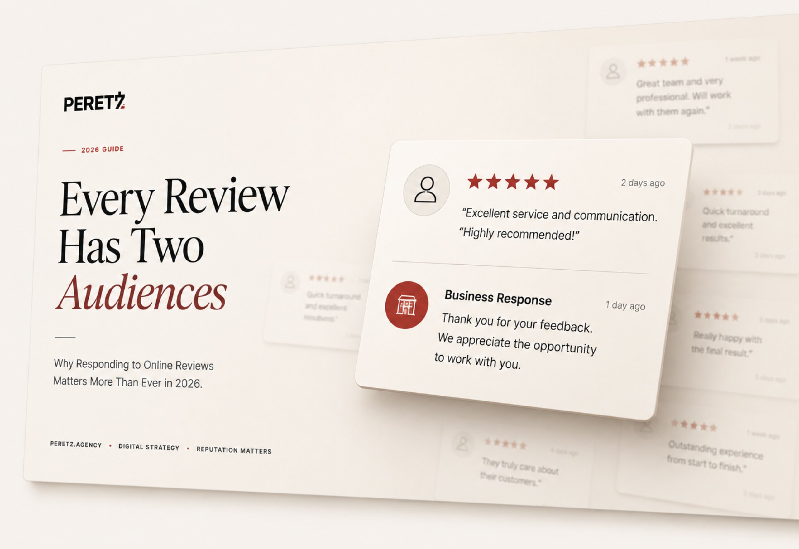
Why Responding to Online Reviews Matters in 2026 — And How to Do It Right
-
24. 11. 2020

7 UX/UI Design Trends That Actually Matter in 2026
-
20. 12. 2020
Why Your E-Commerce Store Needs a Blog in 2026 — And How to Start One That Actually Works
-
13. 11. 2020
Why Launching a New Site Is Good for SEO: The Nicole Case
-
12. 03. 2021

In-House vs Outsourcing in 2026: What Business Owners Actually Need to Know
-
15. 06. 2026
AI-Powered Web Design and AI Video Editing in 2025-2026
-
16. 03. 2021
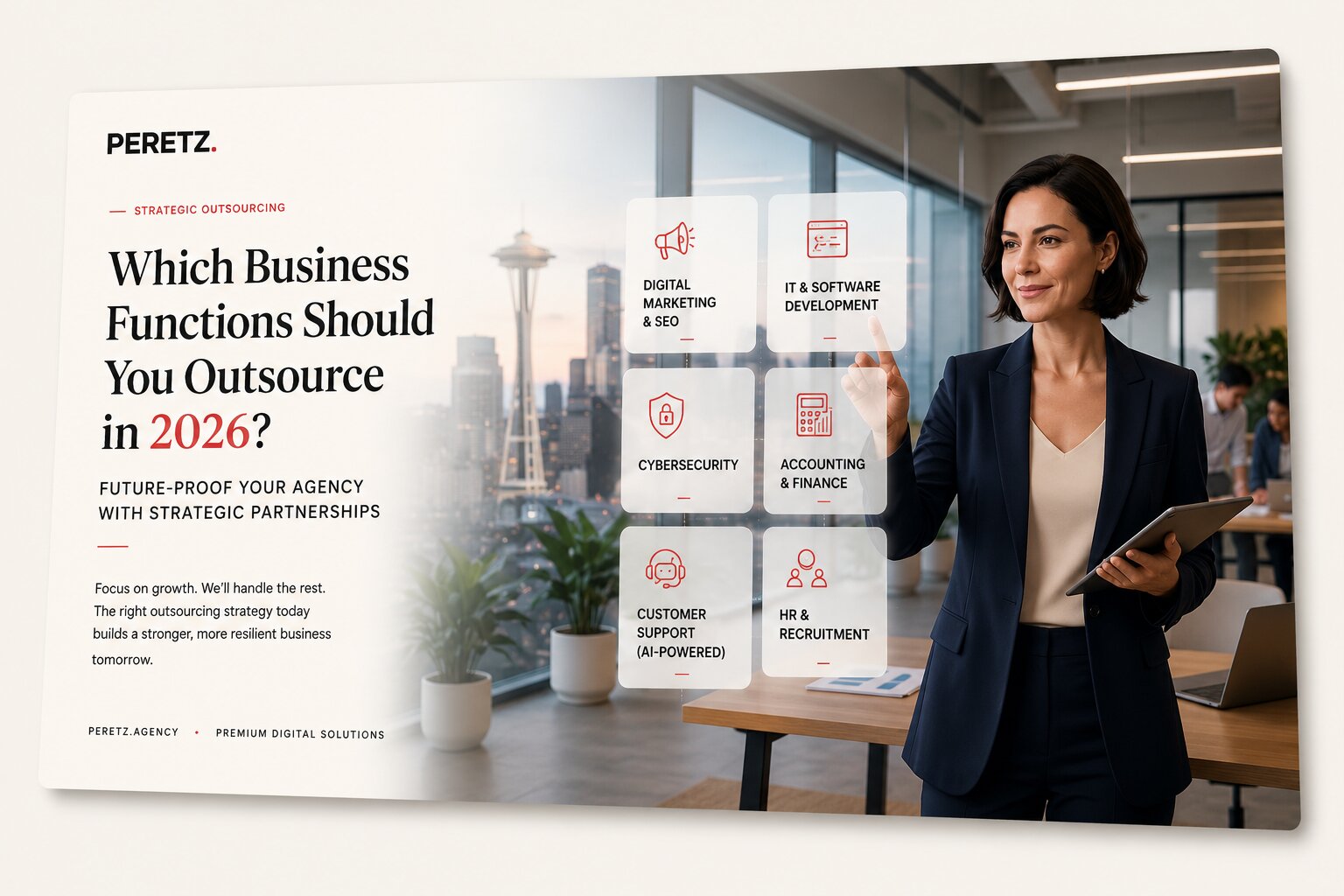
Which Business Functions Should You Outsource in 2026?
-
06. 04. 2021
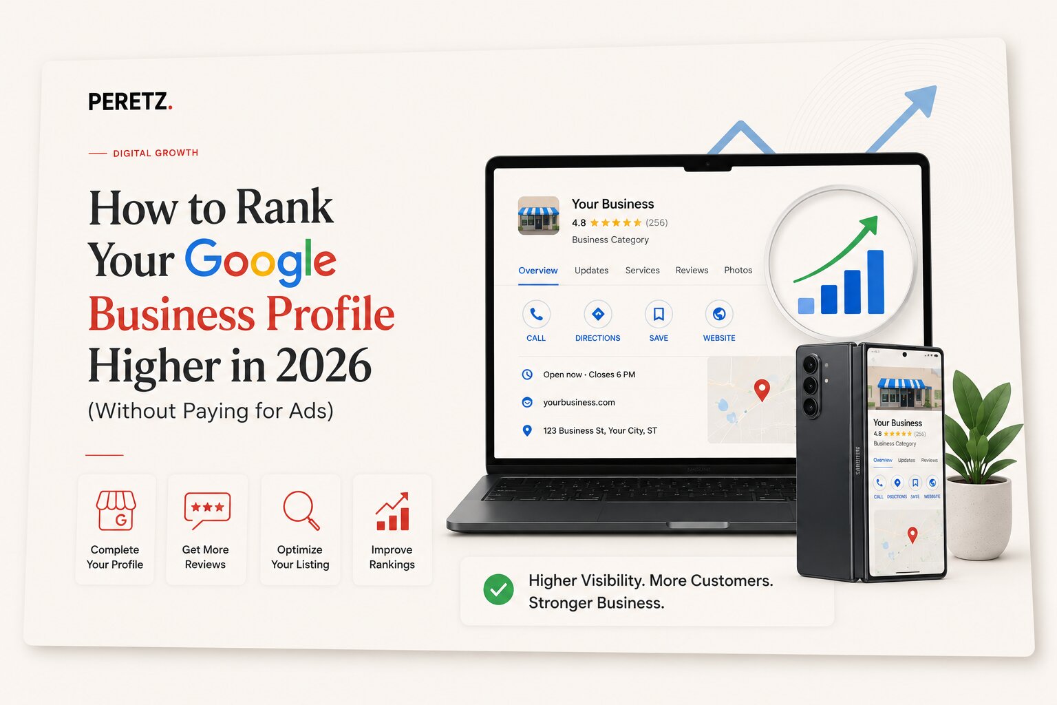
How to Rank Your Google Business Profile Higher in 2026 (Without Paying for Ads)
-
15. 06. 2026
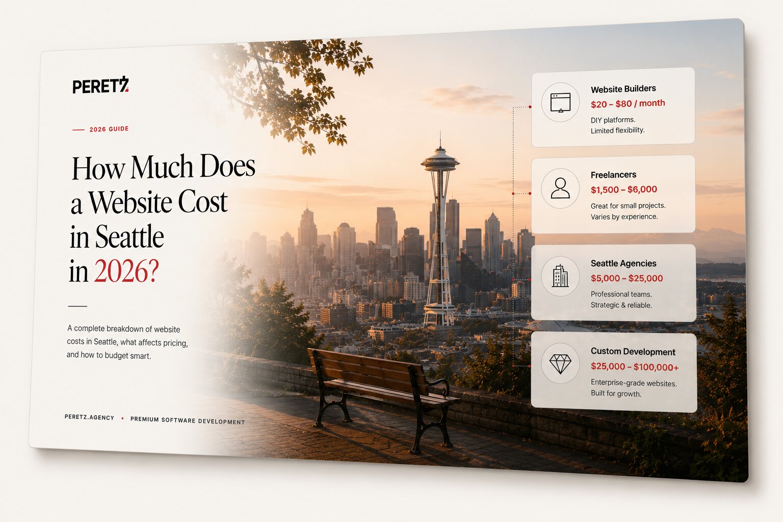
How Much Does a Website Cost in Seattle in 2026?
-
26. 06. 2026
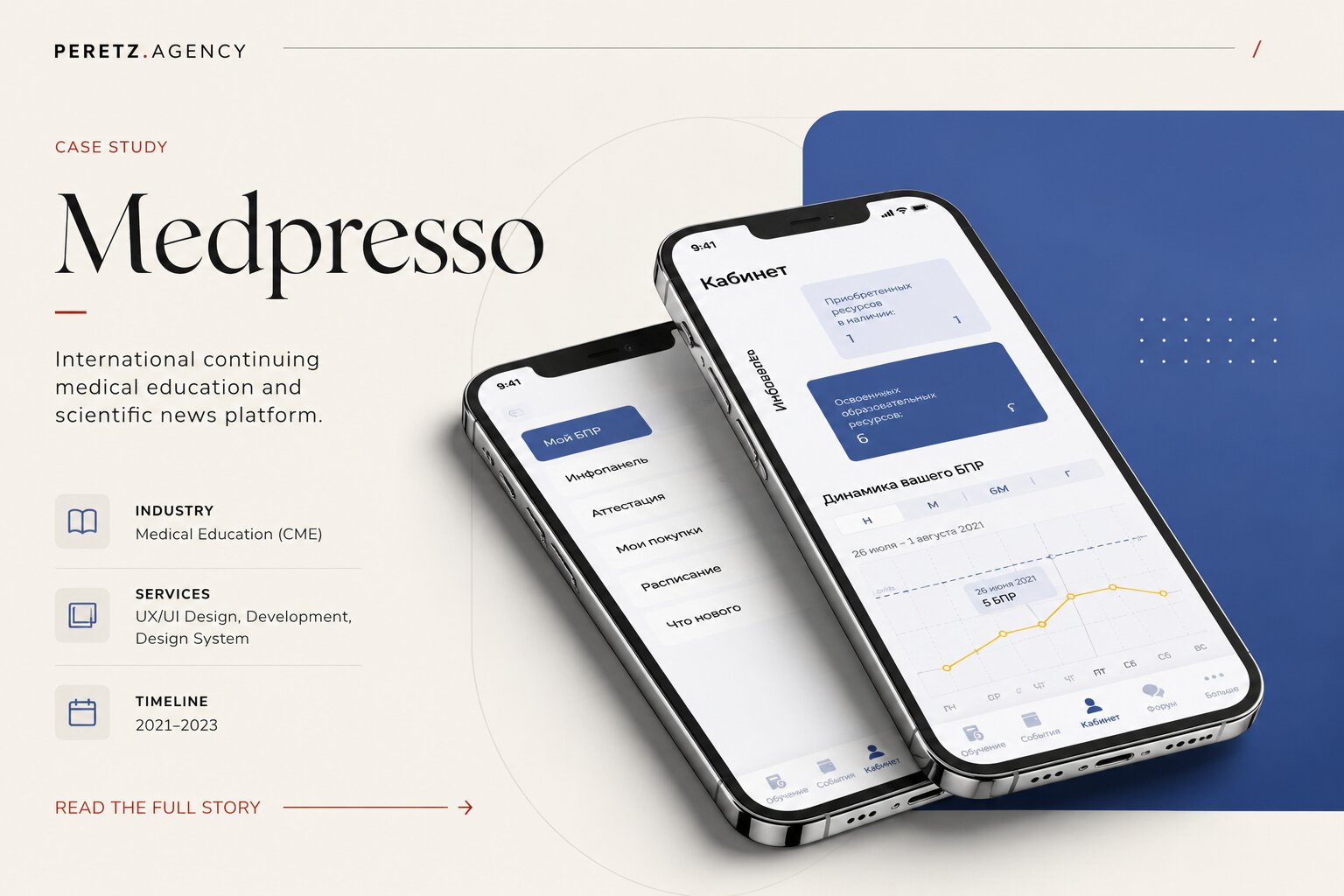
The Story We Never Planned to Tell - Case MEDPRESSO