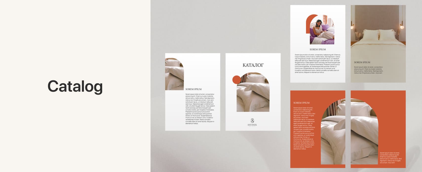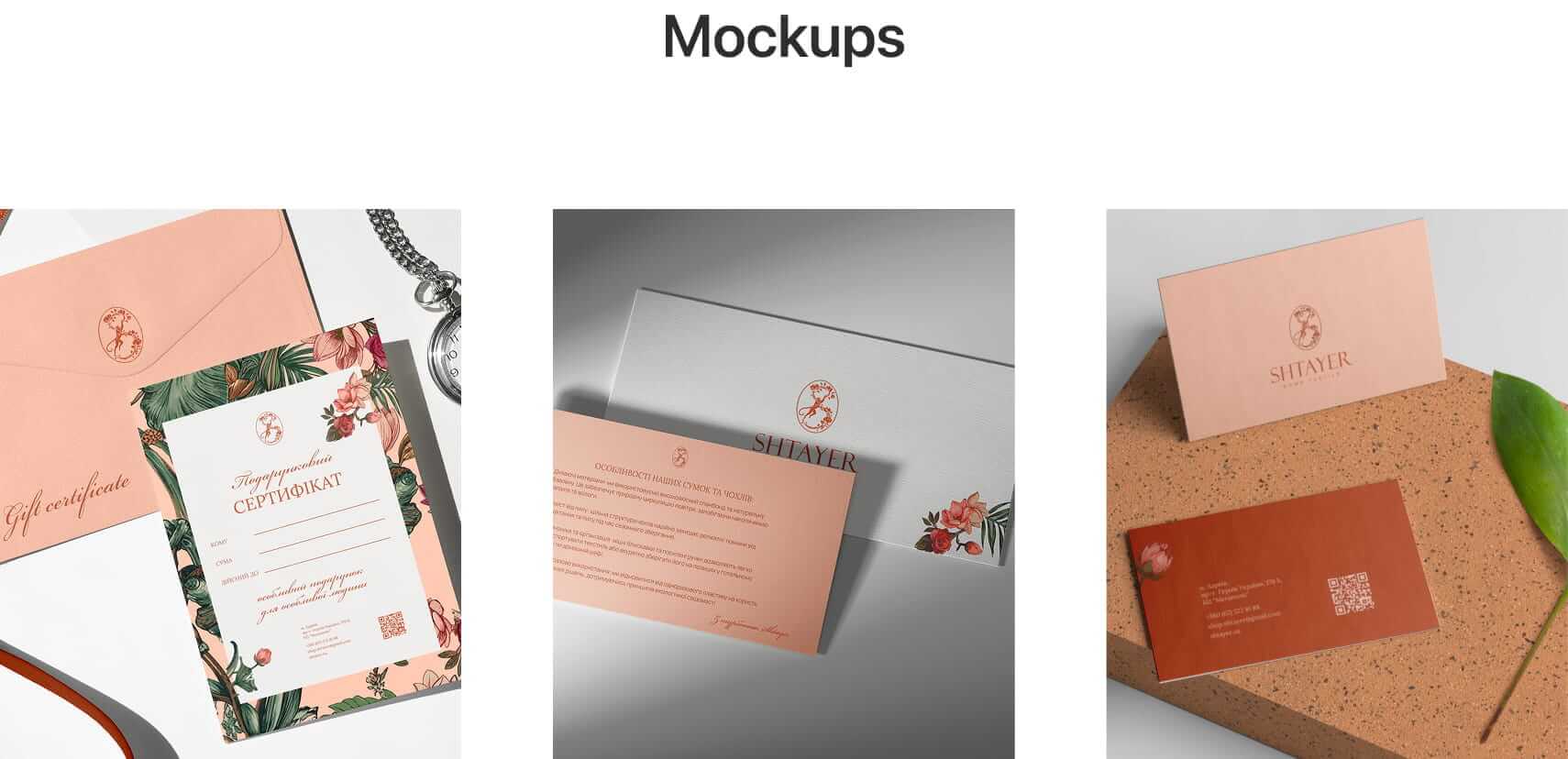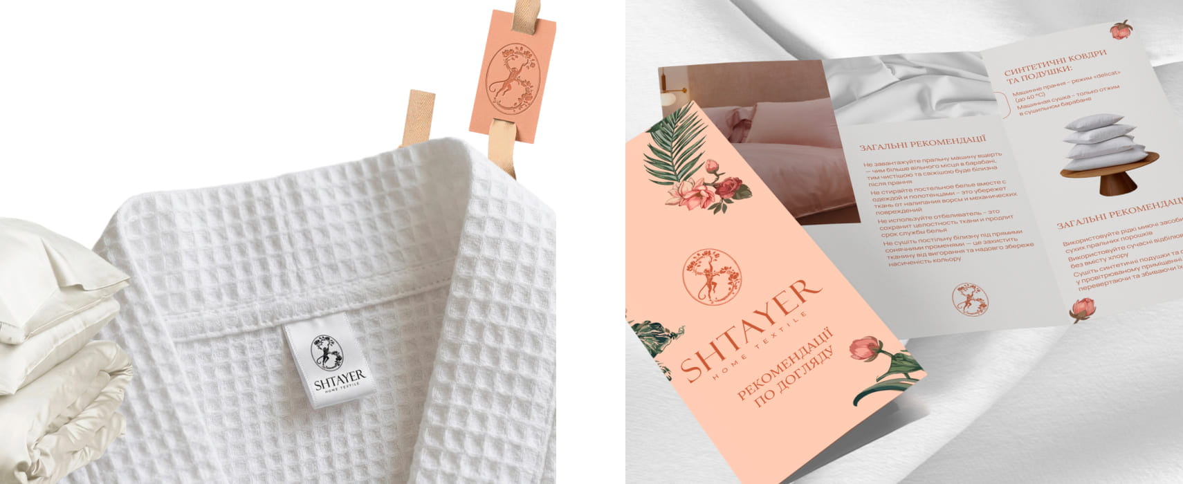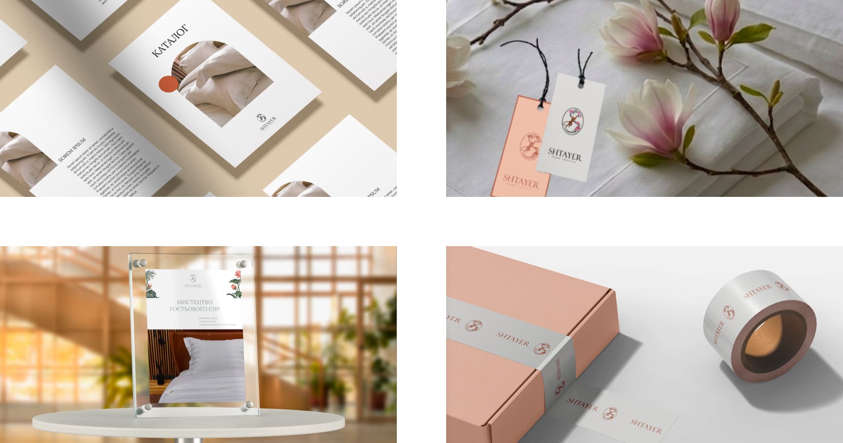
In 2026, we developed a new visual system for SHTAYER, a premium home and hospitality textile brand.
The brand's previous minimalist style was well built and continued to work well. But over time, SHTAYER outgrew that system. Universal minimalism started to feel too small for it: the brand wanted to speak in a more personal voice, gain its own character, and visually unite the different directions it works in.
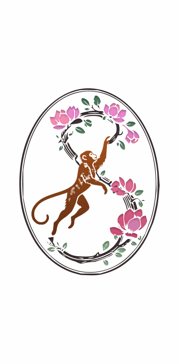
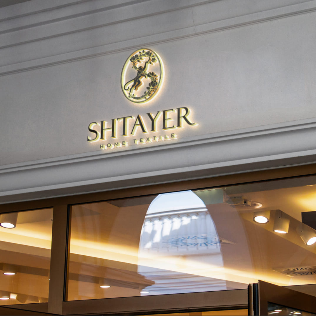
At the core of the new SHTAYER was not an abstract design concept, but the personality of its founder, Yulia Shtayer. Yulia once said she feels like that curious little monkey from a childhood cartoon, a small character who is endlessly interested in everything around her, who explores, invents, plays, and looks at the world a little differently.
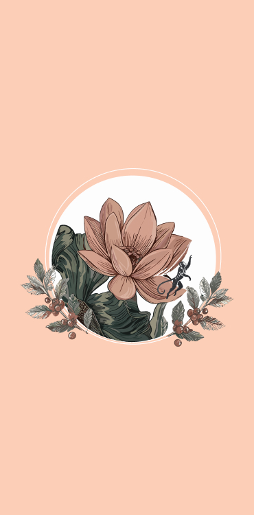
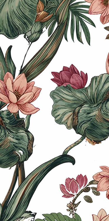
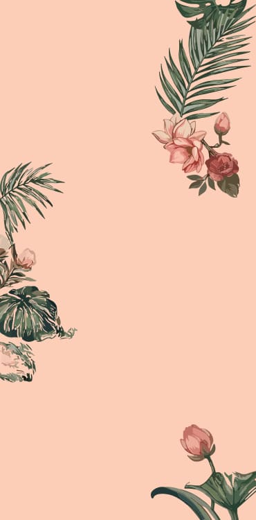
So we did not want the new SHTAYER to become just another neat premium brand with pretty typography and a neutral palette. That is how Chinoiserie entered the system, not as decorative styling, but as a language that let us connect the brand's history, its founder's personality, and SHTAYER's genuinely different visual worlds.
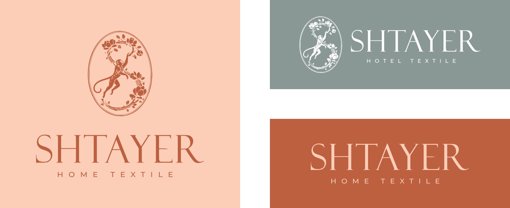
One of the central elements of the new identity is the magnolia. After the business was forced to relocate to western Ukraine because of the war, magnolias became part of SHTAYER's new life, and in the new emblem, a vine forms the letter S, keeping the connection to the previous minimalist logo.