Nico Juliany Brand Identity 2026

For Nico Juliany, we were not just designing a logo. It mattered to find a visual language that could carry the principle behind the brand's jewelry itself: ultimate beauty, made by perfectionist craftsmen.

There is an interesting tension in that philosophy. Every detail of a piece is refined to perfection, but the jewelry itself should never look cold or mechanical. It has to keep life in it: the movement of the maker's hand, the energy of the material, the sense of someone who knows exactly what they are doing.

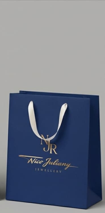
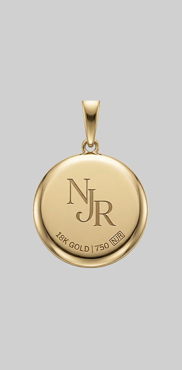
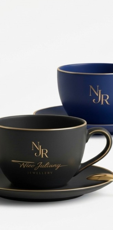
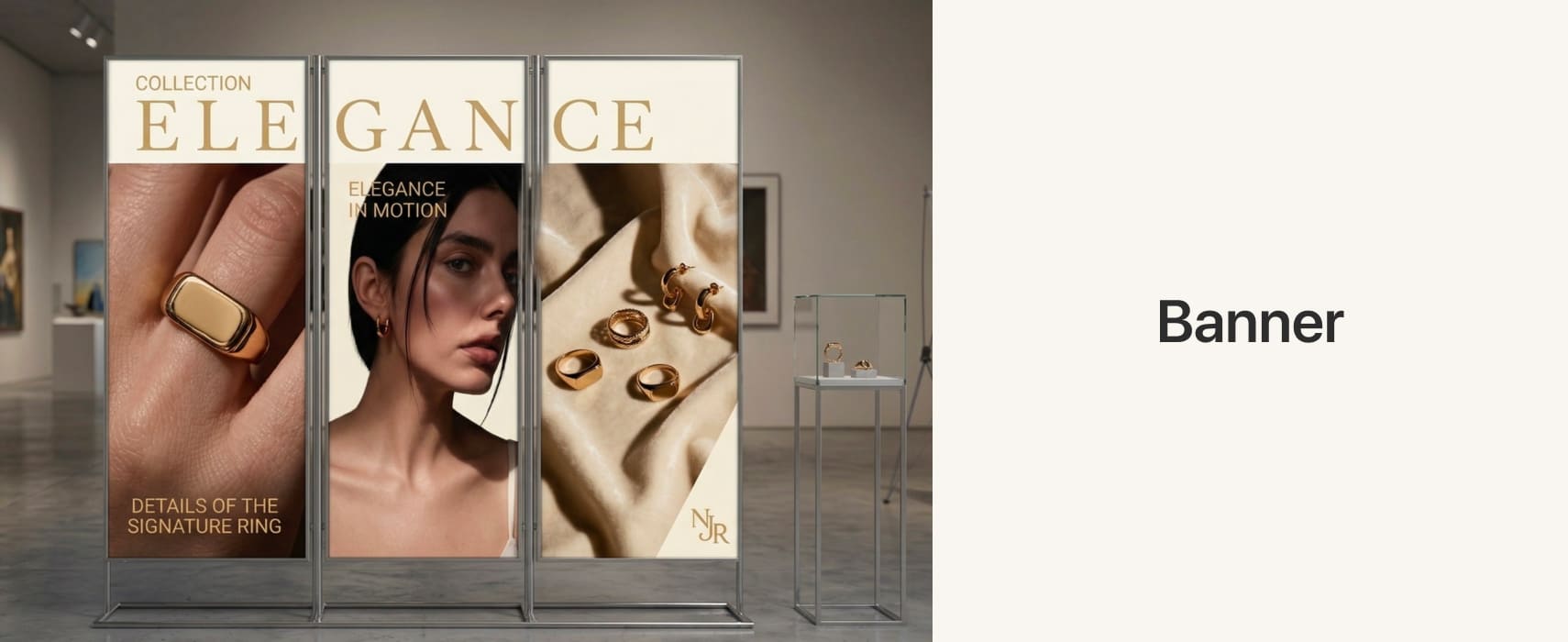
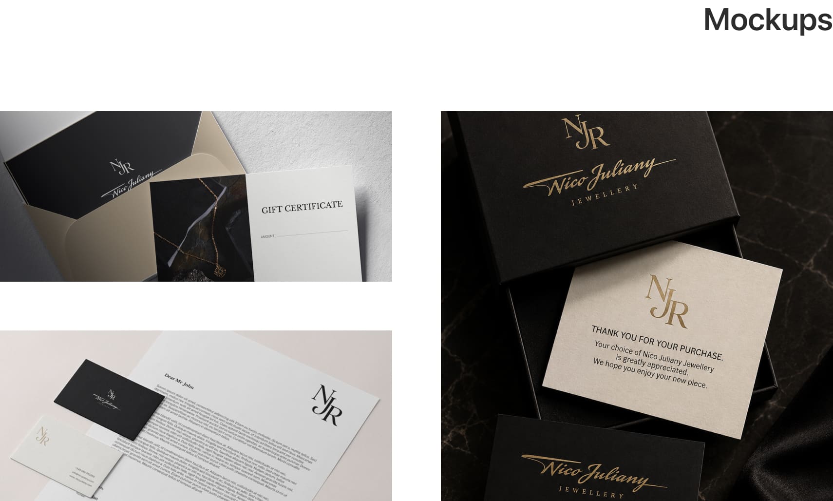
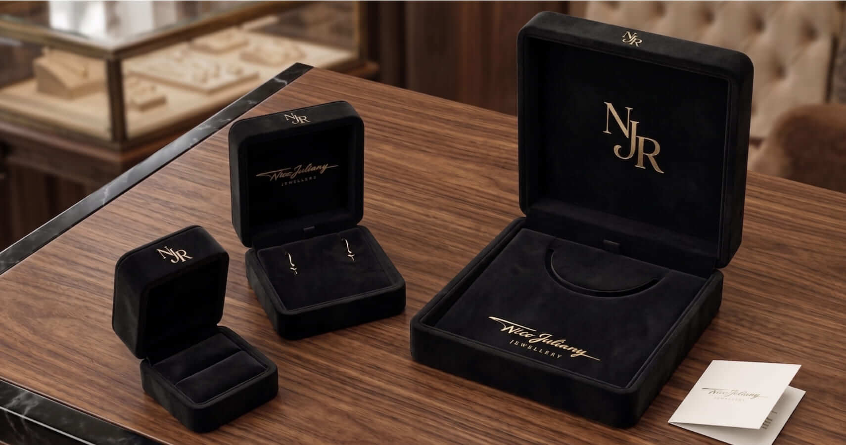
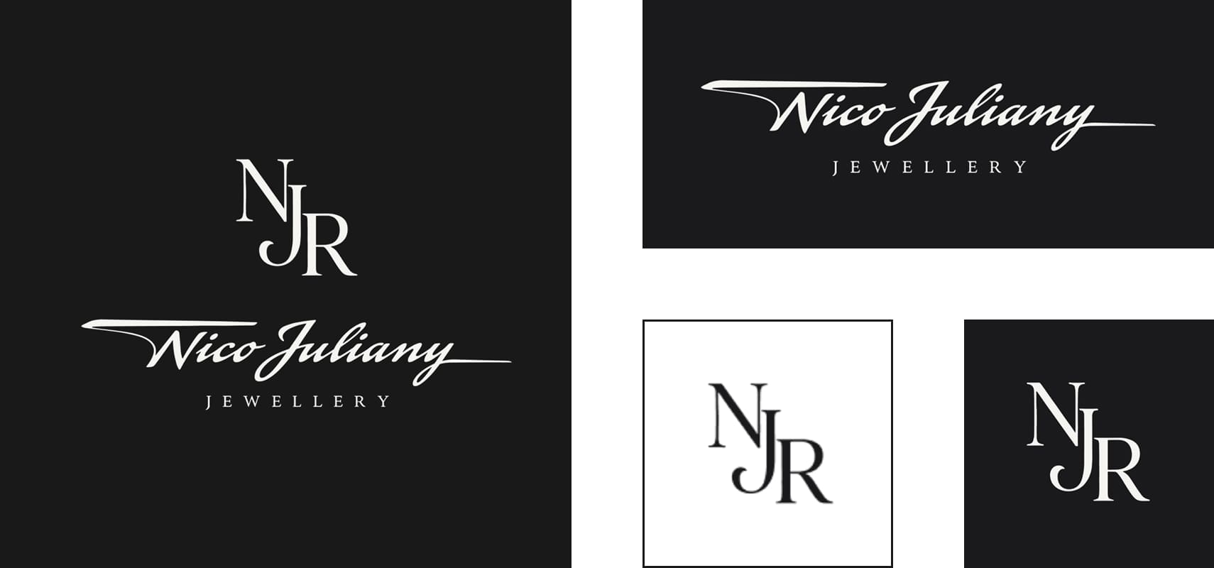
Two elements sit at the core of the brand. NJR, the mark of the jewelry house. Composed, precise, almost architectural. It can exist on its own easily: on packaging, on a piece itself, on a boutique sign, or on any small surface where the full name simply won't fit.

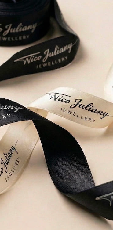
And the second element: Nico Juliany, a pen stroke. A dot. That stroke says a great deal about whoever left it. There is movement and freedom in the line, but that freedom is fully controlled. It is not accidental. It is a flow guided by a maker's hand.

Next to the precise NJR monogram, it creates exactly the right tension: one element provides structure, the other, life. One speaks of the house. The other, of the person standing behind it.
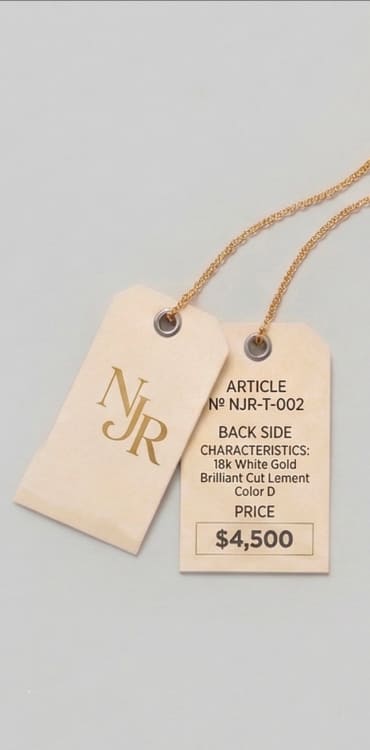
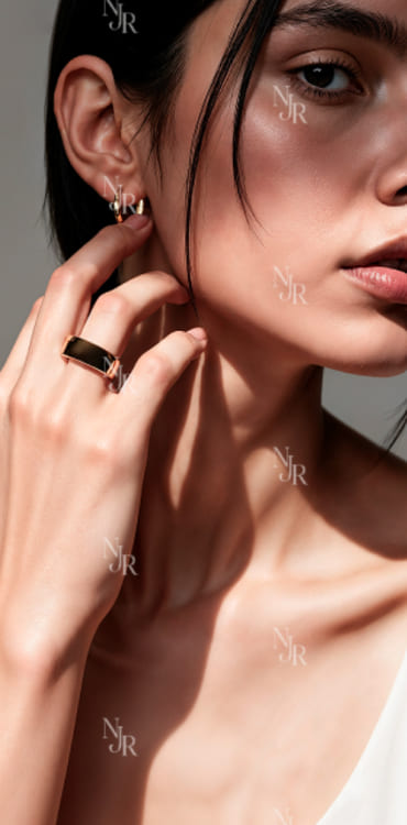
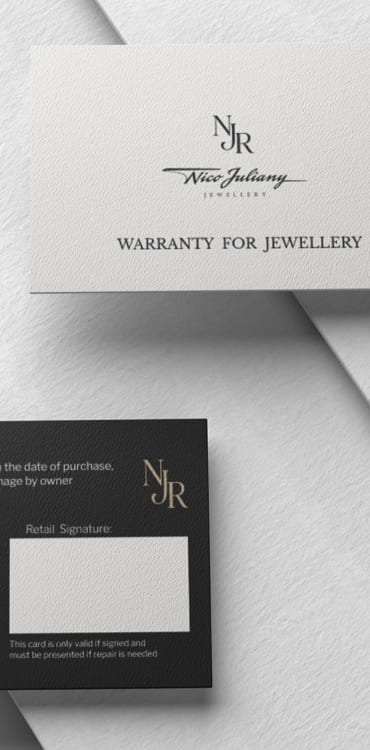
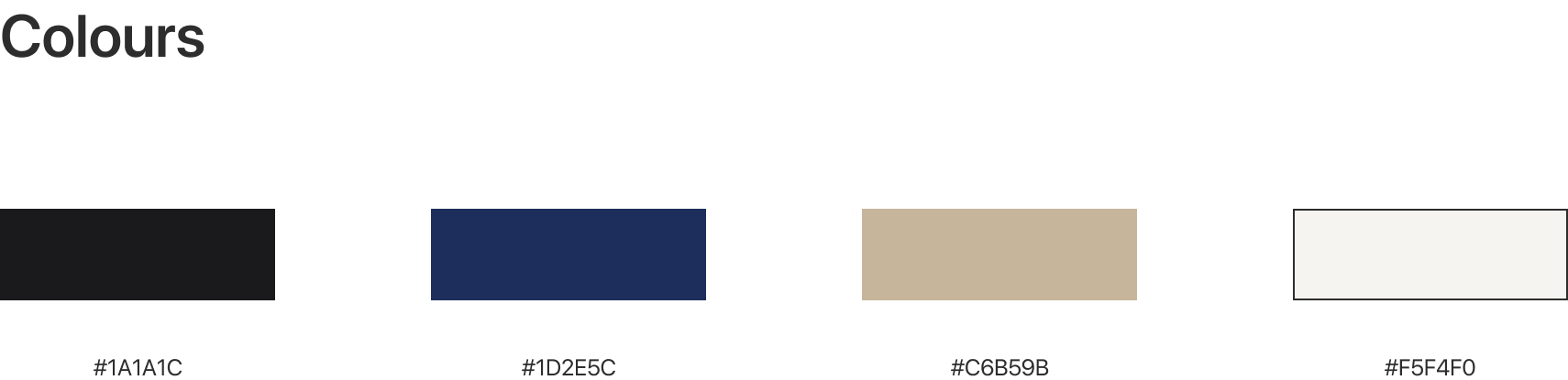
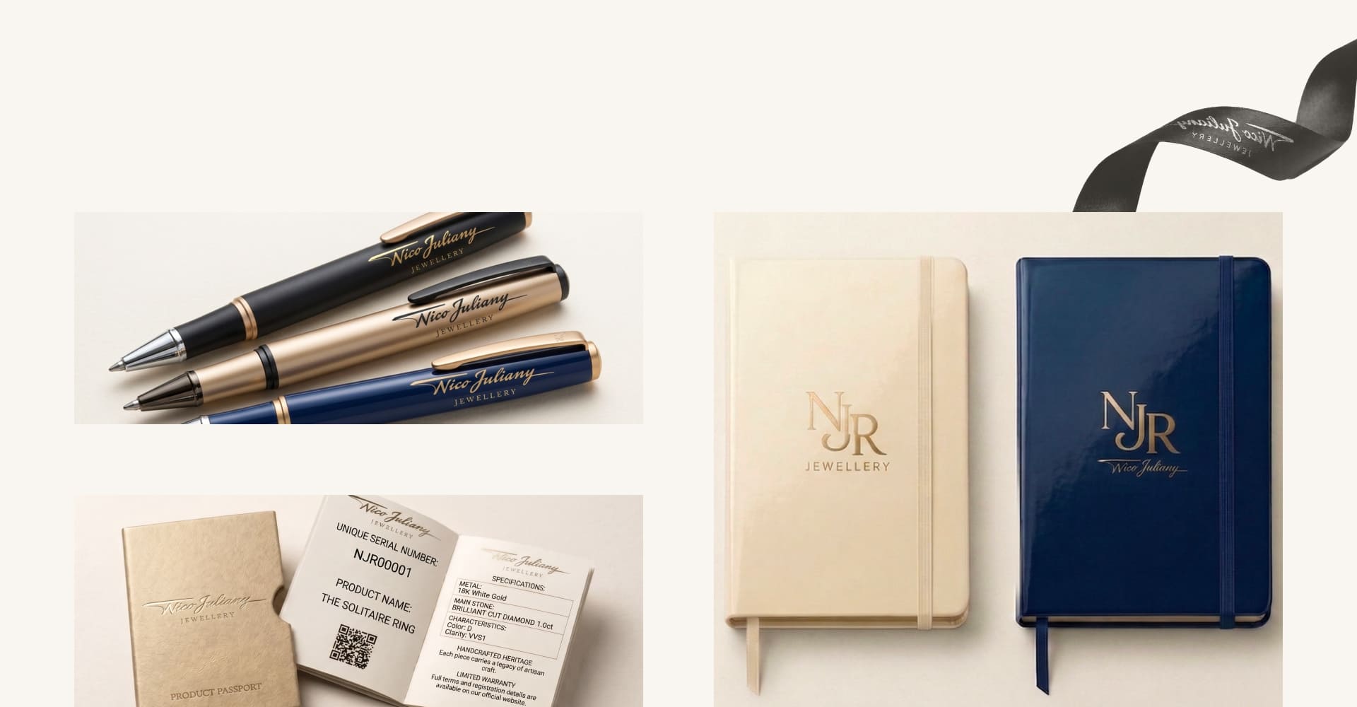
We looked at the system as far more than a screen from the start. Nico Juliany is a physical boutique, a piece of jewelry, a case, a certificate, a product passport, a business card, packaging, and countless other moments where a person meets the brand for the first time. A dark palette, deep black, a warm metallic accent, and a generous amount of open space create the environment the thing that matters most, the jewelry, needs.

Opening a Nico Juliany case, a person should feel the same aesthetic they saw in the boutique or on the site. A piece of jewelry is, in the end, an object that ends up in someone's hands, which is why the visual system also needed a certain tactility. Not just to look expensive, but to look like it carries the same level of craftsmanship as the jewelry itself.

The result is an identity where the strict monogram and the living stroke don't compete with each other. NJR, precision and the house. The stroke, movement and the maker. Not an attempt to build yet another "expensive" jewelry brand, but an attempt to show, through the simplest elements, the thing that is usually hardest to explain in words: quality that doesn't need explaining.

The Results

The two-character system gave Nico Juliany recognizability on several levels at once: the NJR monogram works on packaging and boutique signage where the full name won't fit, while the pen stroke carries the maker's personal, human trace. The identity exists naturally in both the physical boutique experience and the digital environment, without losing the tactility of the jewelry it represents.

Nico Juliany brand identity, application detail

This project extends the identity we have been developing for Nico Juliany since 2026, see how it lives on the brand's site in Nico Juliany E-commerce. Explore our Brand Identity services on the service page.