

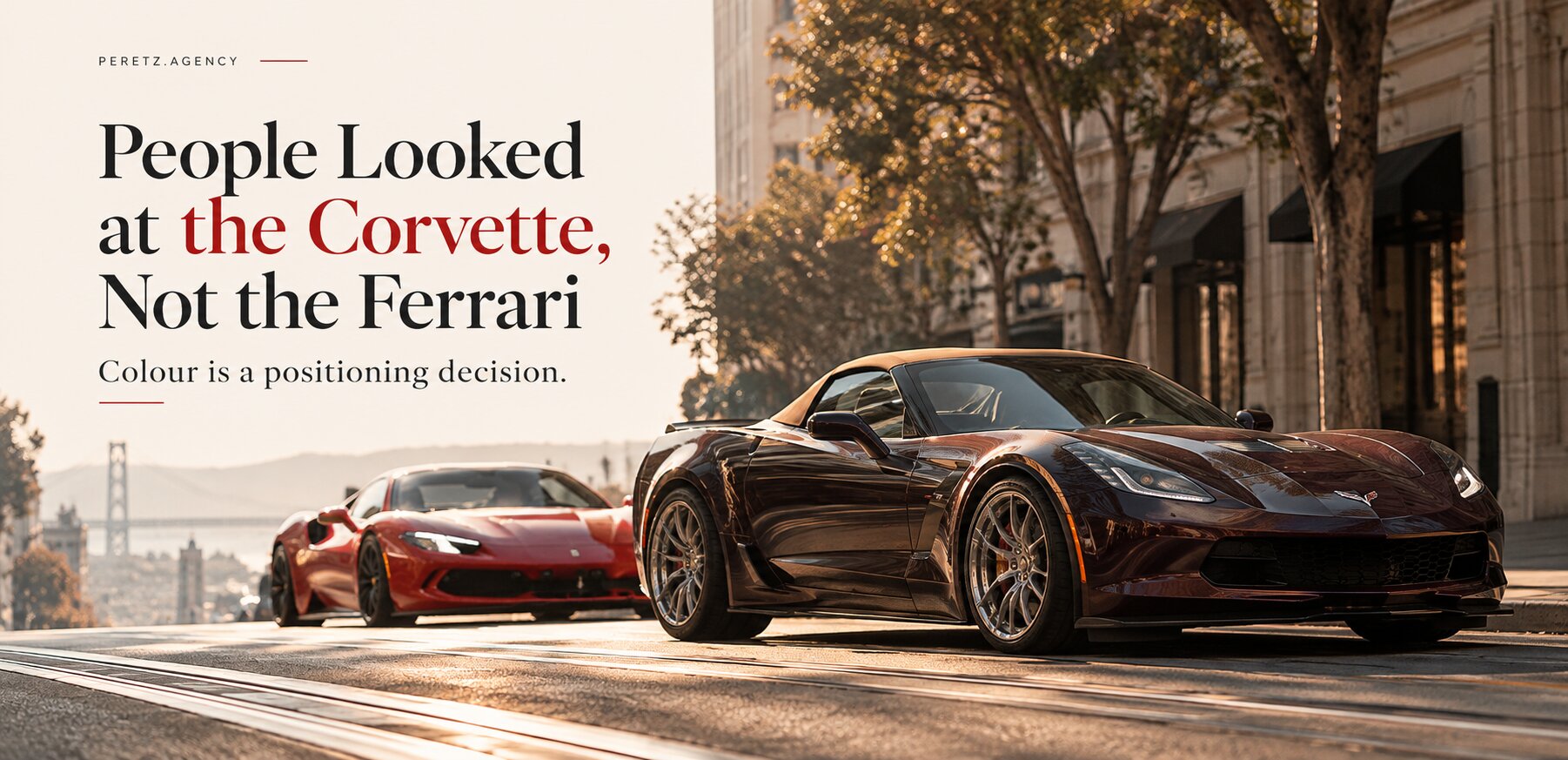
A walk down Market Street, three cars, and what they say about choosing a brand colour.
THE CORVETTE
The Corvette Nobody Expected
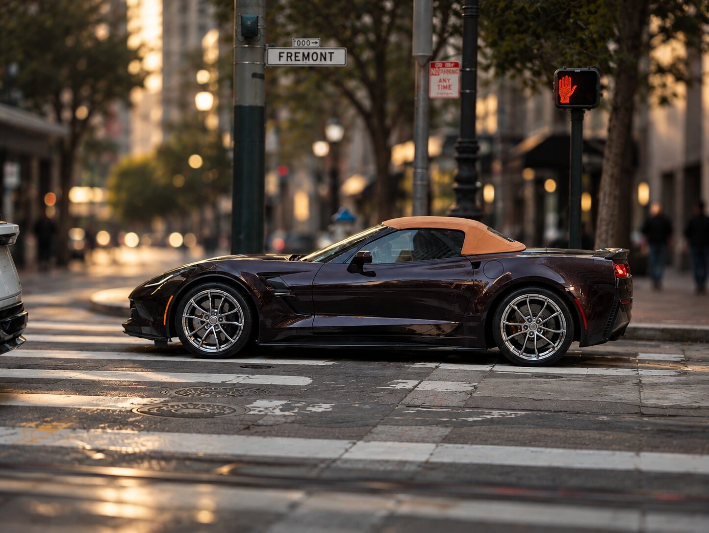
On a Sunday walk through San Francisco, at the corner of Market and Fremont, I stopped for a Corvette. That in itself is unusual for me. My neighbours and friends own several: one from 1967, another a current Stingray in full sports trim. I know these cars, and I have learned to see them as one thing: the loud, honest American sports car.
This one was a convertible from the previous generation, and it looked like a different car. The paint was a very dark burgundy, close to black in the shade, with a metallic depth that came alive in the sun. The soft top was camel, warm and pale. In that combination the Corvette stopped being a sports car and became something elegant and well bred, the kind of car you expect outside a good hotel rather than at a track day. Visually it was no longer competing with other Corvettes. It was competing with Aston Martin. Nothing about the shape had changed. The colour had moved it into another category.
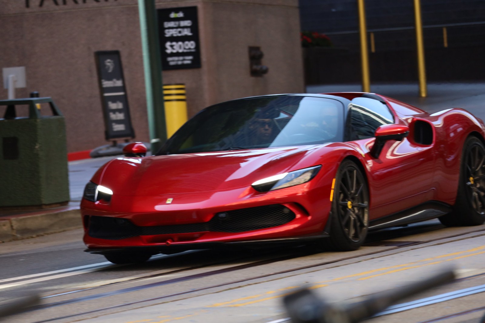
The same afternoon a red Ferrari went past on that street, by any measure the more exotic car and several times the price. A bright blue Lamborghini, all sharp edges, caused the biggest stir of the day, and there is no arguing with that: it is built to be stared at. But between the Ferrari and the Corvette, my wife and the people around us kept looking at the Corvette. That surprised me more than the car did.
The prices make it stranger still. A new Ferrari like that one starts at more than $370,000, about ten times what a used Corvette of this generation can cost. The Corvette is a car Americans love partly because you can still work on it in your own garage. The Ferrari got the attention its price buys, and not much more. The Corvette got something closer to delight, and it was not only mine: the people around us reacted the same way.
I design brands and websites for a living, so I spent the rest of the walk thinking about why.
In short
- A colour on its own decides little. Depth, finish, the second colour, proportion and even the name decide how a product is read.
- A colour can help people recognise a brand, win their attention, or change what they think the brand is.
- Owned colours such as Ferrari red and Tiffany Blue took decades of consistent use to build.
- On the nine luxury websites we measured, five buy buttons were black or near-black and brand colour lived in small details.
- Colour should be decided after the strategy and before the first screen, and checked for contrast.
CATEGORY
Colour Changes the Category
The Ferrari was exactly what you expect a Ferrari to be. I knew what it was before it reached the corner, and so did everyone else, so we looked and then looked away. The Lamborghini made sure nobody could ignore it; with a body like that and a blue that bright, subtlety was never the plan. The Corvette was more interesting, because its colour changed the kind of car I thought I was looking at.
If you asked what colour it was, "dark red" would be a fair answer and would explain nothing. The paint was dark enough to look almost black in the shade, with a metallic flake that shifted as you walked around the car. Against it sat a pale camel top in fabric: warm against cool, light against dark. The dark colour covered nearly everything and the camel was the smaller part. Reverse those proportions and you would have a different car.
As far as I can tell from my photograph, Chevrolet calls these colours Black Rose and Kalahari.
Nobody buys dark purple with beige. They buy Black Rose and Kalahari.
A brand's colour works the same way. It is never a single hex code. It is how deep the main tones are, how photographs and surfaces feel, how sparingly the accent is used, how much of the screen each colour takes, and what the brand calls things. Sometimes that combination helps people recognise a company, sometimes it wins their attention, and sometimes it changes what they think the company is.
Research points the same way in general terms. In a series of studies published in the Journal of the Academy of Marketing Science, Labrecque and Milne (2012) found that hue, saturation and lightness each shift how people read a brand, with blue linked to competence and red to excitement. That does not explain what happened on Market Street, but it does explain why "red" or "blue" alone is never the whole decision.
OWNED COLOURS
You Can't Own a Colour Overnight
Ferrari owns its colour so completely that a red Ferrari is the default picture of the car. That took a very long time. Italian racing cars were red from the early twentieth century, and Ferrari inherited the colour before it made it its own on the track. Even so, not every customer wants it: in 2015 the head of Ferrari Australia said red accounted for about 35 per cent of the cars sold there.
Tiffany first used its blue on the cover of its Blue Book in 1845 and registered it as a colour trademark in 1998. Christian Louboutin's red sole reached the US Court of Appeals for the Second Circuit in 2012, which protected it only where it contrasts with the rest of the shoe, and only because customers already linked it to the brand.
A newer business will not get there through a branding workshop. What it can own much sooner is a combination, used the same way everywhere for years.
BUSINESS
Which Car Is Your Business?
Neither car got its colour wrong. The Ferrari did exactly what Ferrari colour is supposed to do, and whoever ordered that Corvette made one of the best choices you can make with that car. They worked differently, and that difference is the useful part for a business.
Imagine the Ferrari in Black Rose with a camel top, parked next to the Corvette. I doubt it would look more expensive; I think it would look odd. Ferrari's world is red, yellow and black, perhaps silver, white, a deep blue or a bright green. Change the colour inside that world and the car stays itself. Its value lies in being recognised, and the brand has spent decades making sure it will be.
The Corvette comes in all of those colours too, and in most of them it is the car everyone expects. This one did something more interesting: it showed the same car in a different role. A new role is worth a great deal, because a role is what people pay for.
Most businesses are Corvettes, and that is an advantage.
Most of the businesses we work with are closer to the Corvette than to the Ferrari. They are good at what they do, their customers like them, and they have no century-old colour code to protect. That is an advantage. Borrowing the codes of the best-known brand in the category will not turn a company into it; next to the original, the copy simply looks borrowed. What a company can do is choose, deliberately, the combination that shows it in the role it wants to hold: more established, more personal, more premium or more expert. Whoever ordered that Corvette did not need a more expensive car. They needed the right colours, and they chose them.
LUXURY SITES
What We Found on Nine Luxury Websites
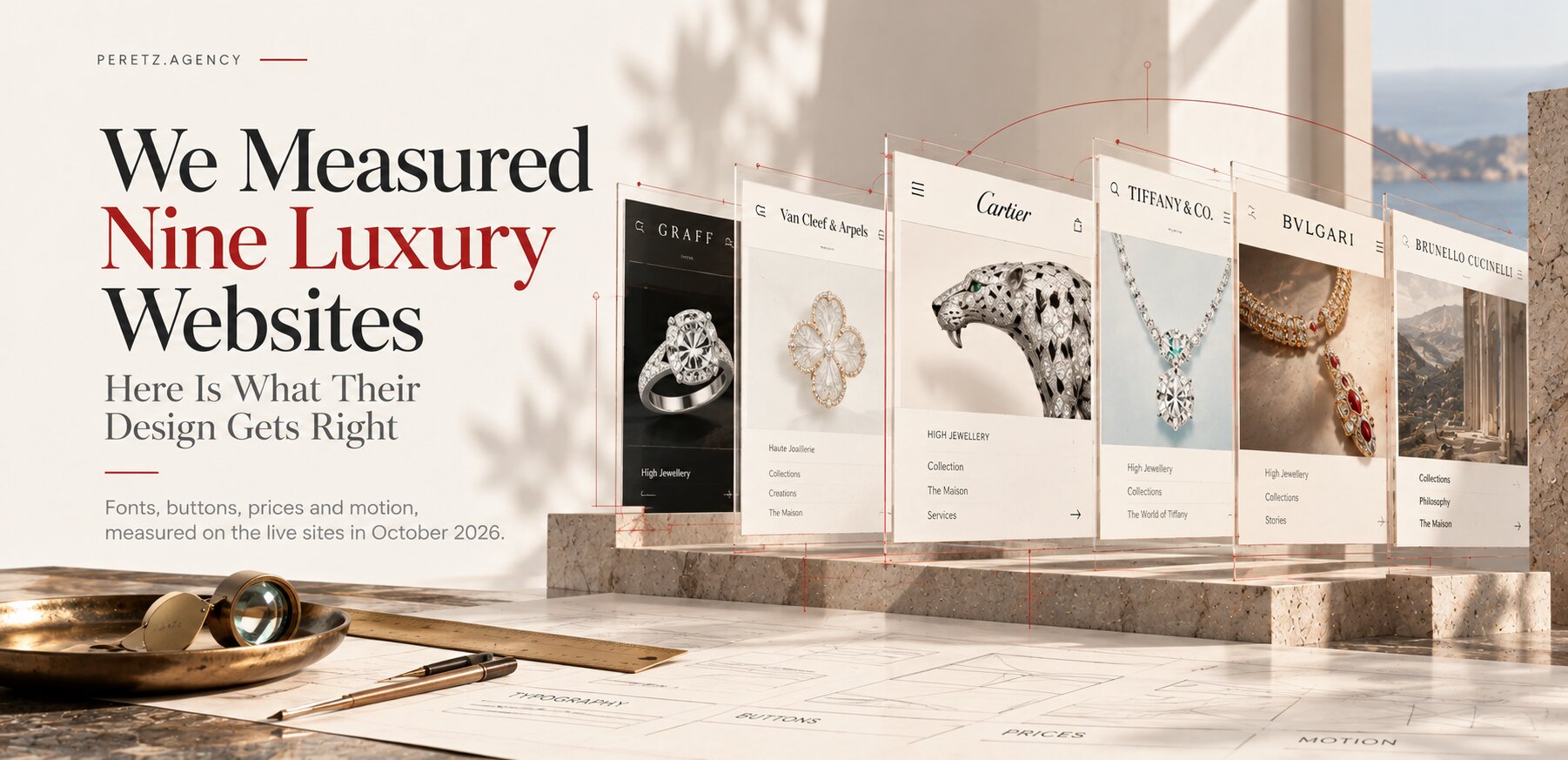
In October we measured nine luxury websites, from Cartier and Graff to Tiffany and Brunello Cucinelli, as part of the research for a pearl house whose new site we are building. We read every colour from the browser's computed styles.
| What we measured | What we found |
|---|---|
| Main buy button | Pure black (#000000) at David Yurman, Messika, Tiffany and Bulgari; near-black #1d1c1c at Cartier |
| Brand colour on the button | Two houses: Graff with a muted bronze, #897358; Mikimoto with a pale gold, #e5d3a9 |
| Where Graff uses its bronze | The buy button, the top bar and the chat bubble, nowhere else |
| Van Cleef & Arpels | ADD TO BAG as an outlined white button |
| Contrast | ORDER BY PHONE at Van Cleef & Arpels: black text on #222222, about 1.3:1 |
Five of the nine buy buttons are black or near-black. Graff's bronze appears in three places on the whole site. On these sites brand colour lives in small, important details, and large areas stay neutral so the photographs carry the colour.
Luxury sites keep colour small and let the photographs carry it.
The contrast figure is a plain accessibility problem. WCAG asks for at least 4.5:1 for normal text, and this is the button the house most wants pressed on its High Jewellery pages. The full study, with screenshots, is in We Measured Nine Luxury Brand Websites.
OUR METHOD
How We Choose Colour
At Peretz, colour is decided after the strategy and before the first screen. By then we know who the brand is talking to and what position it needs to hold.
First, decide what colour has to do: help people recognise the company, win attention, or change how it is seen. A clinic group that needs to look established has a different task from a new brand trying to stand apart.
Then look at the category: we collect the colours of the brands a customer will compare you with. Most categories have a habit worth knowing before you follow it or break it.
| Category | The usual colours |
|---|---|
| Banking and payments | Blue, navy, white (Chase, Citi, PayPal, Visa) |
| Luxury fashion and jewellery | Black, white, one metallic or signature accent |
| Clinics and healthcare | Blue, teal, white |
| Organic food | Green, earth tones, kraft |
| Fast food | Red and yellow (McDonald's, Burger King) |
Habits have exceptions: Wells Fargo is red and gold, and it is one of the largest banks in the United States.
Decide the combination: base, accent, proportion, depth and finish, tested on real photography and on a phone outdoors, where colours look different from a designer's monitor.
Check contrast: every text and button against its background, at 4.5:1 or more for normal text.
Finally, name the colours: names that describe the intent help a team use them the same way long after launch.
Our own palette is a warm off-white, #F9F5F0, instead of pure white; a soft black, #2E2E2E, instead of #000000; and one red, #BE2E24, kept for the few things that matter. What makes it work is how little red there is. If you are building a brand from scratch, our brand identity work starts with the same five steps.
The mistakes we see most often:
- Brand colour poured over whole sections, until the signature turns into wallpaper.
- A palette chosen from a mood board or a founder's favourite colour, with no look at the category.
- A competitor's hex code copied, which copies one decision out of several and lands you next to them.
- A new palette with every redesign, which throws away the recognition that repetition builds.
- Accent colour on everything clickable, so the main action gets lost.
FAQ
Frequently Asked Questions
Does colour psychology really work?
Partly: associations such as blue with competence and red with excitement show up in research, but they shift with saturation, lightness, culture and category. A colour on its own decides less than the combination and how consistently it is used.
Should a brand follow its industry's colour code?
Follow it when you need to look safe and familiar; break it when you need people to see you differently. If you break it, do it with a coherent combination, or the result reads as noise.
Can a small business own a colour?
Rarely in the legal sense, which took Tiffany and Louboutin decades. What a smaller brand can own is a recognisable combination used the same way everywhere for years.
How many colours should a brand palette have?
Usually a base, a dark, a light and one accent, plus functional colours for errors and confirmations. The fewer colours carry meaning, the stronger each one becomes.
Do luxury brands avoid colour?
On their websites, mostly yes: in our measurement of nine luxury sites, most buy buttons were black and only two houses used their own colour on the button, Graff and Mikimoto.
Sources
- Labrecque and Milne, 2012: Exciting red and competent blue: the importance of color in marketing. Journal of the Academy of Marketing Science, 40(5), 711 to 727. doi:10.1007/s11747-010-0245-y
- Wikipedia: Rosso corsa
- CarsGuide, 7 August 2015: Red no longer the favourite Ferrari colour
- Wikipedia: Tiffany Blue
- Loeb & Loeb: Second Circuit rules that a single color can be a trademark (2012)
- Corvette Action Center: 2017 Corvette Grand Sport in Black Rose Metallic
Choosing a colour for a new brand, or wondering why your current one stopped working? Start with the strategy behind it.
- Share
-

-

-

-