

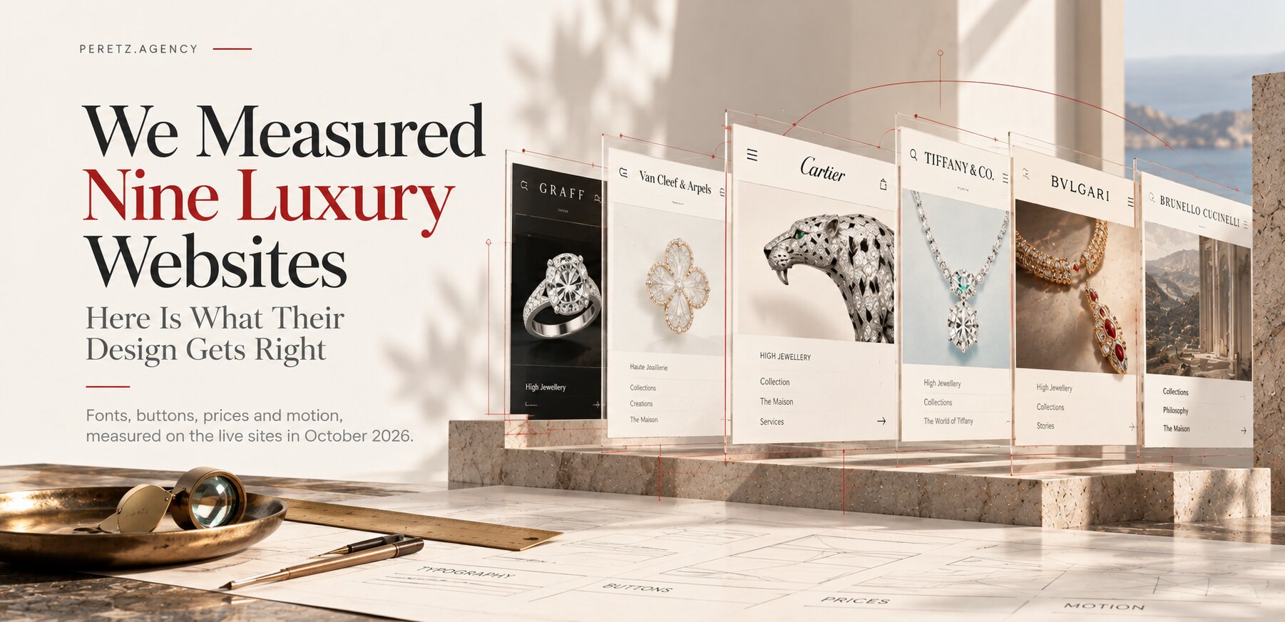
Fonts, buttons, prices and motion, measured on the live sites in October 2026.
METHOD
Measured, Not Admired
Every designer has an opinion about luxury websites. Most of those opinions are formed the same way: you open Cartier or Van Cleef & Arpels, scroll for a minute, feel something expensive, and leave with an impression. I wanted something more useful than an impression, so this time we measured.
On the night of 9 to 10 October 2026 our team opened nine jewellery and luxury websites: Cartier, Graff, Van Cleef & Arpels, Tiffany & Co., Bulgari, David Yurman, Messika, Mikimoto and Brunello Cucinelli. We used the US storefronts, a desktop window of 1440 by 900 pixels and a phone screen of 390 by 844. For each brand we looked at the home page, a category, a regular product and, where it exists online, a High Jewellery piece. Non-essential cookies were refused, nothing was added to a bag, no forms were sent. Fonts, colours, button shapes and animation times were read from the browser's own computed styles, so every number below is what the site actually renders on that date, not what it looks like it renders.
Five of the nine sites refused an automated browser outright and had to be opened by hand in a regular one, which tells you something about how seriously these houses guard their pages. Bulgari let us see six pages and then closed the door.
This measurement did not start as a blog post. Before we design anything, we study the market the site will live in, and this pass is one part of the full research for Schoeffel, the pearl house founded in 1921, whose new website we are building. Earlier in October we reviewed thirteen jewellery and luxury sites for its architecture, five of them pearl specialists; here we went back to the big houses and measured them. We describe how that kind of research shapes a project in The Website Design Process Most Agencies Show You Is Wrong.
In short
- Five houses handle the price of High Jewellery in five different ways, from "Price on application" to a $250,000 necklace with an ADD TO CART button.
- Luxury is fast. Most buttons change state in 0 to 0.5 seconds; the calm comes from space and stillness, not from slow motion.
- Six of eight buy buttons have perfectly square corners, and almost all of them are black.
- The usual type pairing is a serif for names and a sans for the interface. Cartier turns it upside down.
- Even the best make basic mistakes: a button with a contrast ratio of 1.3:1, a 19.9 MB home page, chat bubbles sitting on top of the buy button.
THE PRICE
Five Houses, Five Answers to "How Much?"
The most interesting design decision on a luxury site is not a font or a colour. It is what happens next to a piece that costs as much as an apartment. We compared the High Jewellery product pages and found five different answers.
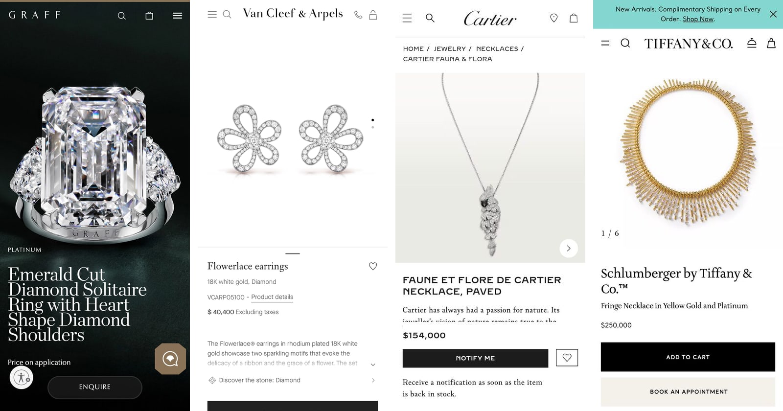
Graff hides the price. The emerald-cut solitaire shows the words "Price on application" and no bag at all. Instead, a fixed bar at the bottom of the screen offers three ways to talk to a person: ENQUIRE, APPOINTMENT BOOKING and ORDER BY PHONE. The same site sells a $4,300 pendant with an ordinary ADD TO BAG button, so the switch from shop to salon is deliberate.
Van Cleef & Arpels shows the price but not the bag. The Flowerlace earrings are listed at "$ 40,400 Excluding taxes", and the only way to buy them is ORDER BY PHONE. You are allowed to know the number; you are not allowed to click it into a cart.
Cartier shows the price and keeps the shop logic. A necklace from the Faune et Flore line, listed in the High Jewelry section, shows $154,000 in the same fixed bar as a $2,830 pendant. It happened to be out of stock, so the main button read NOTIFY ME.
Tiffany sells it like a pendant. The $250,000 Schlumberger necklace from the High Jewelry selection uses exactly the same product template as the $1,900 Tiffany Knot: ADD TO CART in black, BOOK AN APPOINTMENT underneath, FIND IN STORE.
Bulgari doesn't have a product page at all. The Eclettica High Jewelry collection is an editorial page 11,470 pixels tall, with eight videos, no prices and a "Contact an expert" form at the very end.
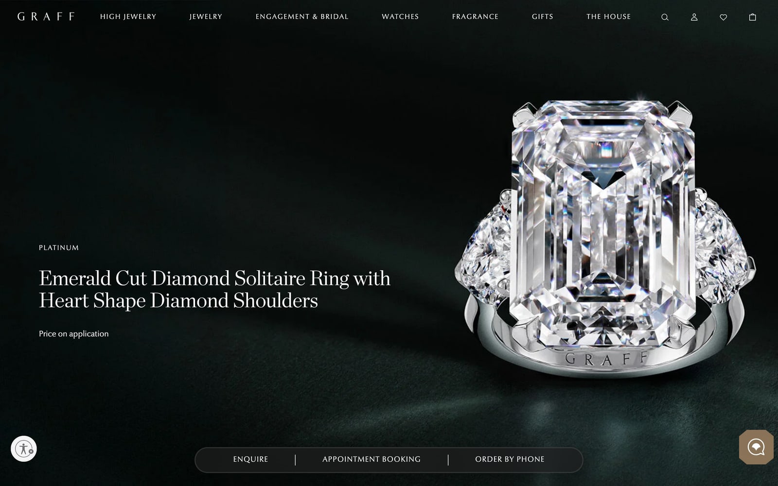
None of these is wrong. Each is a statement about the relationship the house wants. Graff and Bulgari say that a piece at this level begins with a conversation. Van Cleef & Arpels is transparent about value but keeps the purchase personal. Cartier and Tiffany treat the website as a real shop at every price. The design lesson is that the price decision has to be made before the page is drawn, because it changes the template, the buttons and the mobile bar.
At this level, the price is a design decision, not a data field.
MOTION
Luxury Is Not Slow
I expected the measurements to confirm a cliché: expensive sites move slowly. They don't.
On Van Cleef & Arpels every button we measured changes state instantly, with a transition of 0 seconds. David Yurman uses 0.15 seconds, Mikimoto 0.15, Bulgari 0.2, Graff 0.3, Messika and Tiffany 0.4, Cartier 0.5 on its buttons and fades. The longest animation we found anywhere was the 0.5-second fade Van Cleef & Arpels uses as product photographs appear. Most links on most sites have no transition at all.
So where does the sense of calm come from? From what the pages refuse to do. The first screens carry very few words: 28 on Cartier's home page, 34 to 38 on Van Cleef & Arpels and Messika. Photographs get the whole width. Nothing blinks for attention. A site can respond in a tenth of a second and still feel unhurried, because the stillness is in the layout, not in the easing curve.
That changes how we brief motion for our own premium projects. We keep animation for the moments that deserve it, such as a product photograph arriving or a page opening, and we let buttons answer the hand immediately.
BUTTONS
Square Corners and a Black Button
If you want to know what a luxury buy button looks like in 2026, the numbers are almost unanimous.
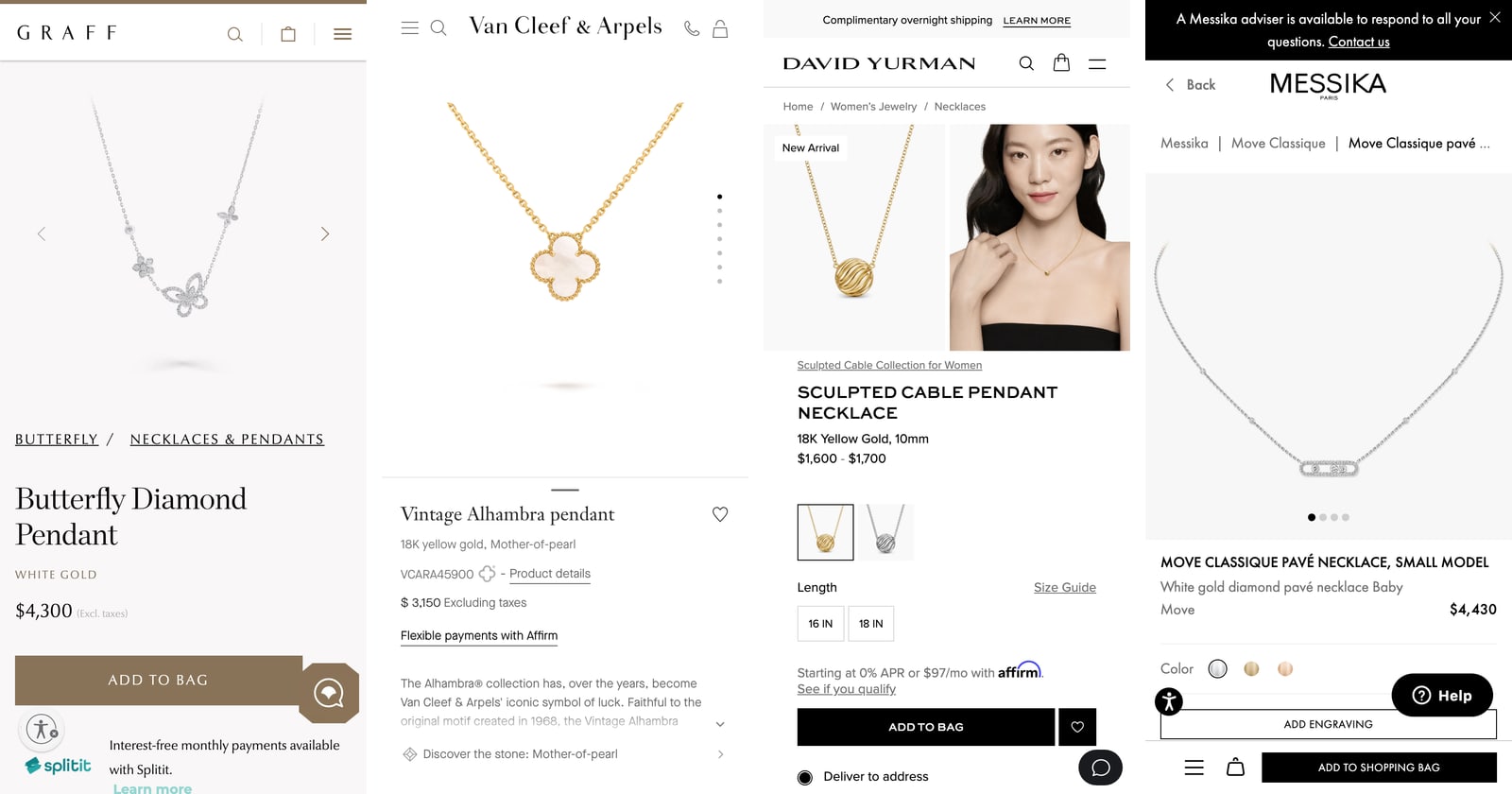
The main purchase button has a border radius of exactly 0 at Graff, Van Cleef & Arpels, David Yurman, Messika, Cartier and Tiffany & Co. Only Bulgari rounds it, by 3 pixels, and Mikimoto by 4. The pill-shaped button that dominates mainstream e-commerce does not appear as a primary action on any of the nine sites.
Colour follows the same discipline. David Yurman, Messika, Tiffany and Bulgari use pure black (#000000), Cartier a near-black #1d1c1c. Only two houses put their own colour on the button: Graff a muted bronze, #897358, also used for its top bar and chat bubble; Mikimoto a pale gold, #e5d3a9, with a darker gold border. Van Cleef & Arpels does something quieter still: ADD TO BAG is an outlined white rectangle.
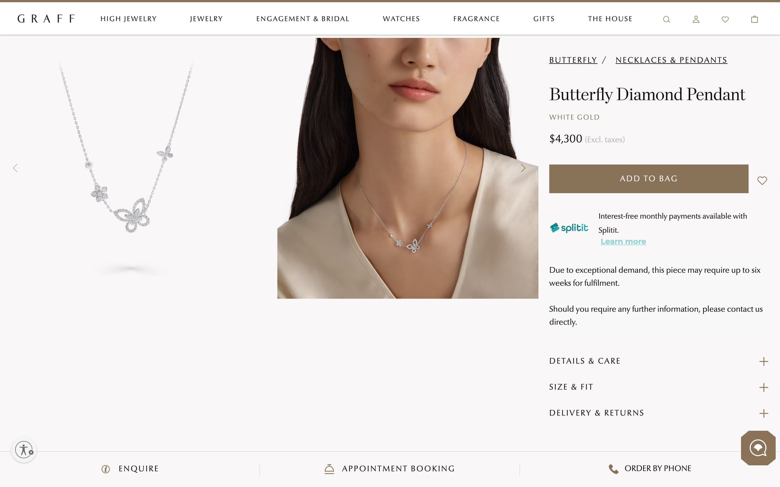
What these choices have in common is restraint with a single exception. A house allows itself one strong element, a black block or a bronze one, and keeps everything else neutral so the eye knows where to go.
TYPE
A Serif for the Name, a Sans for the Rest
Four houses use the classic luxury pairing: a serif display face for product names and headings, a sans for the interface. Graff sets product names in ChronicleDisplay at a very light weight of 200 (32 px on a product, 38 px on High Jewellery) with Optima Nova for text and navigation. Van Cleef & Arpels uses Janson Text at 45 px on its home and category pages and Maison Neue at 13 px for everything you click. Tiffany pairs the serif Sterling SSM, tightened with negative letter-spacing, with the sans Santral. Mikimoto uses Cormorant Garamond.
Cartier reverses the roles. Product names, prices, navigation and buttons are set in Brilliant Cut, a sans at weight 600 in capitals, while the serif Fancy Cut appears only in descriptions. The effect is architectural rather than romantic, and it is instantly recognisable.
Two houses use a single family for everything: Messika with Futura PT, where the price is the only bold text on the product page, and Bulgari with its own Bulgari Type at a light weight of 300.
The way prices are set says as much as the fonts. Tiffany prints $1,900 and $250,000 at 13 px, the same size as body text, as if the number were a detail. Mikimoto sets the price in its serif at 28 px, exactly the size of the product name. Bulgari and Mikimoto show cents ($3,950.00), Graff, Van Cleef & Arpels and Bulgari add "excluding taxes" next to the figure. None of this is accidental: the size of a price is a statement about how comfortable the brand is with it.
FIRST SCREEN
One Image, or a Moving Show
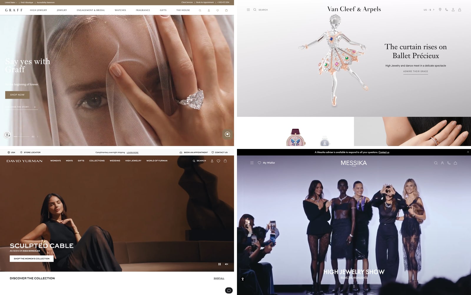
The home pages split into two camps. Graff, Cartier, David Yurman and Messika open with video. Graff's first screen is a video slider whose headline changed between our two visits ("Say yes with Graff", then "Diamonds Take Flight"); in one capture the white headline sits on a pale veil and nearly disappears. David Yurman's autoplay video at least carries visible pause and mute controls, a small courtesy most sites skip.
Van Cleef & Arpels and Brunello Cucinelli do the opposite. Van Cleef & Arpels gives the first screen to a single piece, a jewelled ballerina, with a two-line headline and one text link. Cucinelli uses one full-width campaign photograph and two text links. These are the screens that feel most expensive, and they are also the simplest to build and the fastest to understand.
One subject per screen is still the strongest luxury layout. Video can work, but it hands the first impression to whatever frame happens to be playing when the visitor arrives.
A single piece on a quiet screen still looks more expensive than a show.
MISTAKES
Where Even the Best Get It Wrong
The measurements also caught things that would fail a basic design review at any agency, including ours.
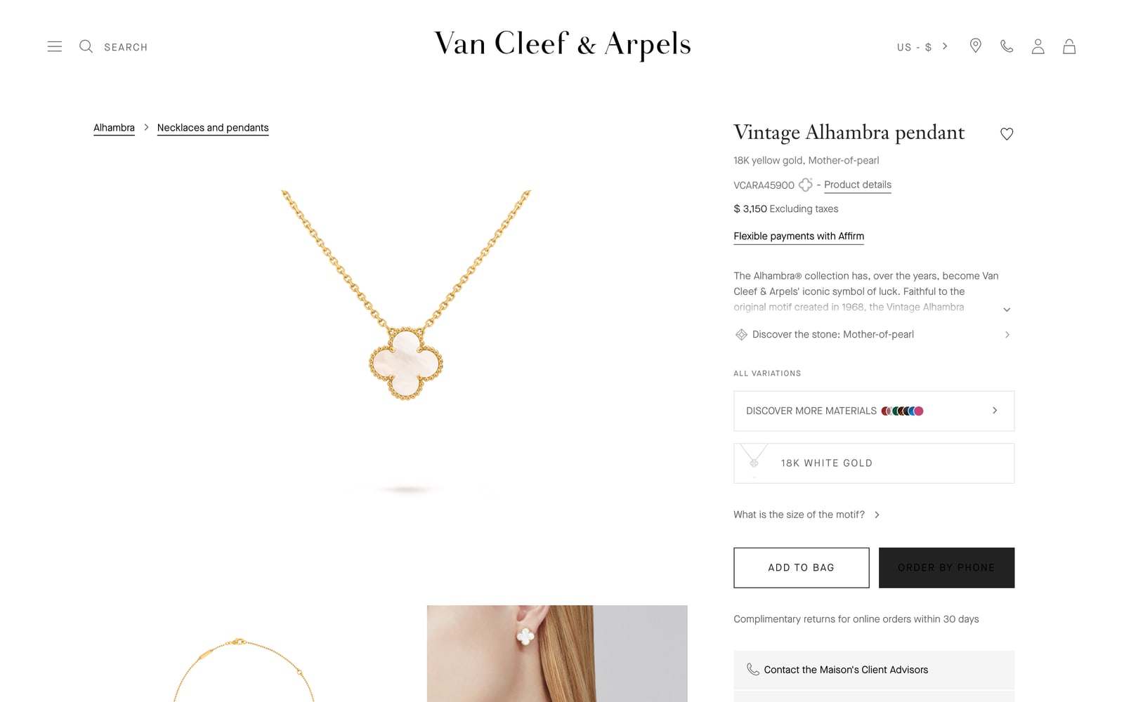
Contrast. Van Cleef & Arpels sets ORDER BY PHONE in black text (#000000) on a near-black button (#222222). The contrast ratio is about 1.3:1; the accessibility guidelines ask for at least 4.5:1 for text this size. On the screen the label is barely there. It is the button the house most wants you to press on High Jewellery.
Weight. Graff's home page transferred 19.9 MB on a first visit, Van Cleef & Arpels 15.7 MB. David Yurman's was 5.5 MB but needed 287 separate requests. On a phone in a hotel lobby, that is the difference between seeing the campaign and seeing a grey rectangle.
Things on top of the buy button. On a 390 px phone, Graff's chat bubble overlaps ADD TO BAG, Messika's "Help" button covers part of ADD ENGRAVING, and Mikimoto's accessibility widget sits over the left end of its fixed ADD TO BAG bar. Each of these widgets was probably added by a different team at a different time, and nobody looked at them together on a small screen.
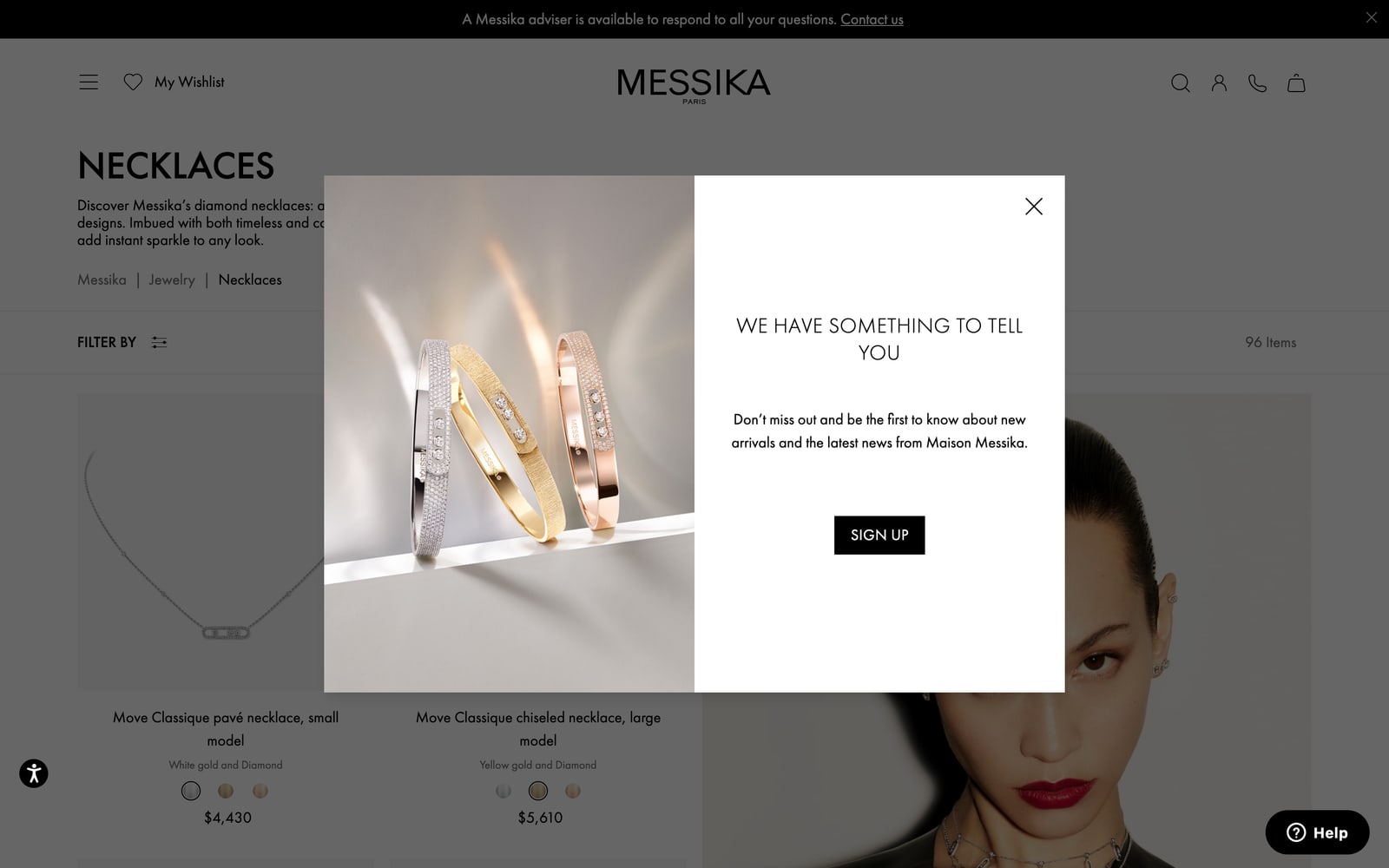
Interruptions. Messika opened a newsletter pop-up over the category and product pages a few seconds after we had refused cookies.
Structure. Five of the nine home pages have no visible h1 heading at all, and Brunello Cucinelli's h1 exists but is empty. Mikimoto's mobile category tiles show internal stock codes such as "U___16W_CFG" next to the product names. None of this is visible in a design mockup, which is exactly why it survives.
SERVICE
The Person Behind the Page
Every one of the nine sites tries to put a human being within reach, and the ways they do it are worth studying. David Yurman runs a utility bar on every page with BOOK AN APPOINTMENT and CONTACT US, plus an "At your service" section on the home page. Messika keeps a black bar on top: "A Messika adviser is available to respond to all your questions." Cartier places CONTACT AN AMBASSADOR and BOOK AN APPOINTMENT as quiet text links under the buy button. Tiffany and Mikimoto put a small service bell next to the bag in the header. Brunello Cucinelli has gone furthest, with a fixed "AI Boutique" button on every page.
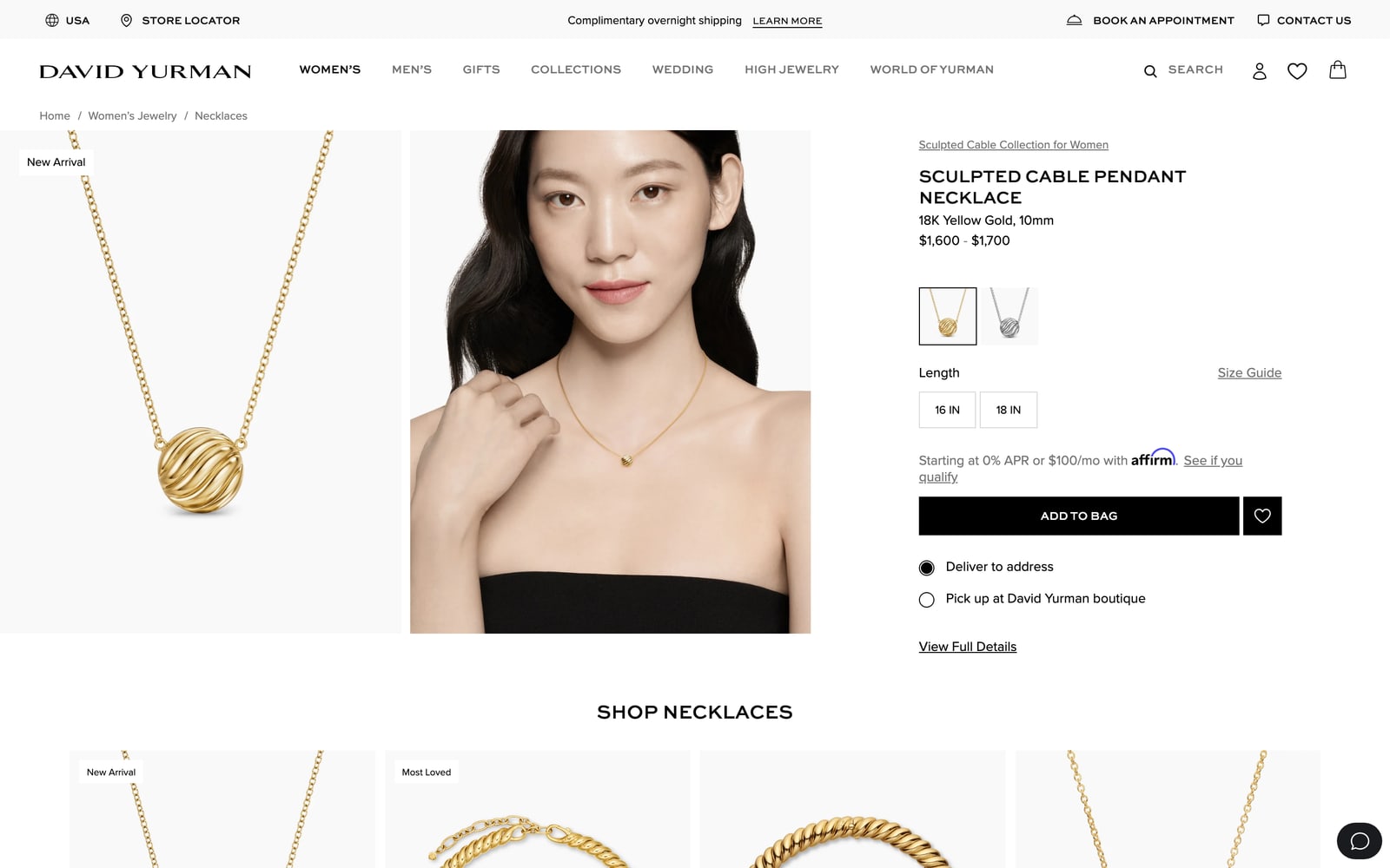
Payment has also become part of the luxury interface. David Yurman, Messika and Mikimoto show monthly instalments through Affirm under the price, Graff offers Splitit, and David Yurman lets the customer choose between delivery and pick-up at a boutique on the product page itself. The most luxurious sites are no longer the most distant ones; they are the ones that make it easy to reach a person and easy to pay.
OUR RULES
What We Take, and What We Don't
The point of measuring was never to copy anyone. It was to decide what to carry into our own work, starting with Schoeffel, where these findings went straight into the architecture before any visual design. Here is where the measurements left us.
We take:
- One subject per screen on the first view, with very few words.
- A serif for names and numbers that matter, a calm sans for everything you click.
- Square or nearly square buttons, one strong colour for the main action, everything else quiet.
- A decision about price for every price level before the first template is drawn.
- A person within one tap on every page, without covering the buy button.
We don't do:
- Carousels and autoplay sliders as the first impression.
- Pill-shaped buttons as the main call to action outside the checkout.
- Brand colour poured over whole sections instead of placed in details.
- Floating widgets nobody has checked together on a 390 px screen.
- Home pages that weigh more than the campaign video is worth.
Design like this is less about invention than about discipline: deciding what the page will not do. We wrote about the same principle from the visitor's side in Design You Don't Notice. If your brand sits in this world, our UI/UX design work starts with exactly this kind of measurement of your market.
Luxury on screen is mostly the discipline of leaving things out.
FAQ
Frequently Asked Questions
Should a luxury website show prices?
It depends on the relationship the brand wants. In our sample Graff and Bulgari hide High Jewellery prices, while Van Cleef & Arpels, Cartier and Tiffany show them. What matters is deciding per price level and designing the page around that decision: a hidden price needs a strong enquiry path, a visible one needs a clear way to buy or call.
Which fonts do luxury jewellery websites use?
Most pair a serif for product names with a sans for the interface: ChronicleDisplay and Optima Nova at Graff, Janson Text and Maison Neue at Van Cleef & Arpels, Sterling SSM and Santral at Tiffany. Cartier reverses the pairing, and Messika and Bulgari use one family throughout.
Do luxury websites use slow animations?
Not on the sites we measured. Button transitions ranged from 0 seconds at Van Cleef & Arpels to 0.5 seconds at Cartier. The calm feeling comes from space, few words and one subject per screen.
What is the most common mistake on luxury websites?
In our sample, the details nobody reviews together: low contrast on an important button, very heavy home pages, and chat or help widgets covering the buy button on phones.
Sources
Measurements taken by Peretz Agency on 9 and 10 October 2026 (US storefronts, 1440 × 900 desktop and 390 × 844 mobile, computed styles). Pages measured:
- Graff: High Jewellery ring, Butterfly pendant
- Van Cleef & Arpels: Flowerlace earrings, Vintage Alhambra pendant
- Cartier: Faune et Flore necklace, Love pendant
- Tiffany & Co.: Schlumberger necklace, Tiffany Knot pendant
- Bulgari: Eclettica High Jewelry, Divas' Dream necklace
- David Yurman, Messika, Mikimoto, Brunello Cucinelli: home, category and product pages of the US storefronts
- W3C: Understanding contrast (minimum), WCAG 2.2
Building a website for a premium brand? Let's start with your market and your customer.
- Share
-

-

-

-