What Is Product Design? A Product Has to Be Useful, Profitable and Wanted



I drew turbine casings at Turboatom, took my first iPhone back to the shop, and sold every piece of a leather goods line that never became a business. This is what those things taught me about why a product gets wanted.
IN SHORT
The short answer
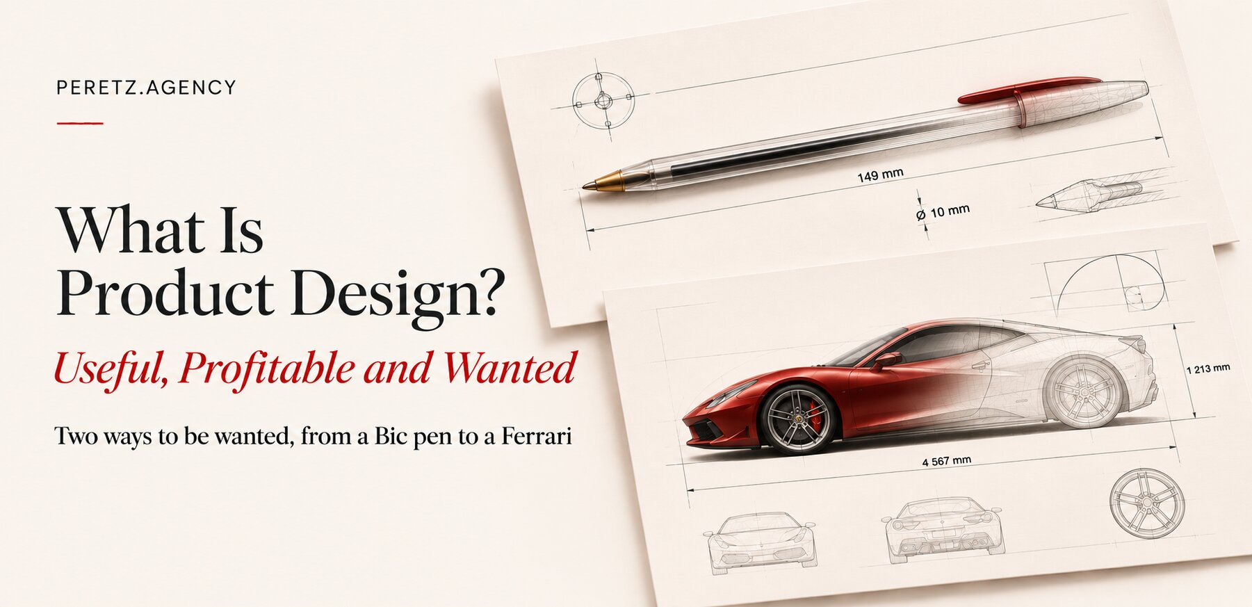
Product design is the work of creating a functional, useful product that also succeeds commercially, and to succeed commercially it has to be wanted. People want things in two very different ways. A Ferrari is wanted with passion. A Bic pen is wanted because it is cheap and does not let you down, and it is a historic success too. Weak products usually come from nobody deciding which of the two they were building.
That is wider than web design and wider than an interface. IDEO names the same three questions as lenses: desirability, feasibility and viability. I agree with all three. What I want to add comes from my own hands and my own money: the word "desirable" hides two different jobs, and they ask for opposite decisions. Where the screen stops and the product begins is a separate subject, and we covered it here.
To be honest, in our own articles we were wrong to go almost entirely into web design. Product design is a different scale, and I know it from more than websites: from metal, from leather, and as a buyer with my own money. So the things you can hold come first here, and screens only after them.
TWO WAYS
Two ways to be wanted
Take the Bic Cristal. Bic launched it at the end of 1950 and says it has sold more than 120 billion, the company's own figure. It has a place in the permanent collection of MoMA. Nobody dreams about one. You buy it because it costs almost nothing and it writes.
The Kalashnikov belongs in the same column, and I mean this purely as engineering. The Small Arms Survey estimates 76 million rifles of the type and calls them very durable. Its reputation rests on working in dirt, in the hands of someone with little training, and that is the whole of its appeal. Commercially and historically, few products have gone further.
Now put a Ferrari next to them. It is expensive to run, impractical, loud, and bought with the heart. Its buyer would be insulted if you praised its value for money. Both columns contain great products, and the mistake is to borrow from the wrong one.
Notice that both columns are desire. The person picking up a Bic wants it too, and what they want is exactly this: cheap and no surprises. The cheap pen stands next to the Ferrari in earnest. Their makers were solving different problems, and each object did its own job superbly.
| Wanted with passion | Wanted for price and reliability | |
|---|---|---|
| What the buyer feels | I want that object | I will never have to think about it |
| Examples | Ferrari, MacBook, Hardgraft | Bic Cristal, Kalashnikov |
| What design protects | Feel, materials, character | Cost, simplicity, no failures |
| What kills it | A neutral object that stirs nothing | A higher price or one bad failure |
| On a screen | A brand or a product people show to others | A checkout, a CRM, a booking form |
Most companies do not choose. They ask for an object of desire at the budget of a Bic, or put ceremony on a form that a tired person fills in forty times a day. The window and destination map in our essay on sameness is the same split applied to the parts of one website.
THE IPHONE
The phone I took back
I had the first iPhone, and I returned it.
It went on sale on 29 June 2007 with a 2-megapixel camera and EDGE, and no third-party apps. It turned the experience of the whole market upside down: multi-touch, a screen that was large for its time, control with a finger and not a stylus. And at the very start its function was sad. I was running a business, and I much preferred a Windows communicator. Of course that was an entirely different experience, but it solved business tasks better.
In those years I also had a Nokia N93, then an N93i and an N95 8GB, with cameras of 3.2 and 5 megapixels. Their cameras, function and apps beat the first iPhone. On paper Nokia won, and in my pocket as well.
Steve Ballmer said the same thing that January, to CNBC: the most expensive phone in the world, without a keyboard, so "not a very good e-mail machine", and of no appeal to business customers. I was precisely the customer he was describing, and I agreed with him enough to hand the thing back.
Notice that the buyer in this story made no mistake. The phone did not do what I needed, and returning it was sensible. Had anyone asked me then, I would have explained at length why business had no use for it. Customer research will not show you a thing like this, because it honestly records what exists today.
What neither of us weighed properly was the feeling. Even then I could see that this new experience would be brought to perfection sooner or later, that much was clear. The function had a date on it. That is why the iPhone evolved so fast: it had to solve exactly this business task and close this market. On 11 July 2008 the App Store and Exchange support arrived through a free update, for first-generation phones too. In the end that experience, that feeling from the product, killed both Nokia and Sony Vaio. By September 2013 Nokia was selling its handset business to Microsoft for EUR 3.79 billion. It had many reasons to fall, and I will not call this the only one. But the order of events stays with me.
Features can be caught. A new feeling is much harder to catch.
That is also the honest case for an early product that does little. We wrote a whole piece on why an MVP is the cost of entry, and the first iPhone makes a strange example of it: minimal in function and not at all minimal in what it made you feel.
THE METAL
The device, not the system
I remember the same thing with a MacBook: the feeling from the device, not from the operating system. As a system, Windows suited me far better at the time. The feeling from the device was wonderful.
This was what even Sony Vaio did not close. I owned a TZ, if I remember rightly: premium, small, thin and beautiful in the pictures. Vaios were interesting, intricate designs, and to be fair to Sony it was no stranger to fine materials: the SZ of 2006 had a carbon-fibre body and the X of 2009 was clad in it. Clever engineering, and light. But carbon fibre does not feel premium in the hand. It feels like plastic, very good plastic. It has neither the feel of aluminium nor its weight, and there was no stature in it. In October 2008 Apple described a unibody "crafted from a single block of aluminum", and my pretty little Vaio stood no comparison with the stature and confidence of that Mac. Material and weight were what made you want the object. In 2014 Sony agreed to sell its PC business.
The lesson for a business is uncomfortable. The buyer often cannot name why one object is more desirable, and when you ask, they will give you a rational reason. I wrote about this in Everyone Wants the Prestige: I once bought an expensive tool and listed the practical reasons to myself. Every one of them was true, and none of them was the real one. The real one was simpler: I wanted it.
People buy this way even where you would expect it least. Clients who had already worked with us on a project for months would sometimes ask to see our office. They came, had coffee, and more than once, just before signing, said with a smile that the office had made the final decision for them. They had already seen the stages and the figures by then. Thirty-one square meters decided it, or rather what stood behind them.
DEGREES OF FREEDOM
The car that did more
My first real car was a Range Rover, an L322, and I knew perfectly well that it was imperfect and very expensive. Very expensive. Engine, transmission, suspension: rebuilding it took about $50,000, a story I told separately. But it was like that iPhone or that MacBook. It gave a feeling, it raised you, at least in your own eyes. At first I even parked it far from the office so nobody would know what I was driving. I was trying to prove something to myself.
And it did something else that I only understood later. It was an off-roader, and after a wash you could put on a suit and drive it to the opera. It solved more tasks than the new one.
The man who created the first Range Rover, Spen King, aimed at exactly that, all-terrain ability with on-road performance. In 1971 the car was chosen for an exhibition at the Musée des Arts Décoratifs in the Louvre Palace as an example of advanced British design.
Then I had the L405, so I know what I am writing about; the latest generation I have not owned. I like how it looks. Clearly it is more technological and cooler, and its air suspension is more reliable. But you will not take it into the mud. You simply will not! Now you feel sorry for it, and you want to risk less. Of course this is about feeling. It is like an expensive thing a person bought and is sorry to use, and the meaning of the object is lost. The prices of the old and the new were about the same. But the old one gave more degrees of freedom, and the product narrowed from an off-roader to an SUV.
Here is the fact that argues with me, and I find it the most interesting part. On paper the L405 is the more capable car. Land Rover lists a wading depth of 900 mm, 200 mm more than the L322. So the specification did not narrow at all. What narrowed is what the owner feels allowed to do. Polish took away a freedom that no spec sheet records.
A product can gain every number and still lose a freedom.
I have described this kind of pity before, laughing at myself. In the same piece on prestige, I bought a new tool and one morning reached for the old one: it worked no better, I just did not want to scratch the new one. I bought it to do better work and started protecting it instead. The Range Rover was the same, only dearer. My next Range Rover was objectively better: newer, more reliable, more comfortable. The first one stayed mine.
For anyone making a product, this leads to a concrete question: as a thing gets more expensive and smoother, what does the owner stop doing with it? It happens on screens too. A website cost so much and was polished so carefully that people are afraid to change a line of it, and it stands there clean, like that L405 by the front door.
CREDIT
Ferrari's credit
I wrote about the Ferrari Luce in the essay on sameness. To me it stirs nothing: an aggressive, muscular car has turned into a worn sliver of soap. Ferrari has every right to disagree, and the numbers it can show are good. On the call of 3 November 2026 its CEO said that 2027 deliveries are fully allocated, without unit figures, and without saying how many buyers are new.
For a company in that position, the first car proves little. It sells on the name, and on being first. Passion works like credit here: a brand spends decades building it up and can draw on it for years before anyone sees the balance. At the launch, an Evercore analyst spoke of "very little demand from existing Ferrari clients", which is the part I would watch. A product wanted with passion has no second reason to fall back on. It cannot suddenly become good value.
So if Ferrari puts out another couple of these slivers, we risk having to buy a Zonda, a Koenigsegg or a Bugatti. What a horror.
BIRTHDAYS
The slides at McDonald's
Here is a smaller loss, from a place with no pretensions. I remember the McDonald's of childhood: colourful, with a big play park outside, slides and the happy birthday parties of children you did not know. Getting there as a child was a celebration, especially in Ukraine. Today's restaurants have a different design, minimalist and grey. They are tidy and without a face.
Again the numbers do not take my side. McDonald's spent about $6 billion on the programme in the US, and said that full remodels brought mid-single-digit growth. That figure comes from another country than my memory, and it bundles the new look with kiosks, table service and delivery, so it says little about the look itself. Still, I would not argue with a franchisee who saw it. Play areas rarely survived the change, and birthday parties are still offered, so even my memory is only partly fair.
I cannot prove what those slides were worth. Nobody can, and that is the point. A remodel is measured over the following quarters, and a child's memory of a place pays out over thirty years, if it pays at all. When a decision is taken by what can be measured, the character goes first, and it does so one correct decision at a time. Our count of thirty home pages found the same drift on the web.
THE DRAWING
Where desire does not count
I began on the far side of all this. At Turboatom I worked as a designer-engineer on casings for million-kilowatt turbines for nuclear power plants, and the main assembly drawing, B1552, was my responsibility. I also designed the production of expansion joints and bellows pipes. Nobody falls in love with a turbine casing. It has to be useful, it has to be made, and it has to hold. The word "like" does not exist there. There is material, tolerance and assembly order, and everything you meant has to be on the sheet.
That habit never left, and it is why I think of design as something you must be able to draw, price and build. It became useful in a place I did not expect: a phone sleeve.
FIFTY PIECES
Fifty pieces and no market
I still get real pleasure from Hardgraft and enormous enjoyment from things like it. It is a small brand known for its leather and felt, which began in 2007 with a laptop sleeve. Around 2016 or 2017 my friend Roman, an architect, and I decided to see whether something of that level could be made in Ukraine. Roman is now with us at DeZZign, and readers may have met him in the SV Group story. Same faces in the same ring. We called it Bulwark Atelier.
The first piece was a pilot, and an honest one. We took a Hardgraft phone sleeve as the original and drew it to the millimetre, to test whether ours would look like the original or a great deal worse. We drew it the way you draw at the level of architecture or spacecraft: nine positions in the process sheet, felt cut to 81 by 270 mm, corner radii of 5 and 2 mm, a brown stitch line 2 mm from the leather edge and a black one 5 mm from the felt edge, neoprene adhesive. At the fold, a 10 mm spacer goes in temporarily and comes out after stitching.
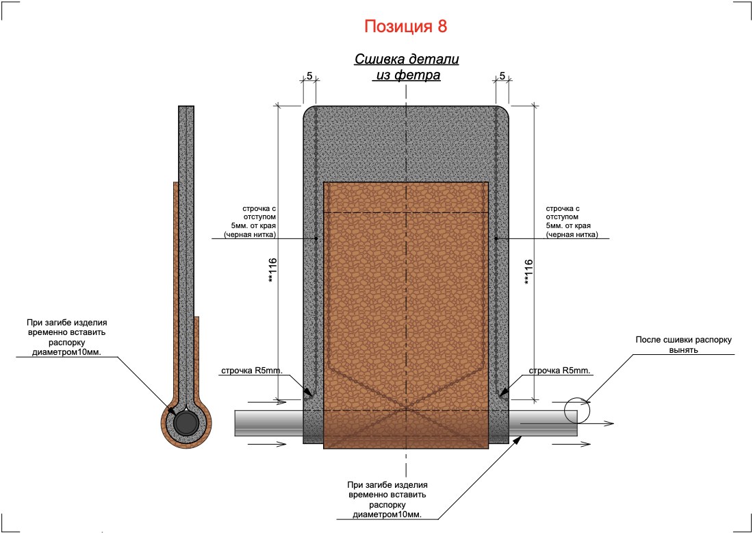
Then came a separate quest: finding real leather, natural felt, thread and hardware of the right quality in Ukraine. Each of those was a search of its own. One of our sheets still carries a red note: state on the drawings the colour, type and thickness of the threads, the stitch length, the hole diameter.
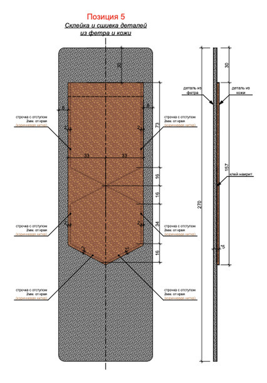
To my eye the pilot came out better than the original. We changed the die cut slightly, and it got better. We made different stitch lines, and that came out better too. We also took slightly thicker felt, and it felt more premium in the hand. All three differences are small and all three can be shown on a drawing, which is why we could find them. So we went ahead with a small series of fifty pieces: 20 felt sleeves for the iPad, 20 for the iPhone, 5 wallets of one type and 5 billfolds of another. We sold all of them.
I still use some of them today. One felt sleeve has been with me for about ten years and nothing has happened to it. There is little to photograph, it is just a sleeve, and that is rather the point: an object made to be wanted turned out to belong in the other column as well.
The business did not grow into anything big. With a small batch and everything chosen by hand, the price left much to be desired. Our retail came out at about $25 to $30, while Hardgraft, as far as I remember, sold at around $50 to $60. So it was about half the price of the original, and still too much. The Ukrainian market was small, its buying power low, and few people understood what kind of product this was. Going abroad would have needed more than I was ready to risk at that time, so we did not invest further. But we made the product and sold the batch. The market belongs to silicone cases from China, and I say that with respect, since those cases are right in the other column of the table above. And the niche exists, Hardgraft lives in it. We never reached it.
Desire without a market is a beautiful hobby with an invoice.
I think about price and philosophy here too. As a user of both, I see similar product lines at Brunello Cucinelli and Massimo Dutti, and things very close in quality and design. The philosophy and the price are different. This is my own experience and nothing more. One is a house built on what it calls humanistic capitalism, the other a concept within Inditex. Whatever the difference in price buys, a good part of it is not in the stitching, and neither brand is wrong.
ON SCREENS
The same choice on a screen
Everything above is about things you can hold, while most of what we build at Peretz is digital. A screen has no leather and no aluminium, and the answer has to be assembled from other things: motion, rhythm, text, and decisions about what the product will leave out. I made the decisions on every digital product in our portfolio and on more besides, and the consequences varied everywhere. The two ways of being wanted show up in all of them.
The purest case of passion on a screen came at the very beginning. Freedom sold premium Italian furniture, and I had no portfolio that could impress them. At the first meeting they explained that what we were showing was ordinary, that they were not looking for ordinary, and politely asked us not to contact them again. By the fifth meeting we had stopped thinking in static mockups and built the homepage for real: animation, motion, video. Then I listened to hundreds of tracks until I found the right one. There was no presentation. I opened a MacBook and scrolled to the footer without a word, and after that we signed the contract. That feeling could not be described on a slide, any more than the weight of aluminium can. It had to be built.
At MDC LUX we delivered a better site, and a month later the appointment calendar looked almost the same. We had improved the object when the job was more CT scans, a job from the plain column, and it took doctors writing their own articles to move it.
Nicole went the other way. For jewellery and watches we built a catalog and left out the checkout, since nobody buys a Rolex by adding it to a cart. Dropping a standard function was the correct product decision, because the site's work was to make someone want to walk in.
At SV Group the line "We are the furniture" came to me and I stood by it. As copy it explains nothing, and for SEO it is close to useless. It was right for a company whose product was its philosophy. And at MEDPRESSO we started from a feeling before there was any interface, then spent the first budget on things users never see, because a medical platform also has to be trusted the way you trust a pen to write.
In the story of hair the job was to show in the first few seconds that this was no ordinary clinic, but a place where a professional field was being shaped. That is where I stopped treating the website itself as the product: the site was a tool, and the real work was telling the story of the business correctly.
Sometimes nothing gets chosen at all. I described the most expensive lesson in the piece on twenty years: a $150,000 marketplace, months spent on function and almost no time on what made that business different. Technology had nothing to do with it, complexity had replaced common sense. And the most useful lesson came from my own store: a website is not a business, only one of its tools. Then there are Peretz and DeZZign, where the client is me.
MEDPRESSO shows that a good product often needs both, on different layers. A Ferrari also needs door hinges that never fail. The mistake is mixing up which layer you are on, and the people who can tell are usually the ones who design and build together. It is why we do not sell design apart from the business it serves.
WHERE IT IS GOING
Where the trend is moving
The shift I feel in all of this was best explained by a Design Theory video, Why Nothing Looks Cool Anymore, the one that started our essay on sameness. Its author believes the next big movement in design will be "a humanistic and emotional one". The reasoning is simple. Algorithms and optimisation pull everything toward the median, and what now sets a thing apart is its distance from that median. The video also names exactly what I described above: people try to settle a question of instinct with a spreadsheet. It calls the Luce the logical endpoint of this feelingless direction.
This is an opinion, and nothing can measure it. But I agree with it, for a reason from my own experience. Features can be caught, and they are being caught faster and faster. Almost anyone can now commission a tidy, competent object, and when tidy objects are everywhere, tidiness stops being a reason to want one.
This touches the two columns differently. A Bic need not move one step from the median: the median is its strength, and the sums there will only get harder. A silicone case has no use for emotion either. What gets squeezed sits between them.
What gets squeezed costs like passion and feels like a spreadsheet.
So I am not advising everyone to turn emotional in a hurry. First answer which column you are in, then decide what your distance from the median costs and who will pay for it. I answered the first question correctly back then, and my Bulwark stopped at the second. The weight of aluminium and the thickness of felt cannot be copied from a screenshot, and that is their value. The bill for them is real as well.
THE TEST
Questions for your product
Before the next brief, I would sit down with these. They take an hour, and the answers change what you commission.
- Which column are you in? Ask what a customer would say if they had to explain to a friend why they chose you.
- If it is passion, what could a competitor not copy by next quarter? If the answer is a feature, you are probably in the other column.
- If it is price and reliability, what is the last failure your customers remember, and what did it cost them?
- What did your last version take away that people never asked you to remove? What is your customer now afraid to do with your product? Name one lost freedom.
- Is there a market for the level you want to build, and how much are you ready to risk to reach it?
The last question is the one I would have liked someone to put to me back then. I would have made those fifty pieces anyway.
FAQ
Frequently asked questions
What is product design in simple terms?
It is the work of creating a functional, useful product that succeeds commercially. To succeed it has to be wanted, either with passion or because it is cheap and reliable. It covers the decision about what the product is and whom it serves, its function, its form and how it will be made. The look is one part of it.
What is the difference between product design and UX design?
UX design works on how a person gets through a product and whether it is easy to use. Product design also asks whether the product should exist in this form and whether it makes commercial sense. A product can have excellent UX and still fail. We go through the boundary in detail in Product Design vs UX/UI.
What makes a product desirable?
There are two routes. One is passion: feel, materials, character and what the object says about its owner, as with a Ferrari or a MacBook. The other is confidence: a low price and reliability, as with a Bic Cristal. Each asks for different decisions, and mixing them usually produces something that does neither well.
Can a product succeed without being beautiful?
Yes. The Bic Cristal and the Kalashnikov are among the most widely made products in history, and neither depends on beauty for its appeal. They are wanted for what they do and what they cost. A product still has to be wanted by someone for some reason, and beauty is only one of those reasons.
Where is product design moving now?
Where people buy with passion, distance from the median matters more, because tidiness has become cheap. Where people buy for price and reliability, the sums will only get harder. A Design Theory video calls the next movement humanistic and emotional. That is an opinion without numbers, though it matches our experience.
Does a good product always find a market?
No. We made fifty felt and leather goods drawn to engineering standards and sold all of them, and the business still did not grow, because the market in Ukraine was small and going abroad needed more money than I was ready to risk. Before investing in a level of quality, check who can pay for it and how you will reach them.
Is product design only about physical products?
No. The same questions apply to software, platforms and internal systems. A checkout or a CRM usually belongs with price and reliability, where nobody wants to think about it. A brand site or a product people show to others usually has to be wanted for itself. Many digital products need both, on different layers.
Sources
- iPhone 3G and iPhone 2.0 software, Apple, July 2008
- Ballmer on the iPhone, CNBC, January 2007
- BIC Cristal figures, BIC, January 2026
- Ferrari third quarter 2026 earnings call, 3 November 2026
- McDonald's remodel programme, Indianapolis Business Journal, August 2018
Not sure which way your product is wanted? Let's look at what it asks people to love or to trust.
- Share
-

-

-

-

One notification a week with the new PERETZ articles. Nothing else.