Who Decides a Brand Identity? Two Projects, Two Opposite Answers



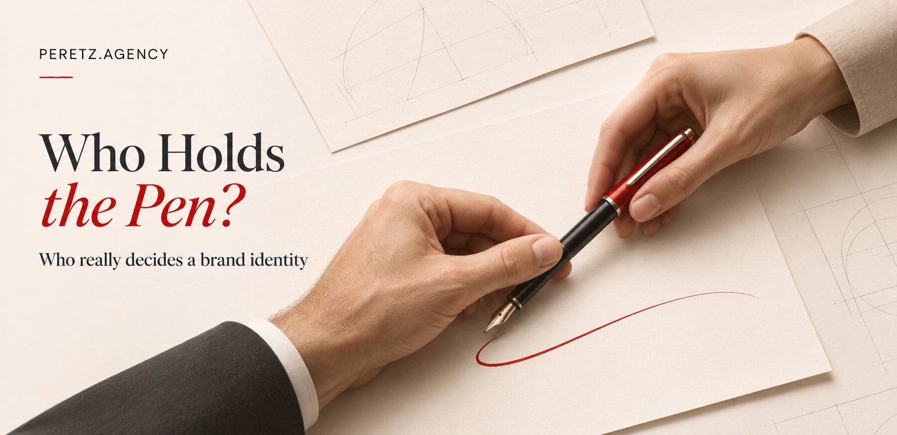
Brand identity is always hard, and very often it is a matter of taste. Formulas do not settle it. What settles it is who holds the idea, what the brand can afford, and whether the owner takes part.
IN SHORT
The short answer
A brand identity is the system by which a brand is recognised: logo, type, colours, image language and the rules for how they work. Maths and statistics help check a decision, but they cannot make it. In practice the decision belongs to whoever holds the idea: at SHTAYER it came from the founders while I first proposed something else, and at Nico Juliany it came entirely from us. The strongest results come when the identity grows from the vision of the person who built the business, and that person takes part.
Our glossary covers what a brand identity and a brand book are, and what it costs has its own article. This one is about something else: how the decision really gets made.
TASTE
Brand identity is always hard
Brand identity is always hard, and very often it is a matter of taste. Certainly there are publications that start laying out mathematical calculations, but those mostly concern things like the rules of the golden ratio and trends that simply work right now according to statistics.
I looked at what stands behind those calculations. The argument over the golden ratio is old, and the authors of a 2021 study say outright that results conflict. In their own experiment 256 people chose among three proportions. The golden ratio took 53% overall, a slight preference that rests on photographs of people, sculptures and paintings. On geometric shapes, which is what most logos are made of, it took 48% and showed no preference, although some older studies found otherwise. I found no confirmation from the designers of famous logos that those marks were built on this proportion. It seems often to be laid over a finished mark afterwards.
There are real measurements too. A study of 597 logos showed that descriptive logos, which make it clear what a company does, work harder for the brand on average. Experiments with packaging showed that handwritten type adds a sense of human presence, and people buy such products more often. This is useful to know. But no such study will tell you that the woman who runs the company feels like a curious little monkey, or what to do about it.
SHTAYER
SHTAYER: they decided
SHTAYER was a unique situation. Even I first proposed a different concept: a silk scarf folded into the letter S, as the first letter of the name. That would have been the symbol, and the logo itself would have been exactly this kind of serif wordmark.
It all began with a question. In their own article on branding they quote it word for word: I asked what we were going to do about the branding, because I could see how they had changed. We had made their earlier minimal style too, but the brand had outgrown it.
Then I heard the story from Yulia and Tatiana. They had a clear vision: the idea of this little monkey. Yulia said she felt like the curious little monkey from a children's cartoon. The genius of it was that first you listen to the story, you see a huge number of elements, your brain explodes, and then Tatiana says chinoiserie. And everything falls into place in your head, mine and the designer's.
It was a very logical view of the brand, and very much theirs, because it was already in what they made. They themselves recall how, even in the monochrome years, they made sets with big roses and chocolate polka dots, the one that by their own account should have been called "Pechyvko", the Biscuit. So this is a personal manifesto, a personal feeling. The new emblem also has a liana in the form of an S, with magnolias from their own story.
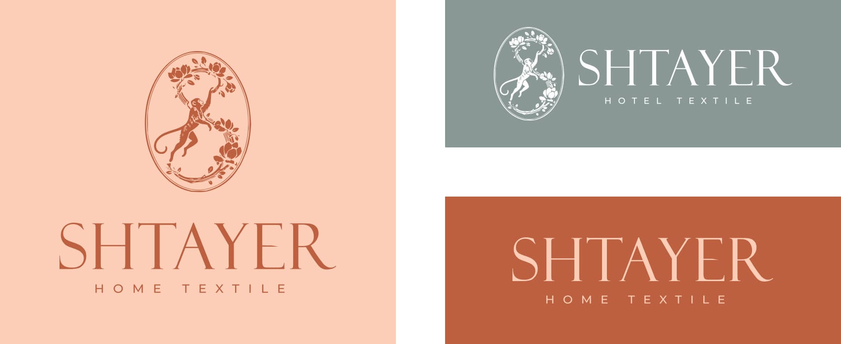
When we presented it, there was an instant match. This is IT. You look at it and you just go: IT.
The boldness of this decision has to be seen in context. Since the brand is established and known, and is one of the leading suppliers of bed linen to both hotels and retail, they can afford such a radical change. A young brand with the same monkey would have to explain who on earth it was. And this is no break with the past: the liana forms that same letter S, so the link with the earlier logo stays.
My job here was something else. The idea already existed, and it was not mine. I had to turn it into a system that works across carriers, and not argue with it just because I had first seen things differently.
NICO JULIANY
Nico Juliany: we decided
Nico Juliany is a different situation. There the decision came entirely from us. It came from the flourish, from individual craftsmanship, from the brand declaring itself and underlining that. That is why there is such a powerful stroke on top.
A piece of jewellery is exact down to the last detail, yet it must not look cold: the movement of the maker's hand stays in it. So we built a system of two characters. The NJR monogram is precise, almost architectural, and works on packaging and small carriers. The name is written with a pen flourish, which has the freedom of a line that a hand still controls.
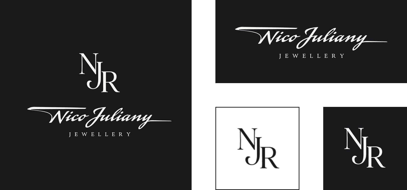
And this is a small nod to myself. My signature has such a flourish too. So I decided to put a little of my signature into the DNA of this brand, because it works well.
By the way, I am not the only one who does this. Many wordmarks have these little houses: either an underline, a foundation, or the opposite, the roof of a house, which gives confidence in the brand. This is my experience and my eye: I found no separate study of strokes over logos. The closest thing is those same experiments with handwritten type, and they were run on packaging, not on logos.
We also added a mark to the logo, and it holds an Easter egg of its own. The YSL logo was designed by Cassandre, born Adolphe Mouron, a native of Kharkiv. The NJR monogram follows his logic, intertwined initials, as a sign that we come from Kharkiv too. So the full logo has the flourish and craftsmanship, and the mark has the classic and the time-tested.
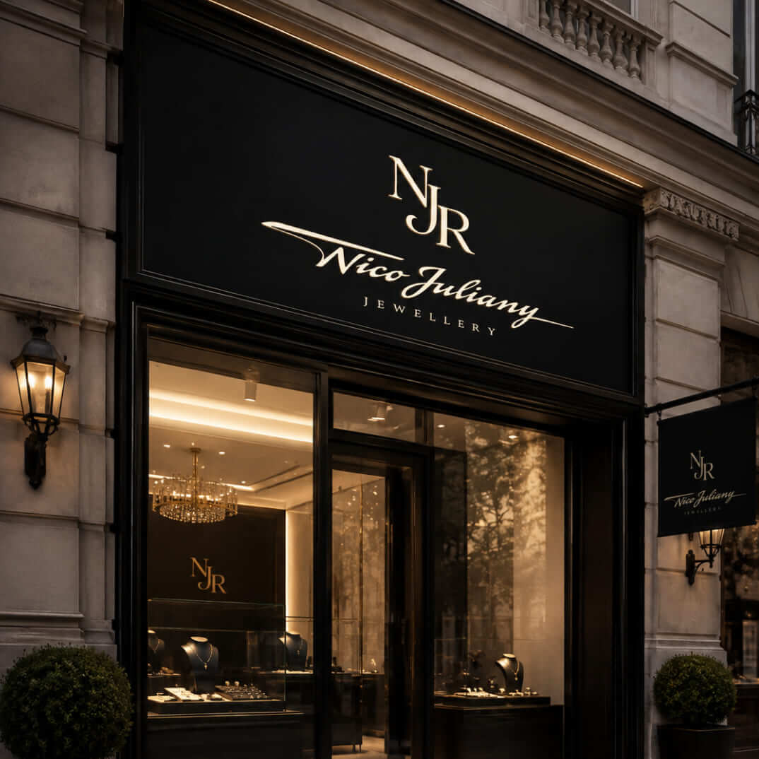
Nobody came to us with a ready image here. The client trusted our decision, and there were no arguments. We made the first identity for this house seven years ago, and it is in the portfolio too.
SIDE BY SIDE
The two answers side by side
| Question | SHTAYER | Nico Juliany |
|---|---|---|
| Where the idea came from | The founders: Yulia's monkey, Tatiana's chinoiserie | Us: the flourish and the craft of the hand |
| My first thought | A silk scarf in the form of an S, dropped | It became the decision |
| Why it was possible | The brand is established and known | The house rests on craft and says so clearly |
| Main risk | Losing those who already trust it | Ending up with a cold or generic expensive look |
| The designer's job | Turn someone else's idea into a system | Propose the idea and answer for it |
If you look for a single rule, these two decisions contradict each other. There is no rule here, only a match: the idea has to be true for this brand, and the brand has to be able to carry it.
OTHER LOGOS
Far from the only logos that worked
These are far from the only logos we have developed, counting practically from the beginning to the end of a brand's life, and they worked successfully.
We once took part in developing the logo of YOD, a sports club from Kharkiv and a true mecca of CrossFit. It was a really interesting logo: a white hand showing Victory on dark red, torn edges and a black band with the name. The logic went like this: Yod, Yad, "yad" being Russian for poison. The club covered many things, martial arts and hellish work that was killing you while you loved every minute. So we had drive, wildness, a poison that kills you, and victory. Nobody would have said it was ours, given that we were developing minimal logos and were among the first to work in that style. We made them a poisonous website as well.
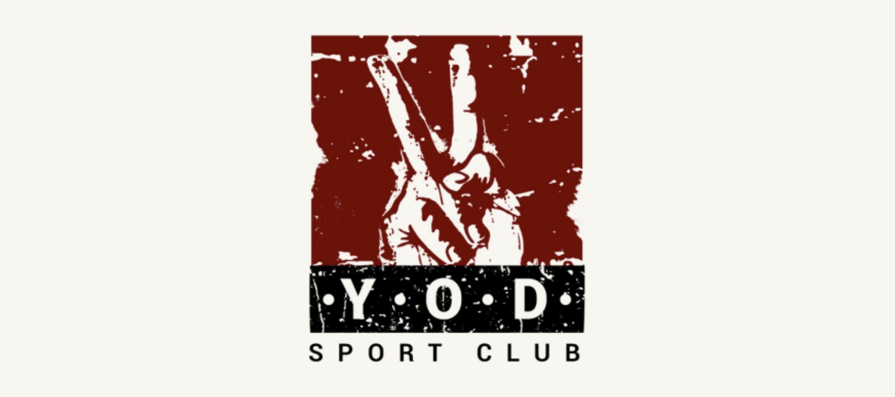
And it worked as well as it possibly could. This club was known far beyond Kharkiv and very popular in Ukraine. A directory of sports venues still keeps its description: the first and only affiliated CrossFit club in the city, more than 3,500 square metres, a separate martial arts area called Yad, CrossFit hard parties and the YODfamily. Iryna Nechaeva had a hand in exactly that. She burned with this project, combined it with her work, even became its marketing director, studied its processes and spent 4 hours a day on it. In all she worked on YOD for at least five years, alongside her other work. The club no longer exists, and her account of what it was like is on our blog.
And a coincidence I noticed only now: the Hebrew letter yod goes back to a drawing of a hand, and the word yad itself means "hand" in Hebrew. We were not thinking about that at the time. Same as with our own name: Peretz means "breakthrough" in Hebrew, and we only learned that years later too 🙂 But a hand is what the logo became.
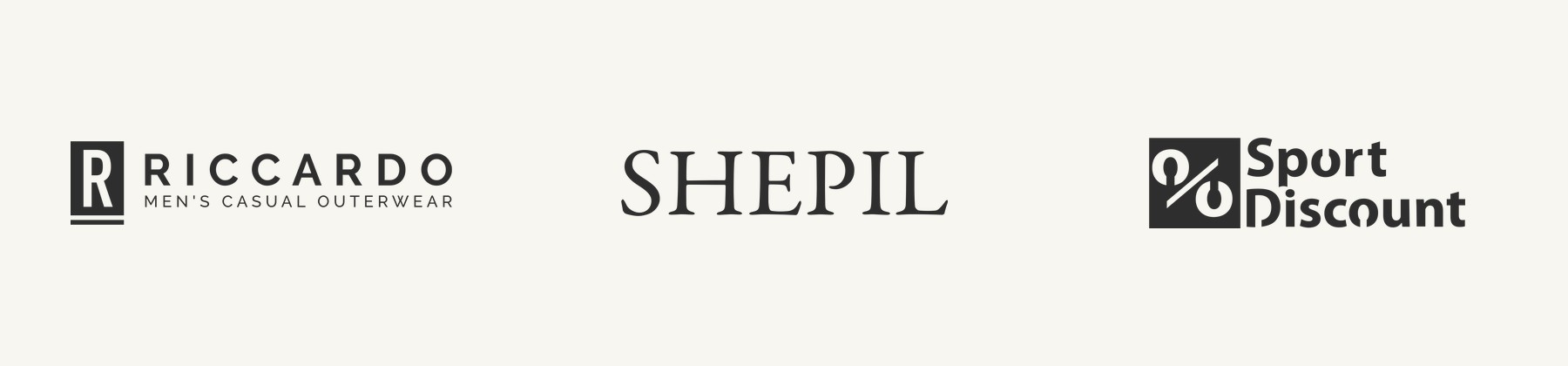
Riccardo was a different story. They were launching a premium line and wanted to show exactly that. Riccardo, so practically Rolls-Royce. And we encrypted that a little in the logo: the letter R in a rectangular block with a line below it, and anyone who has seen the Rolls-Royce badge will get it.
SHEPIL is a purely serif logo. Behind it stands Pavel himself, a master who adores his work, and the logo showed that craftsmanship and a master's long road. And that worked too.
Or Sport Discount, a logo that is many years old now. I cannot say I like it very much. But a percent sign is built into it, meaning discount, and it works excellently for sales. The logo performs its most important function, the one it was created for. This, by the way, is exactly the descriptive logo from the study above: you see at once what the company is about.
And there is a whole sea of logos like these.
INVOLVEMENT
When it works best
I say all this because an identity is strong when it also comes from the vision of the person who created the business. And when that person is engaged and interested. That is when you get the very best result. A designer can still propose the idea, as at Nico Juliany, but the image has to become their own for the person who will live with it.
This has a price. It takes much more time and many more discussions. And most often, by the way, margins in identity work are low, because all the elements, the logo itself, especially if it is complex, mean a huge number of discussions, iterations and drawings. But the result is worth having. That is why brand identity development cannot be fairly compared by the price of a single picture.
WHEN IT FAILS
And sometimes the idea is ours and the client does not want it
There is another outcome too. We once made a site that was itself a work of art, and the client answered roughly like this: well, I wanted a standard design, this is too much, perhaps you do not understand us. We lost the project. I told that story with screens in the article on UX/UI trends.
The price of failure can be higher, and at big brands it can be measured. In August 2025 Cracker Barrel changed its logo with the man by the barrel and went back to the old one about a week later. Its chief financial officer reported traffic down about 8% after the new logo, against 1% in the first half of the month, and the shares fell nearly 16% from the announcement. The criticism there went far beyond design, so it cannot all be put down to the logo. But it shows that people's attachment to a mark is worth money, and before you touch it you need to understand what you are breaking.
HOW TO DECIDE
What to ask before commissioning an identity
Here is what I would find out before drawing anything at all.
- Does the owner have an image they cannot explain but clearly feel? If so, start there, even if the designer had a better idea.
- Is the current logo telling an untruth about the company? If the company has already changed, the logo is just catching up. If not, perhaps nothing needs changing.
- How much can the brand afford? The better known it is, the bolder it can be and the more it can lose.
- What job must the logo do first? For Sport Discount it is the discount, for Riccardo it is premium, and beauty is not the main judge here.
- Will the owner take part? If not, and nobody can have the last word, the system will die of approvals, however beautiful it is.
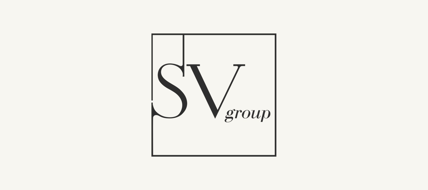
And one last thing. We did not develop the SV Group logo, it was there before us. Drafting lines clearly draw the founder's initials, and with those lines the mark closes, forming and fixing the status of a finished brand and business model. Not always, but sometimes a logo shows the essence so fully that there is nothing to add and nothing to dispute.
FAQ
Frequently asked questions
What is a brand identity in simple words?
It is the system by which a brand is recognised anywhere: logo, type, colours, image language and the rules for how they work together. The logo is only a part of it. The rules are usually written into a brand book, so the system lives on without the designer who invented it.
Does a logo have to be built on the golden ratio?
No. Research conflicts: in a 2021 study a slight preference appeared on people and paintings and did not appear on geometric shapes. Proportions are useful as a designer's tool, but they cannot choose the idea for you.
Who should decide on a brand identity, the owner or the designer?
Whoever holds a real idea, and in the end a specific person has to answer for it. At SHTAYER the idea came from the founders and I dropped my silk scarf. At Nico Juliany it came from us. The best results come when the owner is involved, and the worst when nobody has an idea.
When can a brand change its style sharply?
When the brand is established and known, and the new image is truer than the old one. Even then it pays to keep a bridge: at SHTAYER the liana in the emblem forms the earlier S. If buyers are strongly attached to the mark, first find out what exactly you risk losing.
Does the owner or the designer have to like the logo?
Not necessarily. What matters is that it does the job it was created for. I do not much like the Sport Discount logo, but a percent sign is built into it and it works excellently for sales. Taste matters, but a logo also has to be judged by its job.
Why does brand identity development cost so much?
The expense is not the picture itself but the discussions, iterations and drawings of all the elements, especially for a complex logo. When the owner is involved it takes even more time, and the result is stronger too. We cover ranges and what each level includes in the article on the cost of a brand identity.
Sources
- The golden ratio as an ecological affordance leading to aesthetic attractiveness, PsyCh Journal, 2021
- A Study of 597 Logos Shows Which Kind Is Most Effective, Harvard Business Review, 2019
- A Logo Designed by Cassandre, Musée Yves Saint Laurent Paris
- Справжній брендинг починається не з логотипа, SHTAYER blog, 2026
- Cracker Barrel shares drop as logo change blowback dents restaurant traffic, Yahoo Finance, 2025
Not sure whose idea should sit at the heart of your brand? Let's start with a conversation about your business.
- Share
-

-

-

-

One notification a week with the new PERETZ articles. Nothing else.