How the project came to us
The introduction came through Nicole, a jewellery boutique in Kharkiv whose catalogue site we had built. Nico Juliany was one of the brand partners on its shelves, and the connection came directly from there. The brand was already selling through boutiques and a network of retailers, so its website did not need to compete with stores or simply collect online orders. Its job was to communicate the value of the house before a customer ever walked into a boutique, and the identity had to do the same on a business card, a box or a sign.
A drafting-board language
Seven years ago the brand spoke to a different audience than it does today: progressive, young, technical. The visual language we gave it had almost a drafting quality: clean geometry, controlled lines of one weight, a sense of engineering. The monogram looks constructed rather than drawn by hand, the letters of the name are thin capitals with wide spacing, and the crossed O reads as a detail on a technical sheet as much as a ring on a finger. For that business it was the right answer, and it worked.
Precision is also a quality of the jewellery itself. A ring is exact to a fraction of a millimetre, and a light, almost architectural line said that about the pieces without showing them.
A quiet ground for the jewel
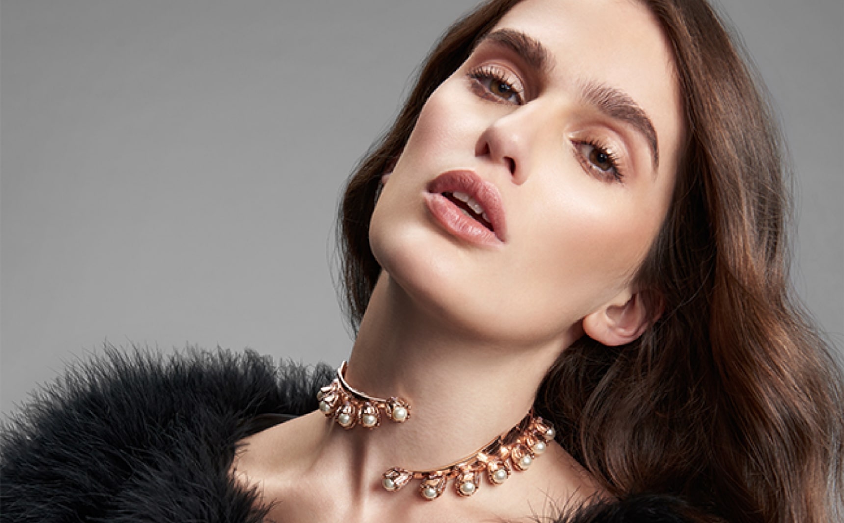
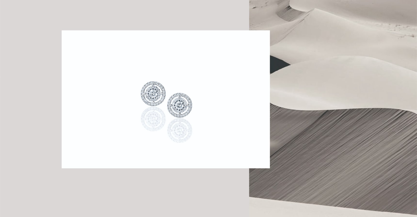
The palette is nearly colourless: warm grey, graphite and white. The background imagery is sand dunes in soft light, with a lot of empty space, so that the only thing that shines on a page is the jewel. Earrings sit on a white card next to the dunes, and the portraits are shot in muted tones, with the necklace at the centre of the frame and the face as its setting.
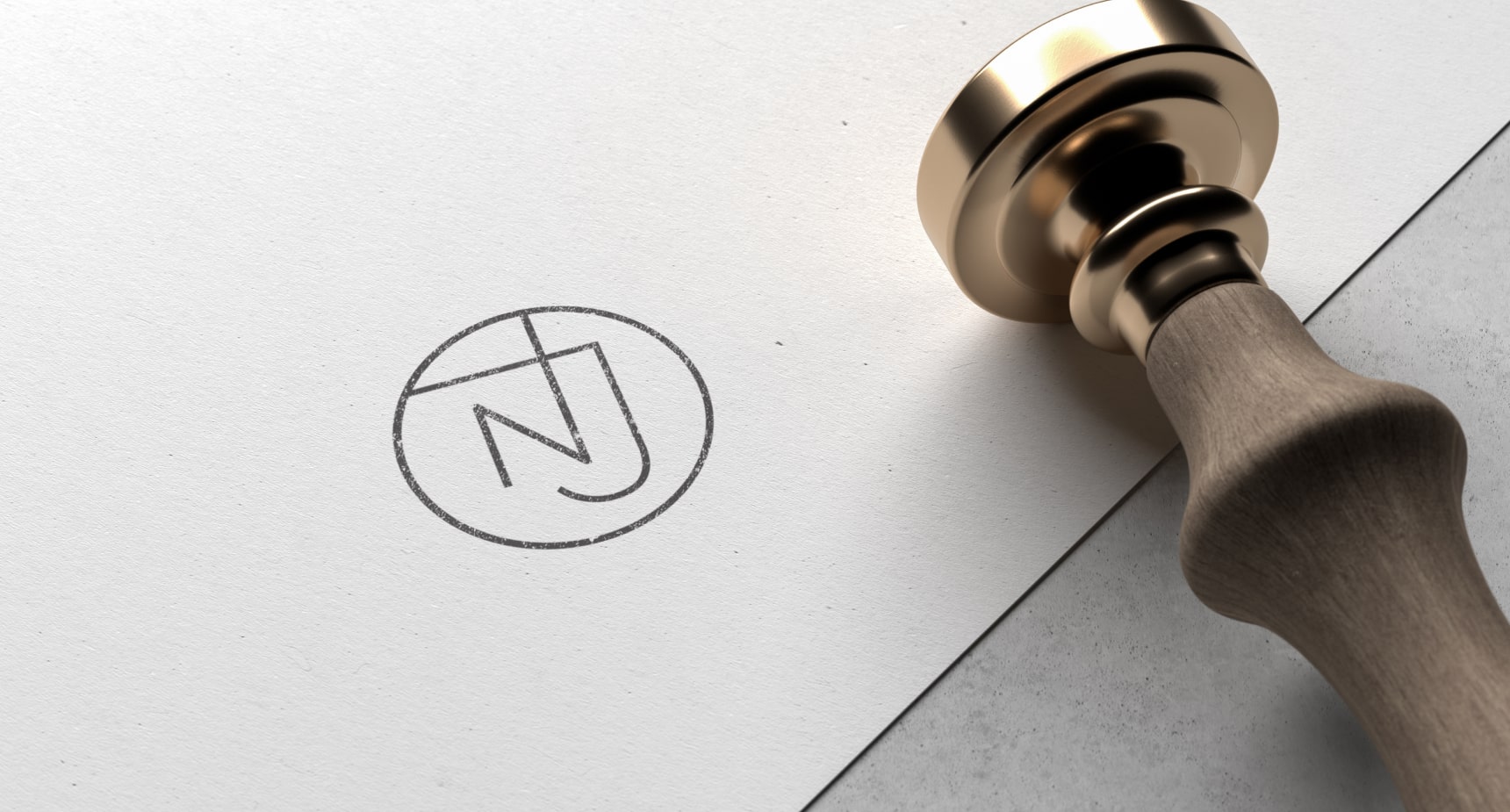
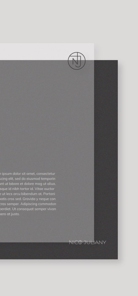
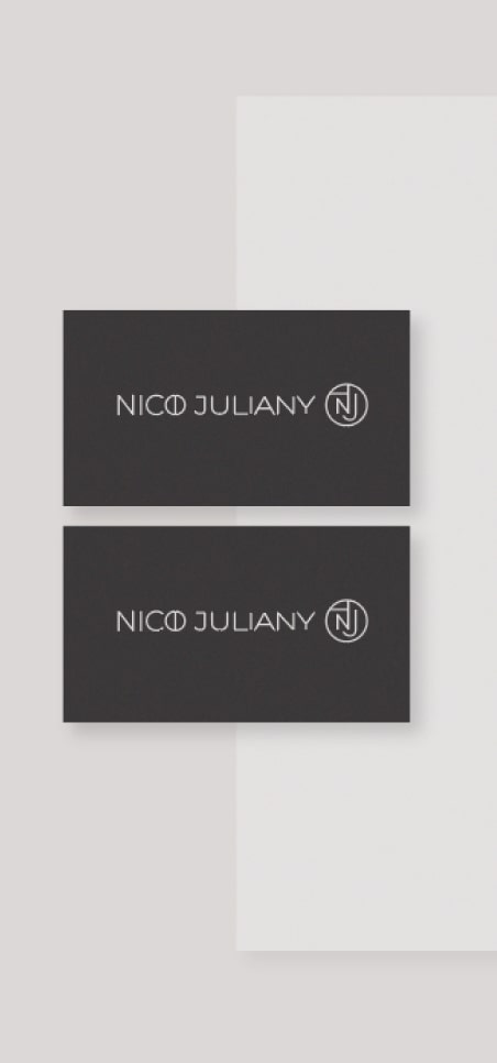
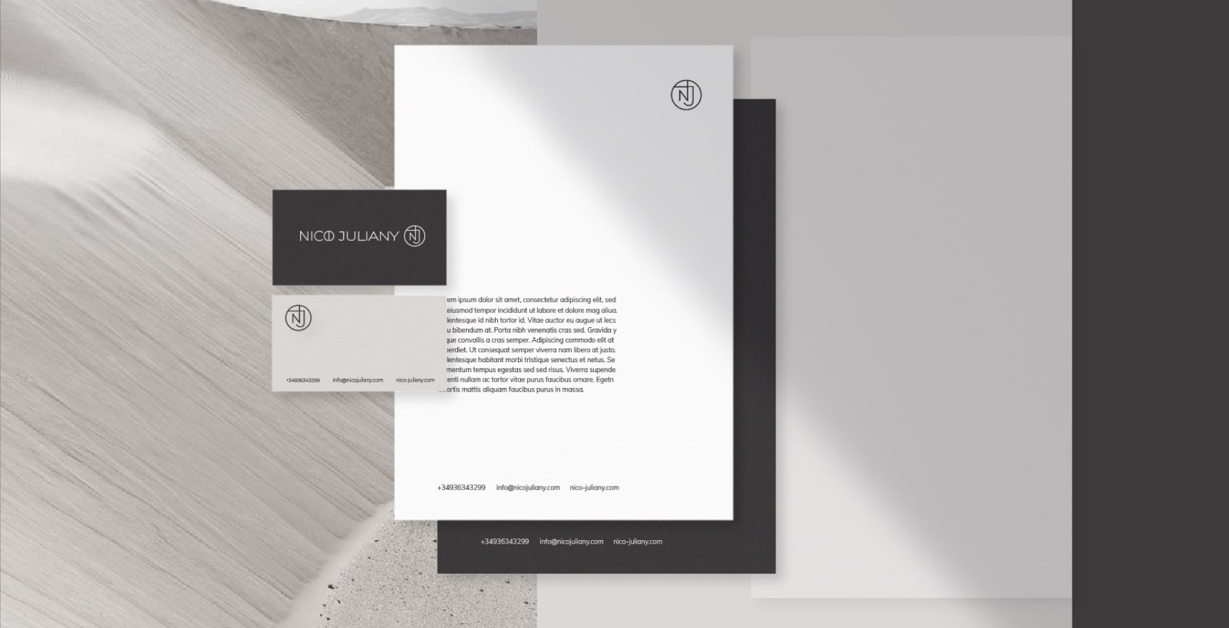
The monogram moves easily between carriers. It works as a wax seal pressed with a brass stamp, as a small mark in the corner of a letterhead, on dark and light business cards and on packaging. The name and the monogram can appear together or apart, and for a jewellery house that matters: on a small box there is room only for the circle, on a boutique wall there is room for everything.
From the brand book to the website
The identity did not live on its own. We gathered it into a brand book, drew custom typography and visual elements, and brought the whole system together in a website written in Laravel for this brand rather than assembled from a template. The central task was to carry the feeling of luxury, intimacy and exclusivity into a digital space. Every detail, from type and composition to navigation and the way the site responds to a visitor, had to reflect the precision of the jewellery and the thinking behind each piece.
A luxury website plays by different rules than an ordinary shop. It does not hurry the purchase, shout discounts or hide the piece behind buttons. It gives time to look at the object and understand why it is worth its price. The thin lines, the air and the quiet of the first identity served that better than any bright banner could.
When the brand outgrew it
Over the years the company changed, and so did its customer. The house moved toward heavy luxury, and its audience became older and more established. The drafting-board language began to tell the story of a business that no longer existed. Making the old logo more beautiful would not have helped; it needed a different story.
In 2026 we built a system of two characters: the NJR monogram, precise and almost architectural, and the name written as a pen flourish with a strong stroke on top, the living movement of a maker's hand. That decision came entirely from us, and how it was made is told in Who Decides a Brand Identity?. The new system is shown in the case Nico Juliany, Identity 2026.
One character gives structure, the other gives life. One speaks of the house, the other of the person behind it. The new identity no longer says "look how technologically advanced we are"; it says "we have already arrived". The flourish holds a small personal detail too: Yevhen Borovoi's own signature has the same sweep, and a little of it went into the DNA of this brand. The thin, exact line of the first identity stayed in the NJR monogram, only calmer and heavier.
The first identity was not a mistake. It was the right answer for the earlier stage of the company, and its main ideas, precision and the jewel as part of the name, carried over. How to tell when a brand needs to evolve and when it needs to be replaced is in When Not to Rebrand. Why a luxury website plays by different rules is in Why Luxury E-commerce Breaks Every Rule of Conversion Optimization. Our approach to identity is on the brand identity service page.