The idea
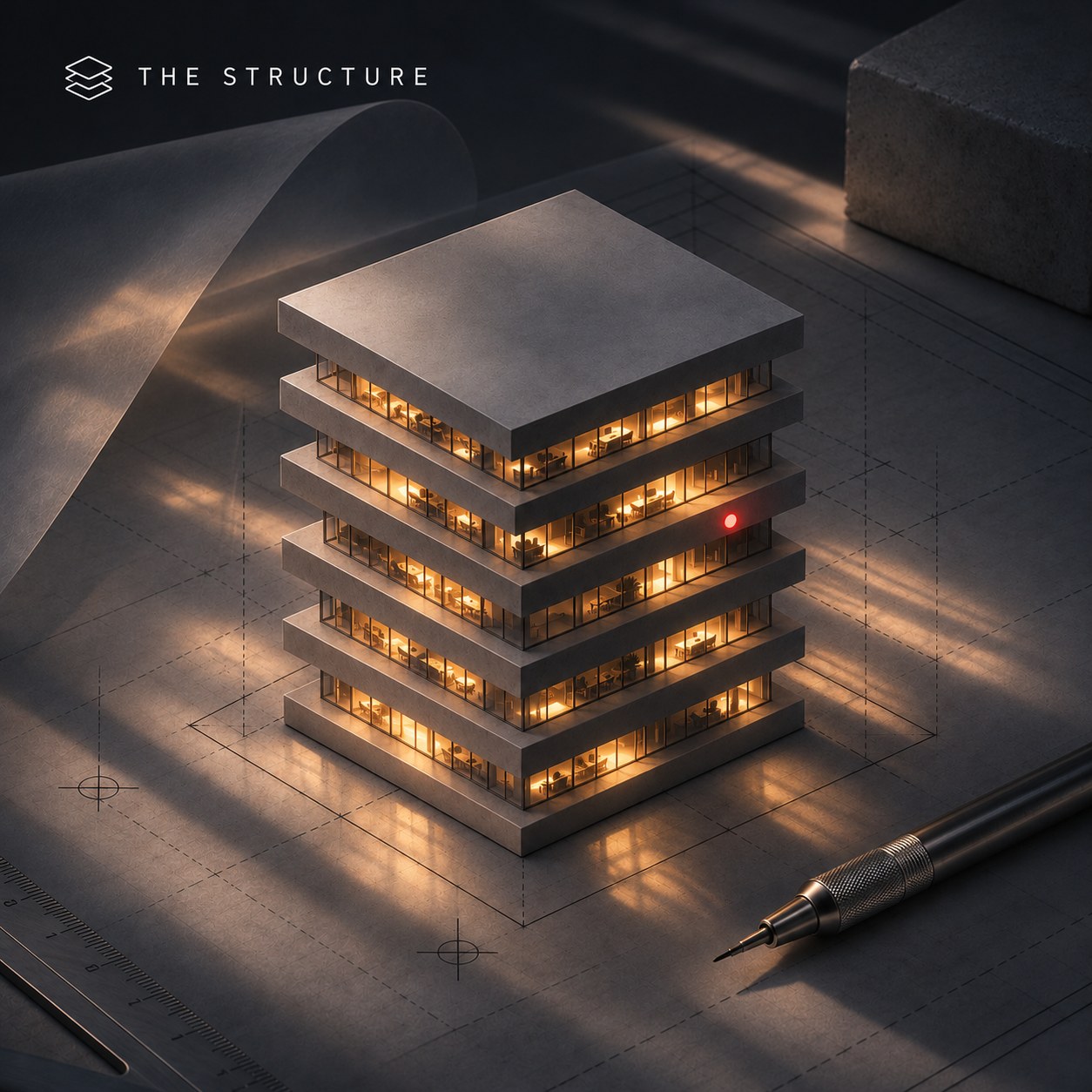
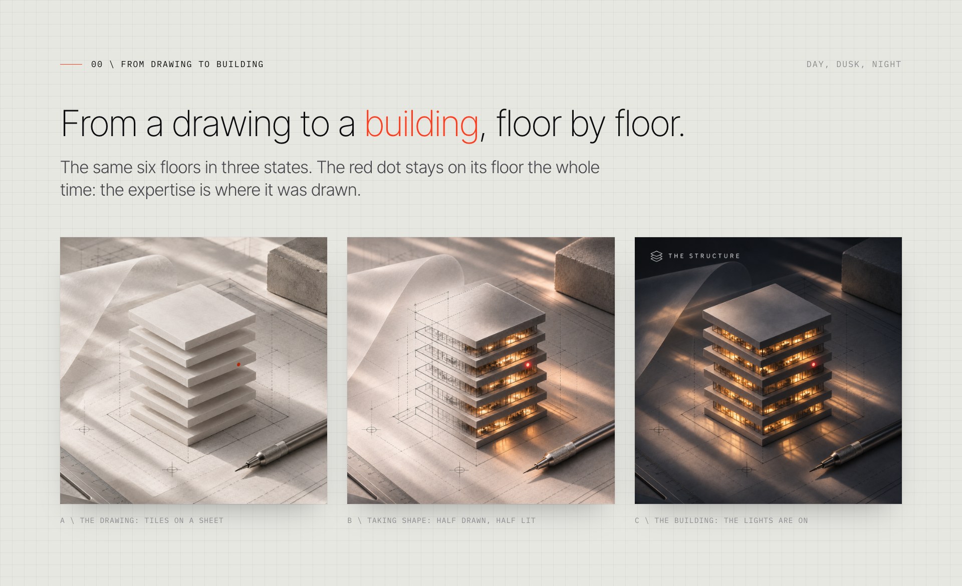
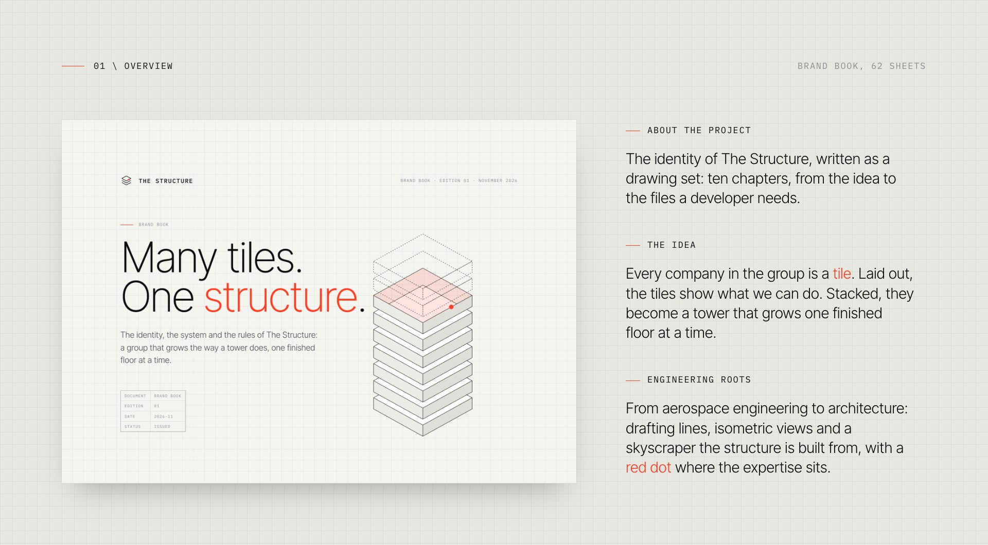
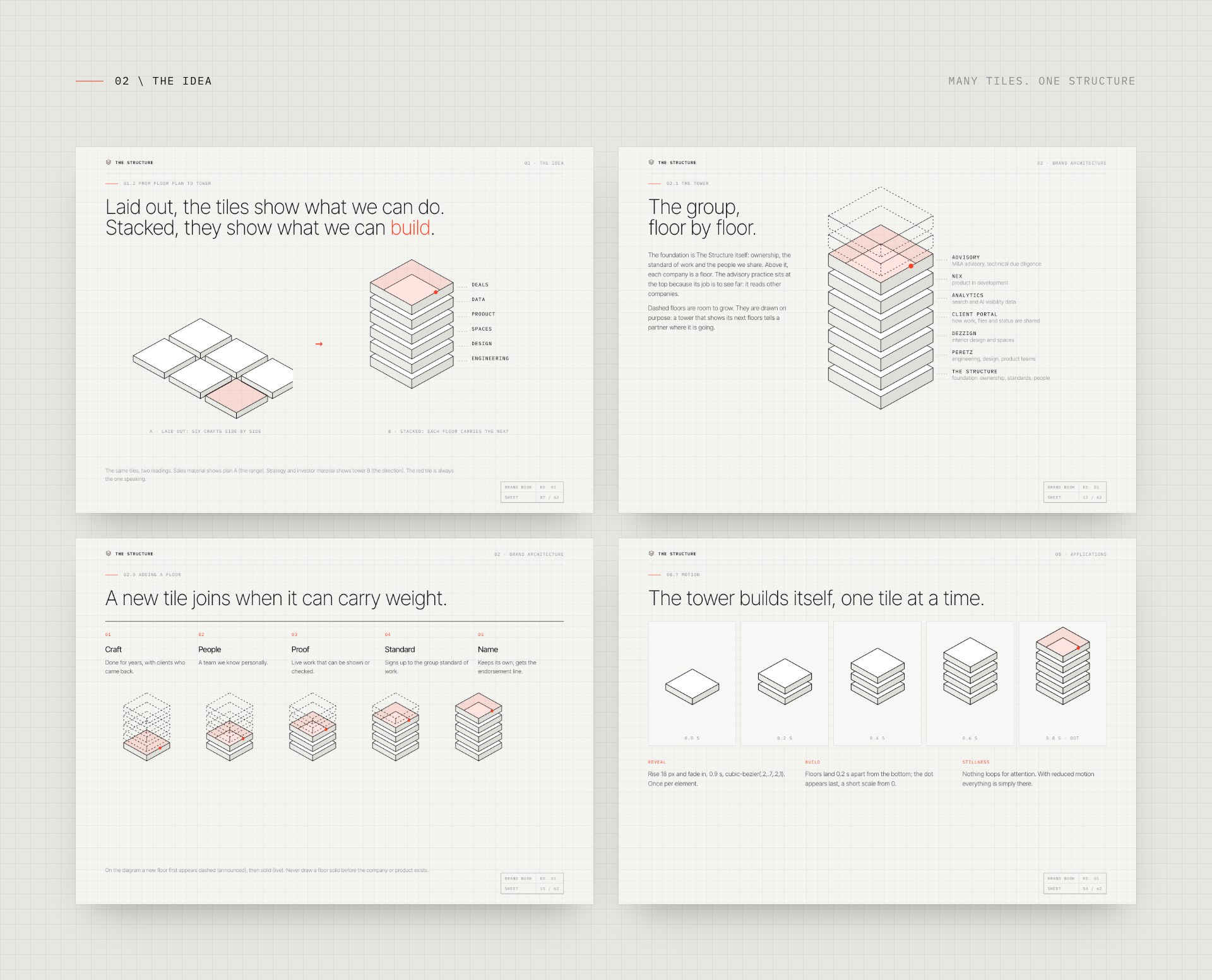
Every company in the group is a tile: a finished piece of expertise with its own team, craft and clients. Laid out side by side, the tiles show what we can do. Stacked, they become a tower that grows one finished floor at a time. The Structure is that tower: a foundation of shared standards and people, and floors for engineering, design, products and advisory on top.
A new tile joins only when it can carry weight: years of craft, people we know personally, work that can be shown and checked. Dashed floors in the drawings are room to grow, drawn on purpose, so the tower always tells a partner where it is going.
The mark
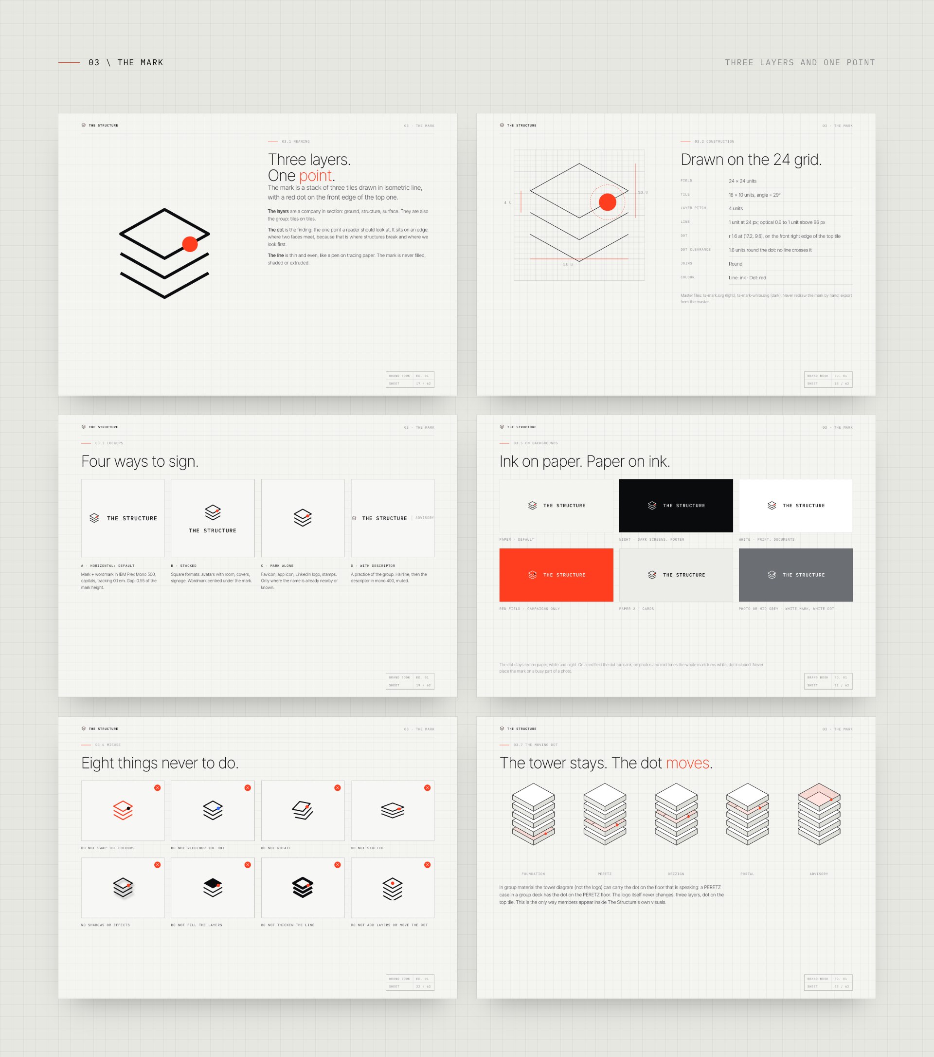
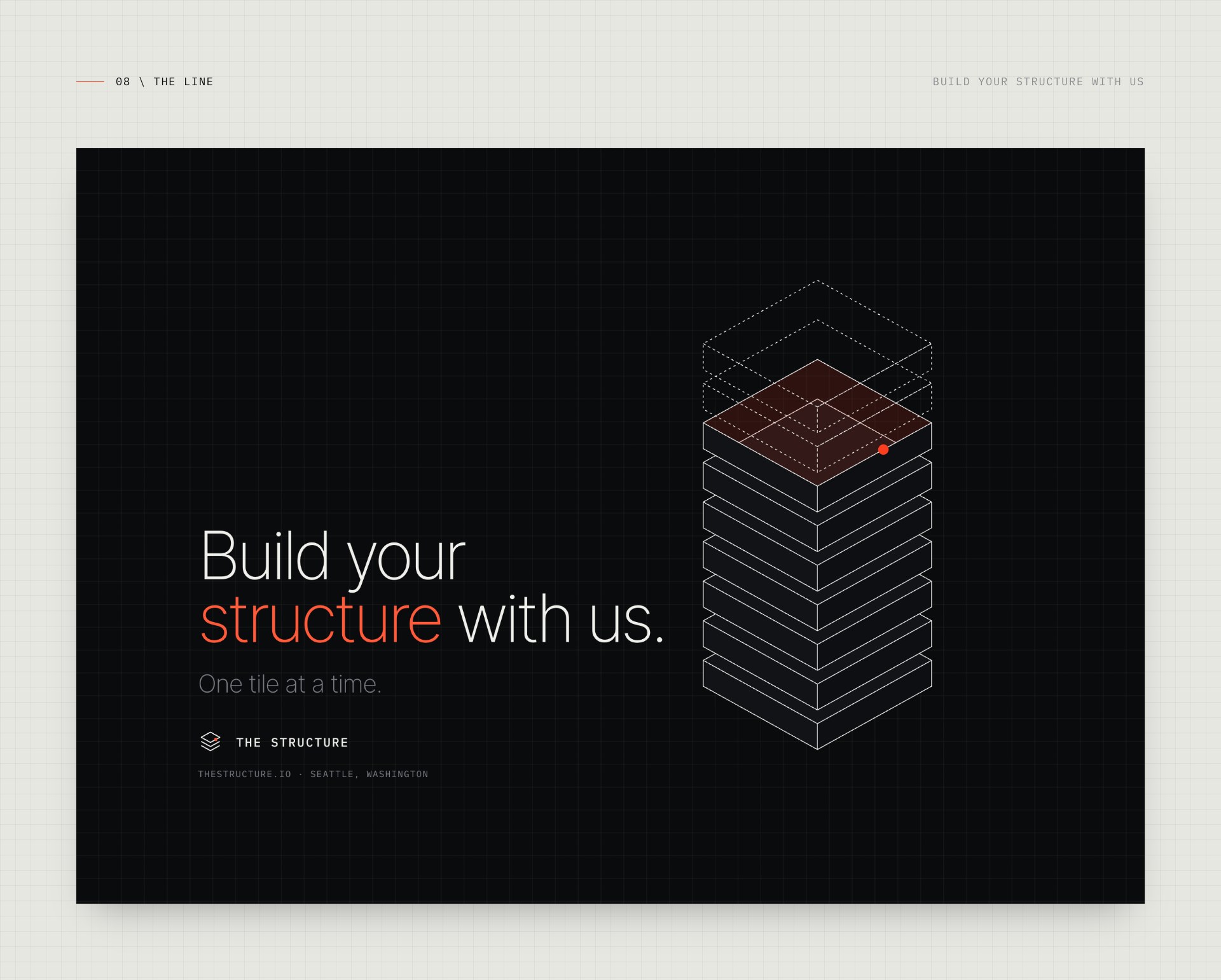
Three tiles in isometric line, seen in section, with a red dot on the front edge of the top one. The layers are a company read from the ground up. The dot is the point where a reviewer's eye stops and where the expertise sits, the finding. The line is thin and even, like a pen on tracing paper: the mark is never filled, shaded or extruded, and it is built on the same 24 grid as everything else.
Paper, ink and one red
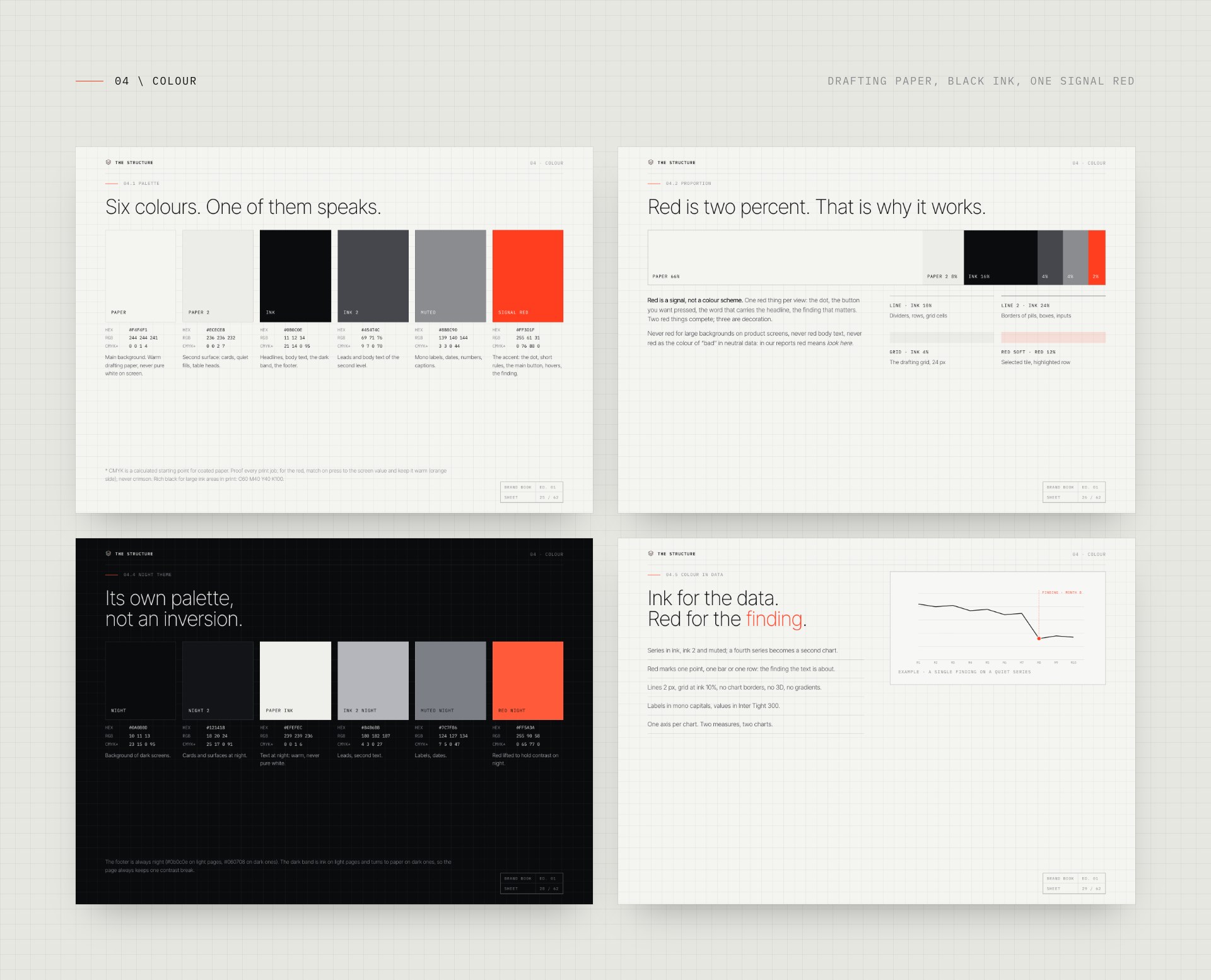
Drafting paper, black ink and one signal red that takes about two percent of any surface. Red is never decoration: it marks the finding, the active floor, the one word that matters. Every colour pair was checked for contrast, and the dark theme has its own palette rather than an inversion.
A drawing set, not a mood board
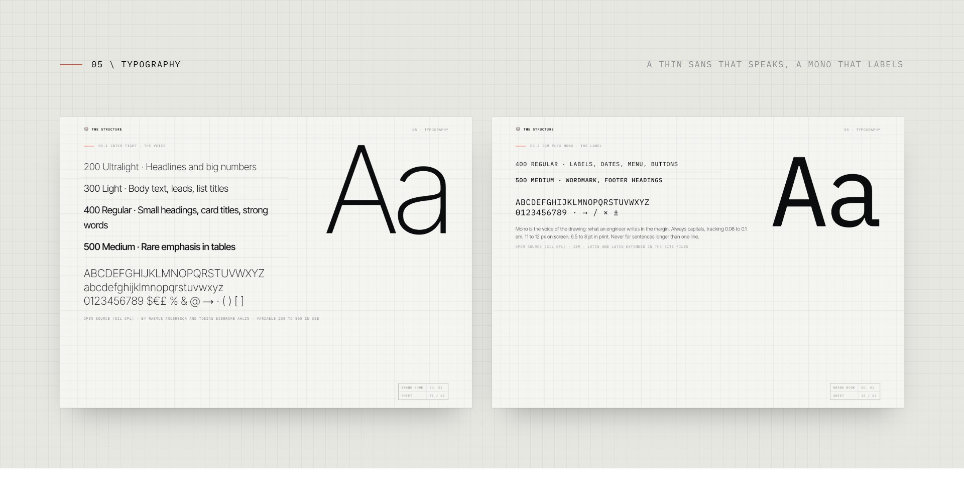
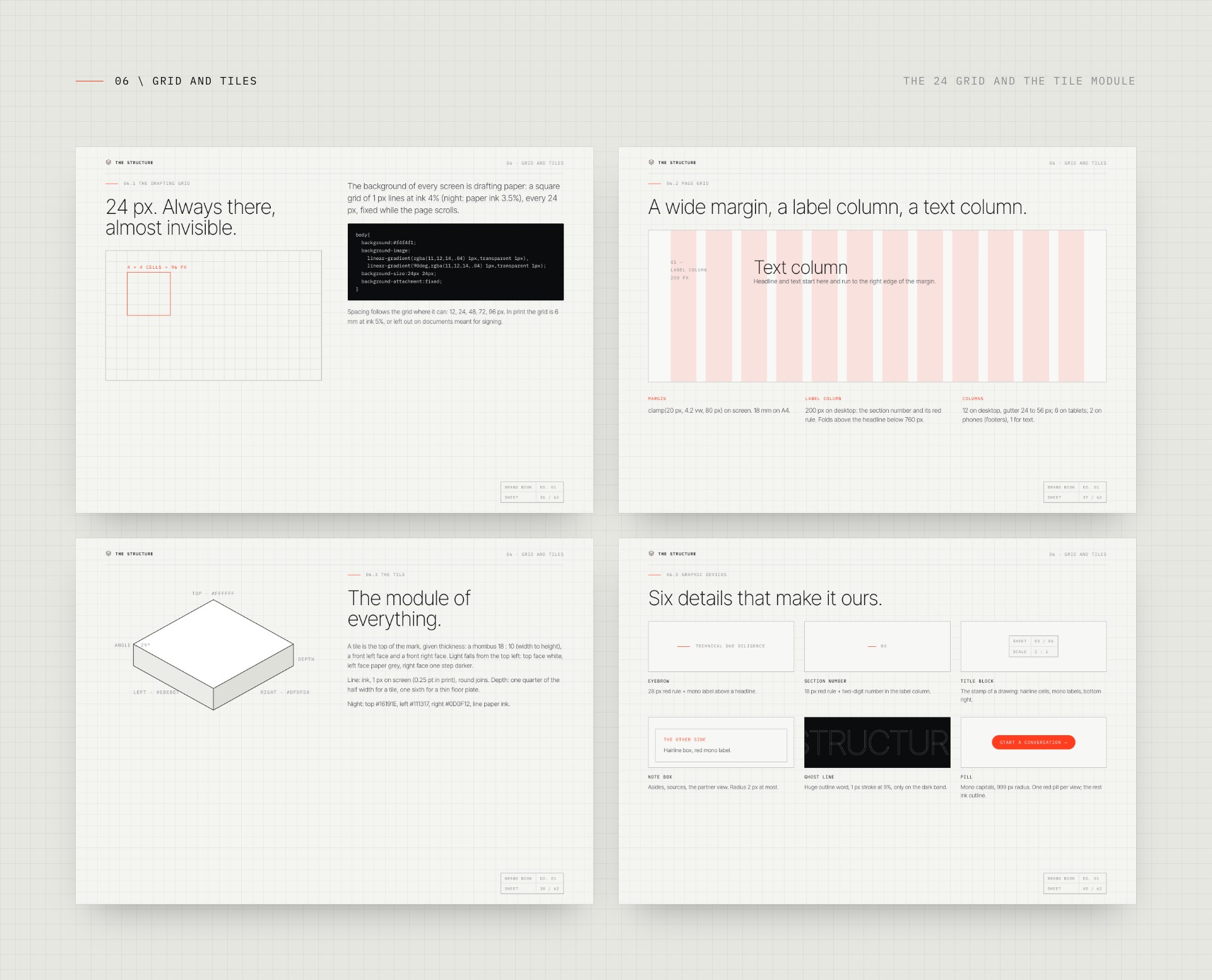
The type is a thin sans that speaks and a mono that labels, in seven sizes and nothing in between. The 24 px grid is always there, almost invisible. Pages carry title blocks and sheet numbers like engineering drawings, and the tile module gives every card, diagram and slide its proportions. The voice follows the same rule: an engineer's note in the margin of a deal, with a list of words we use and words we never do.
The squares come from a notebook
The grid under every page is more than drafting paper. It comes from the notebooks of Valeriya Chumachenko: she loves squared notebooks and plans everything in them. Like Columbo with his notebook, she writes down the small things others walk past: a figure that does not add up, who really signs, the system nobody mentioned. Note by note, the facts line up on the squares until the business shows its DNA. So the grid stays on every screen, quiet and always there.
On things people hold
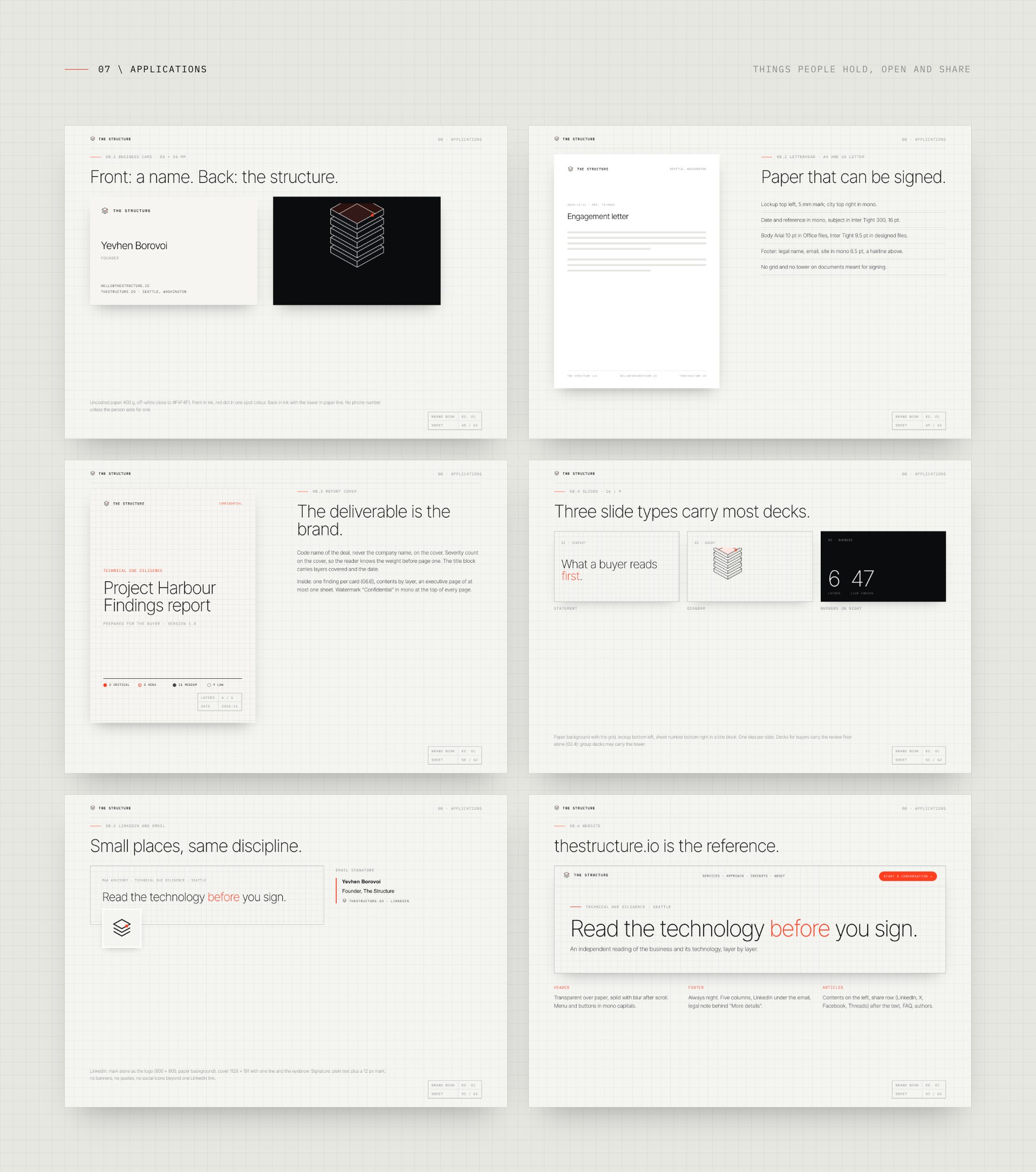
The brand book shows the system on business cards and letterheads, a findings report with severity cards, slide templates, social covers and the website, which is the reference implementation. Its closing chapter hands developers the tokens and files, so the brand is built the same way every time.
One rule drawn into the architecture
A group that reviews companies and also sells engineering has to prove, every time, that a review is not a sales funnel. So the review floor has its own stair: in the brand architecture the advisory floor stands alone and is never drawn on top of the engineering floor. One side per deal, no stake in the companies reviewed, repair only under a separate contract.
The story of the brand launch is in PERETZ Launches The Structure, and why an identity is a decision someone has to own, in Who Holds the Pen.
What we did
- Brand idea and brand architecture of the group
- Brand identity: mark, lockups, colour, type, grid
- Brand book of 66 sheets, voice and imagery
- Business documents, report and slide templates
- Tokens and files for developers
- The site built on it: The Structure website
Line: Build your structure with us. One tile at a time.
Let’s build the structure of your business together.