Type at least 3 letters to search

Обновленный логотип для клиники - Институт трихологии. 2020 год. Харьков. Peretz.Agency

Trichology Institute Logo

The visual identity of the Institute of Trichology was created as part of a much larger project for one of Ukraine's leading trichology institutions.

When we started working with Yulia Ovcharenko, there was no unified visual language that reflected the scale of the institution. The Institute combined clinical practice, scientific research, education and an international professional community, and we needed to create an identity capable of bringing all of these directions together.

We developed the logo, typography, color system, brand guidelines and physical communication materials, and then carried the identity into the Institute's digital ecosystem, including its website and educational projects.

The project went beyond branding and digital. Through Dezzign, our architecture and interior design studio, we also designed and built the Institute's physical clinic. The new identity was integrated directly into the architecture and interior environment, connecting the brand people saw online with the place where they experienced it in person.

You can read the fuller story behind the institution in The Story Behind Hair. The logo was therefore never an isolated graphic element. It became part of a larger system connecting the institution's identity, digital presence and physical environment.

For us, this project was about making visible what the Institute actually was: not simply a clinic, but a professional institution built around medicine, science, education and the development of trichology.
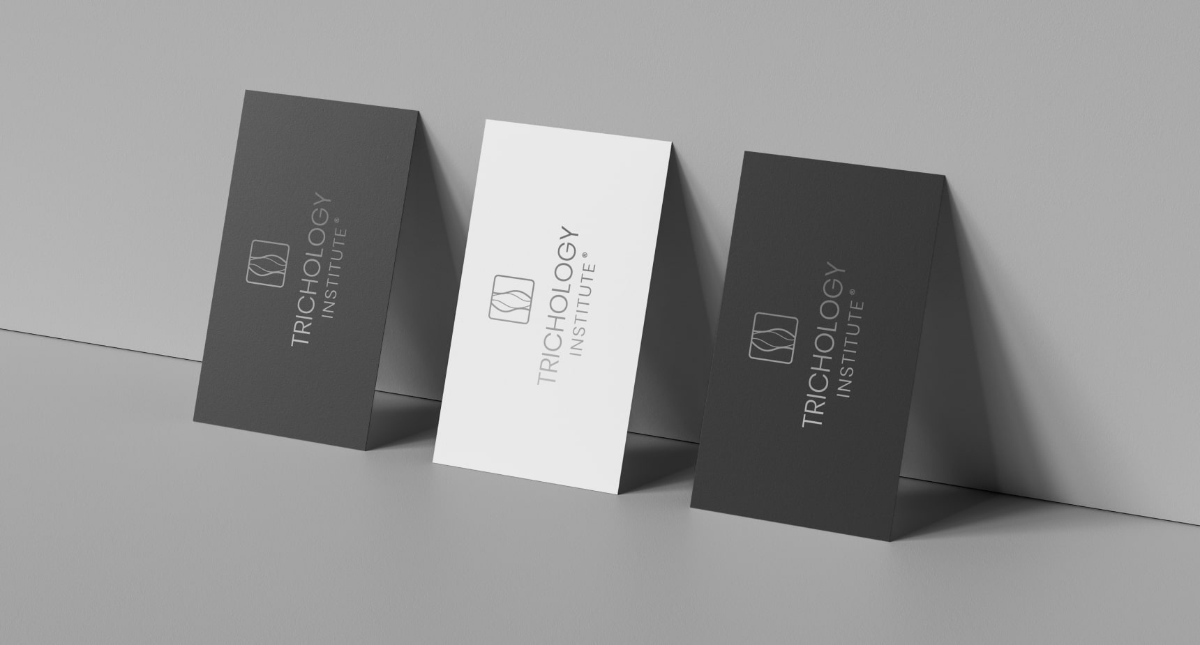

Визитки с новым логотипом -  Институт трихологии Харьков 2020
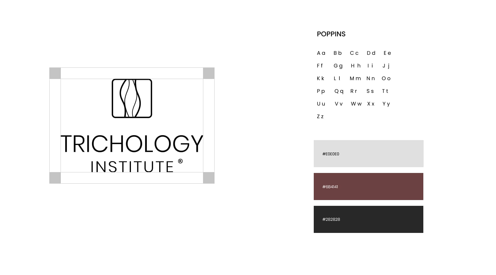
Цвета, шрифт и техническое размещение логотипа - Институт трихологии -2020
Фирменный календарь - Институт трихологии Харьков 2020
Визитка Институт трихологии 2021
POS материалы  Институт трихологии Харьков / Peretz.Agency

A name that does the work

The Institute's previous identity had a complex symbol somewhere between hair, DNA and other references to the field. Its problem was not a lack of meaning. It had too much, while the name itself was not doing enough. So the primary identity became simple and direct: the name Trichology Institute in clear capitals, with a compact mark of hair strands in a rounded square above it. The complex symbol was not thrown away. It moved one layer deeper, because for the founder, a scientist and a professor, hair stands for several things at once: science, DNA, profession, aesthetics, human identity and love for the work.

The system

The typeface is Poppins. The palette has three colours: light grey #E0E0E0, deep wine #6B4141 and graphite #282828, a calm medical base with one warm note. The guidelines fix the clear space around the logo and its versions for light and dark backgrounds.

On paper

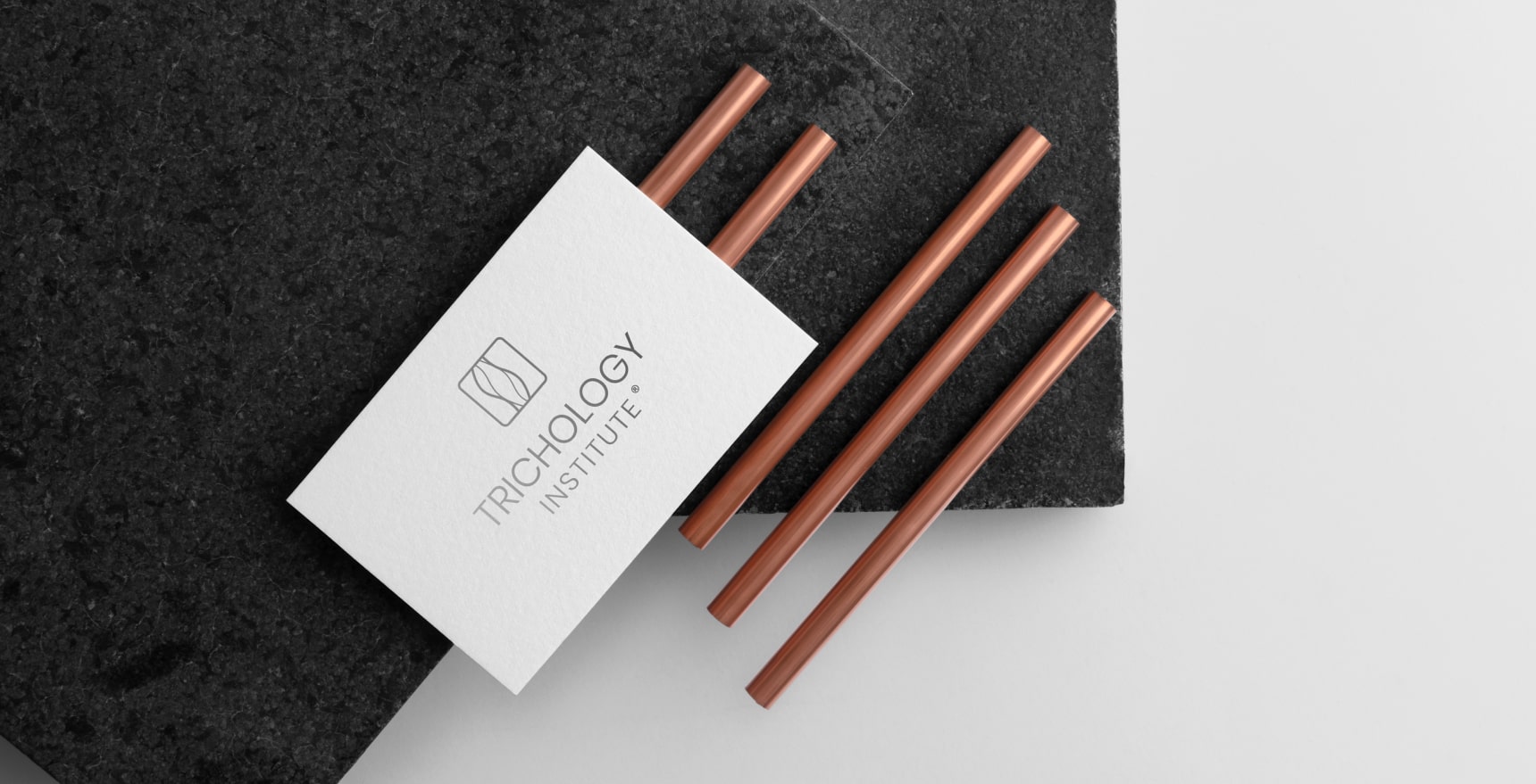
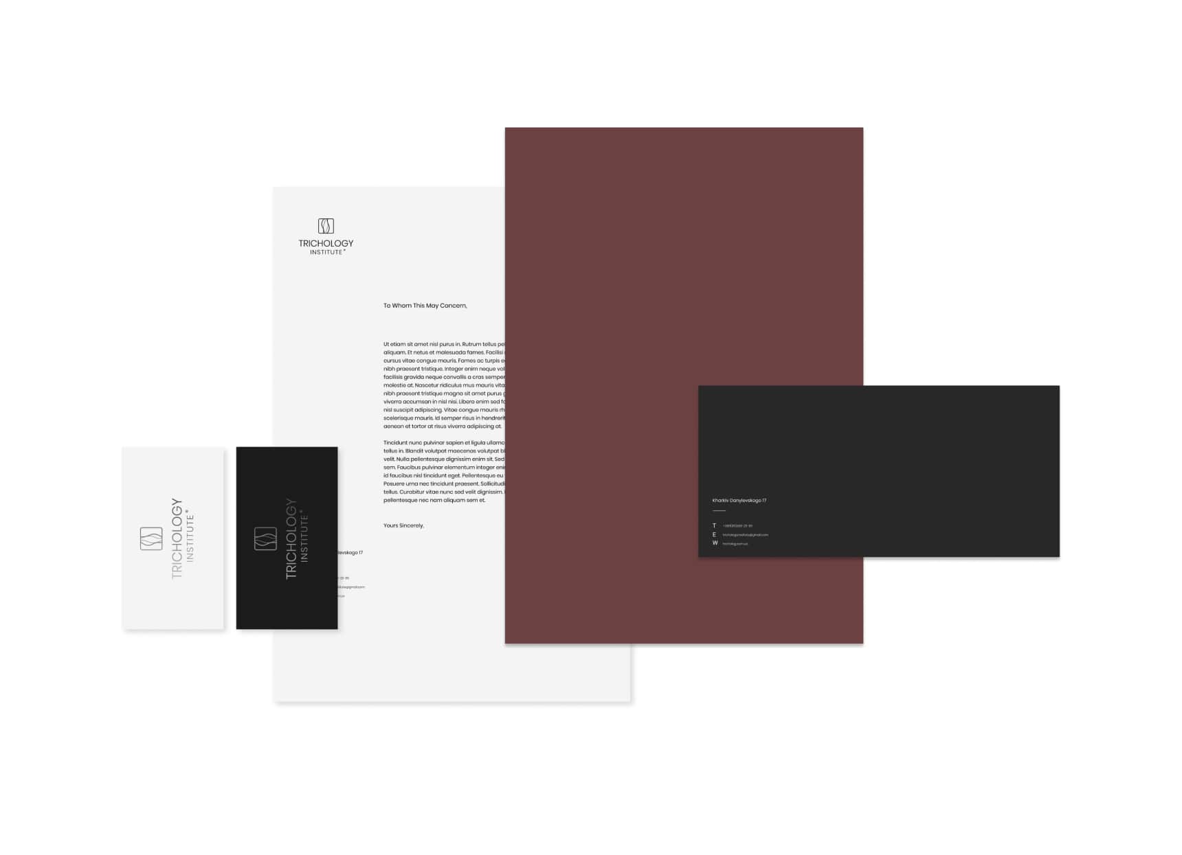
The identity was carried into the things patients and colleagues hold in their hands: business cards in light and dark versions, letterhead, folders and envelopes, a branded desk calendar and POS materials for the clinic.

What clarity changed

In the first month after the new identity and the new website launched, conversion into inquiries from the website rose by 5%, and over the following year by 34%, with comparable advertising budgets. Not all of that growth belongs to the identity, but it shows what a brand that is easier to understand can do for a medical institution. We look at this case among others in How Much Does a Brand Identity Cost in 2026? and When Not to Rebrand. More about the service: brand identity.