Two sevens back to back
Look at the double Z closely and it turns into two sevens, one upright and one inverted, standing back to back. Together they speak the language of every architectural drawing: drafting lines, rigid reference ties that fix one element against another, and completeness, a closed figure where nothing is left hanging. An engineer reads a drawing in it; a client reads order.
The rest of the letters follow the same rule. The name is set in lowercase, in thin geometric strokes of one weight: round letters are built on circles, straight ones are cut at clean angles. Nothing is decorative. Every line in the name could be a line on a plan.
Black, white, warm grey
The palette is strict: black, white and a warm grey close to the colour of concrete and plaster, with no accent colour at all. An architecture studio shows other people's spaces, materials and light, and its own brand should not compete with them. On a portfolio spread the grey sits quietly next to the photographs; on a building site the black reads at once.
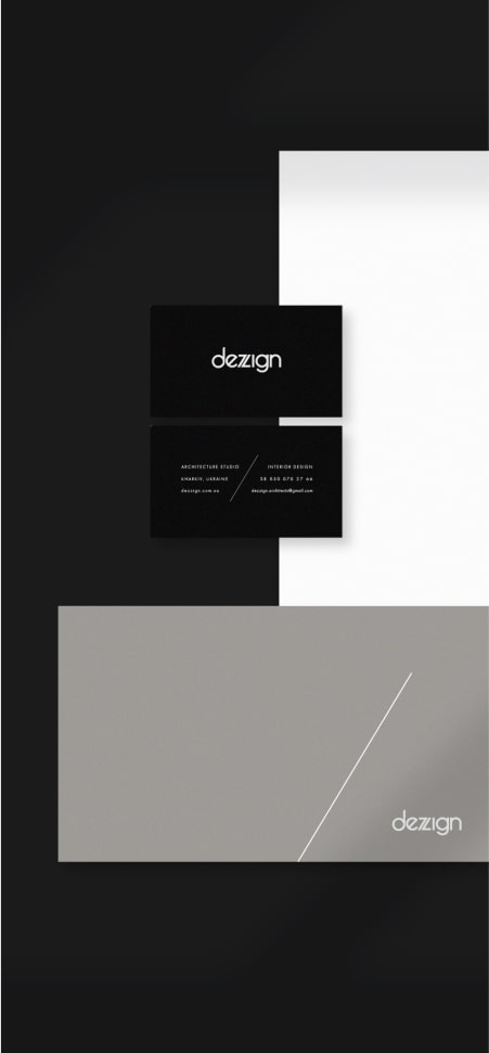
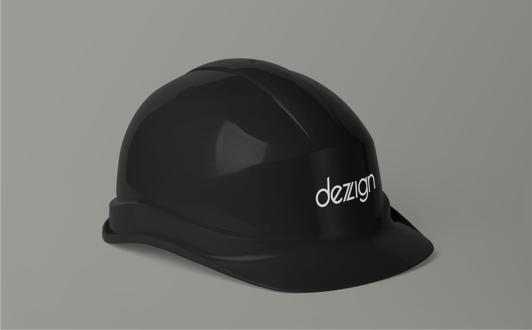
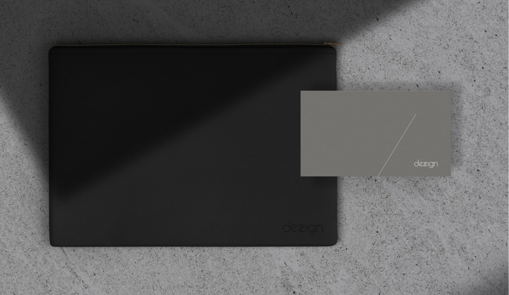
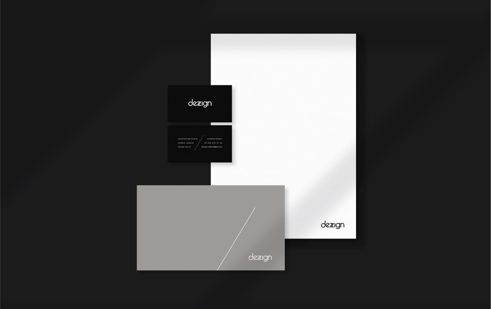
The diagonal of the Z moves onto the stationery as a single thin line crossing a grey business card, like the first line on an empty sheet. The business cards come in black, white and grey with the same name. The letterhead is white with the name in the corner, the project folder is black with the name debossed, and the identity holds on a black hard hat, a carrier that has to work in the dust and sun of a real site. The mark works in one colour on any surface, and it has never needed a colour version.
A studio that shows the space before it is built
At PERETZ we usually take a business online first and then use that growth to change how it works offline. At deZZign the order is reversed: the client gets a complete visual and emotional understanding of a space before a single wall goes up. Planning happens in ArchiCAD, 3ds Max and AutoCAD, and since 2022 Blender and Unreal Engine have added photorealistic walkthroughs of the future house or office. The identity stays out of the way of that work: a strict frame of black, white and grey leaves all the attention on the renders, the materials and the light.
There was no office at the start; we built it while already working inside it. The furniture came later, drawn by us and cut by local craftsmen. Most finished projects cannot be shown publicly, since NDAs are standard in this field, and our lead architect prefers to show only the finished result. So the studio's brand has to be recognisable without a loud portfolio: by its name, by the two sevens and by the tone in which everything else speaks.
Alive and working
The identity is alive and works very well to this day. The studio's website went through three full rebuilds, in Photoshop, then InVision, then Figma, before it settled on the OpenCart site we still run, and through all of them the identity stayed what it was. By the end of 2022 the site brought about 2,000 visitors a month, 40 to 50 calls and 3 or 4 real orders, without paid traffic. That is an honest call-to-order conversion of about 8 to 10 percent: the funnel of a long-cycle, high-consideration business, not viral numbers. One of the clearest signs of trust came from a client, a medical diagnostic centre that changed owners. The new owner first wanted to work with his own architect, then came back to deZZign, and afterwards we took on an even larger project together, a full residential development. A client who left, compared and came back is worth more than any testimonial.
Since then we have put the studio's code, documentation and assets in order and replaced all of its SaaS with our own custom software. The identity needed none of that work. It was right from the start, and when a brand still describes the business exactly, the best decision is to leave it alone. That is also why we talked ourselves out of a visual redesign of the deZZign site, as told in Do You Need a Website Redesign?.
What our own brand taught us
deZZign is our hardest client, because we pay for every decision with our own money. That makes it an honest test. An identity built on one strong idea, with a strict palette and a mark that works in one colour, has served the studio for years in print, on building sites and across three versions of its website. We start client identity work with the same question: what the business really does, and which single idea can carry it. How we work is described on the brand identity service page.