How we came to MDC LUX
Our work with MDC LUX began in 2017, long before there was any talk of a new building. Yevhen Borovoi first heard this team in the recording of a sales call that another agency had lost, and a year later, when he started taking his own projects, MDC LUX was one of the first companies he called. Elena, who answered the phone, wanted to understand the business before talking about a website. We signed the agreement the same day and rebuilt the site of a centre that specialised in orthopedics and computed tomography: the MDC LUX website redesign is in our portfolio.
A new site did not fill the appointment calendar on its own. What helped was a blog the doctors wrote themselves, about the cases and questions they met every day, after hired copywriters could not write with medical accuracy. Organic traffic grew, advertising became more efficient and the calendar filled. Then Elena asked whether we also did architecture and interior design. That question is where this identity began. The whole story is told in Some Clients Change Your Business. MDC LUX Changed Ours.
One project, four disciplines
Around 2019 the founders decided to build one of the most advanced diagnostic centres in the country. Not only new equipment, but a different idea of a clinic: education as part of healthcare, and a building that shows it. For the first time our work went far beyond digital. Together with architects we worked on the architectural concept, the interior, the digital platform and the brand identity, and none of them could exist on its own. The sign on the facade, the route of a patient through the rooms and the first screen of the website had to tell one story.
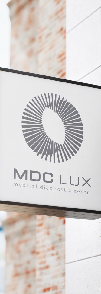
That is why the identity is so restrained. People come to a diagnostic centre with worry, and the brand should calm them rather than impress them. The ring is drawn with thin rays, the letters are wide and even, and nothing in the system shouts.
A quiet medical system
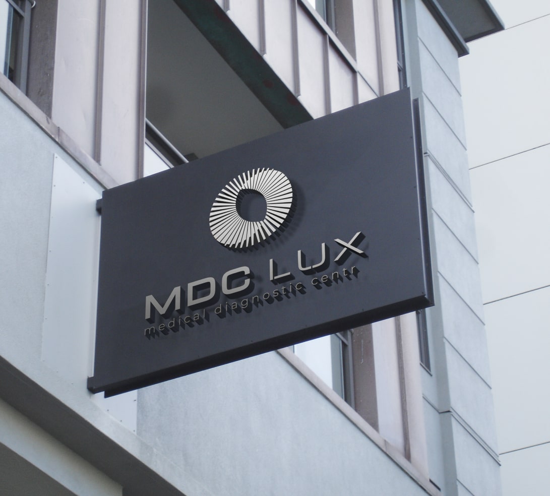
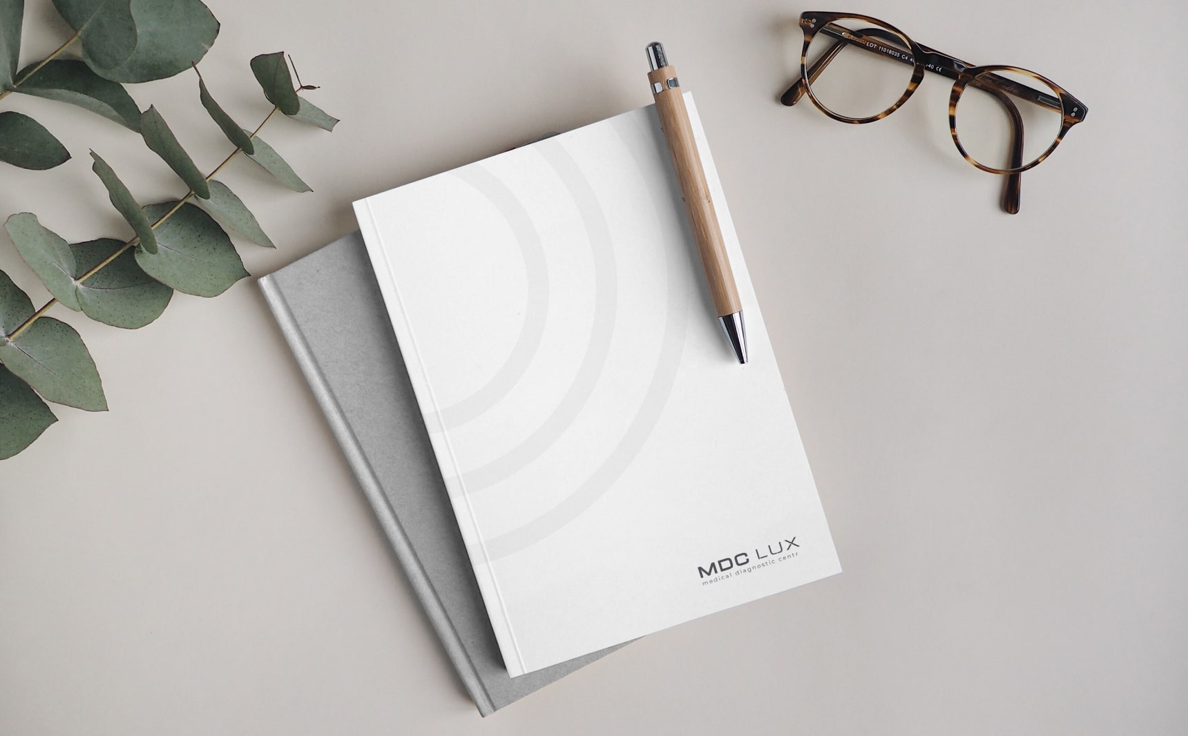
The palette is silver, graphite and white, without the medical blue that almost every clinic reaches for. Silver and graphite belong to the world of equipment and precise instruments, and white gives air. On the facade sign the mark stands in relief on a dark graphite panel, so it is read by its volume and shadow rather than by colour. On paper it works as a one-colour rubber stamp, and on a notebook cover only the arcs of the ring remain, wide and pale, like the edge of the scanner seen up close.
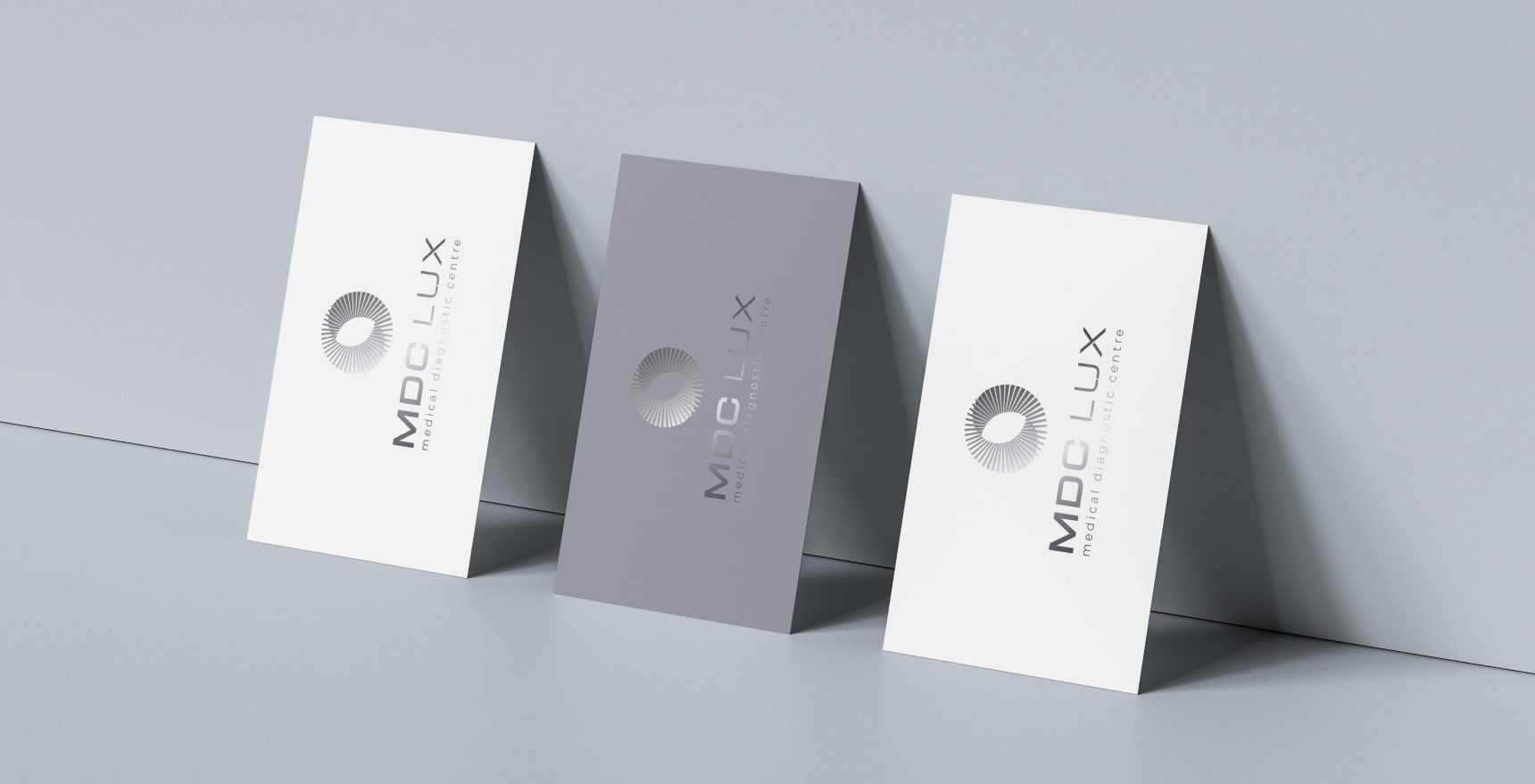
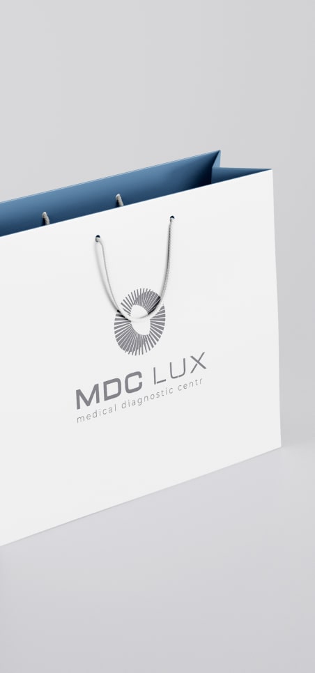
The business cards come in three versions: white, grey and with a silver mark. Together the sign, the stamp, the notebook and the cards show how the mark scales, from a facade seen across the street to a few millimetres of ink on paper.
The centre that never opened
Everything was ready for launch: the identity, the website, the interior design and the architecture. But the diagnostic centre itself never opened. It happens with large projects, and for a designer it is one of the hardest things to accept: the work is finished, and nobody sees it in use.
The work did not disappear. The architectural solution we developed for the clinic later became Copper Hall, an office building in Kharkiv with a copper facade that slowly takes on a patina. It was completed in 2022 and is shown by our sister studio DeZZign. The building changed its purpose, and the project went into IT. And the educational content we had been building with the doctors since the blog grew into MEDPRESSO, an international platform of continuing medical education, with its own identity and a blue that refers back to the project it grew from. How a website turned into a platform is told in The Story We Never Planned to Tell.
What this case taught us
The first lesson was about memory. Even years later, after the original centre had stopped working in the same form and its Google profile was marked as closed, people kept calling, asking for appointments and asking where their doctors had gone. A website brings traffic; a brand creates memory, and memory lasts much longer. For us it became one more responsibility: helping those people find an answer.
The second lesson is that an identity is stronger when it is designed together with the space and the product it will live in, not after them. And work done with care keeps its value when plans change: a building, a platform and a way of working with doctors all came out of a centre that never received its first patient. If you are planning a clinic, a showroom or another business where the physical place matters as much as the screen, see how we approach brand identity.